Share Dialog
Per-person roles, link access, and copy that explains what each one means.
PROGet Share Dialog and 168 other Pro components with pro lifetime — Get Pro
- Category
- Documents
- Access
- ProPro · unlocked
- Source
- 1,005 lines · one file
When to use it
Use Share Dialog to share a file: invite people by email with a role, change or remove their access, and set link access (restricted or anyone with the link) with copy.
Installation
How you get it
Paste this into Claude Code, Cursor, Codex or any coding agent. It installs the file and uses it as it is, instead of writing a new one.
Use Liro's Share Dialog for this.
Install it: npx shadcn@latest add @liro/share-dialog
(the @liro registry is set up in components.json, with LIRO_KEY in .env.local)
Import it from @/components/ui/share-dialog.
Do not rewrite or restyle it. Pass my data through its props
and keep its built-in states.
For the full brief with every prop and the mistakes assistants usually make, use Copy prompt above. Pro components install through the @liro registry with your CLI token: see the Namespaced tab.
Usage
import { ShareDialog, type Collaborator } from "@/components/ui/share-dialog";

const people: Collaborator[] = [
  { id: "1", name: "Michael Carter", email: "michael@madgixs.com", role: "owner", you: true },
  { id: "2", name: "Ada Moss", email: "ada@vertically.dev", role: "comment" },
];

export function ShareFile({ invite, close }: { invite: (emails: string[], role: Collaborator["role"]) => void; close: () => void }) {
  return (
    <ShareDialog
      title="Share"
      fileName="Vertically MSA.pdf"
      people={people}
      shareUrl="https://app.example.com/d/msa"
      onInvite={invite}
      onClose={close}
    />
  );
}
API reference
“Copy prompt” above puts a full brief on your clipboard, install command, dependencies, props, and the mistakes an assistant usually makes with this component.
Props
Read from the component’s own TypeScript interface when the site is built, so this table cannot drift from the file you install.
| Type | Notes | ||
|---|---|---|---|
title | string | No | Panel heading. |
fileName | string | No | Shown under the heading — usually the file being shared. |
people | Collaborator[] | No | The people who already have access. |
linkAccess | LinkAccess | No | Who the link works for. |
linkRole | Exclude<AccessRole, "owner"> | No | What link holders may do, when the link is open. |
shareUrl | string | No | The link itself, copied to the clipboard. |
searchThreshold | number | No | Show the filter field once the list is longer than this. |
onInvite | (emails: string[], role: Exclude<AccessRole, "owner">) => void | No | – |
onRoleChange | (id: string, role: AccessRole) => void | No | – |
onRemove | (id: string) => void | No | – |
onLinkAccessChange | (access: LinkAccess, role: Exclude<AccessRole, "owner">) => void | No | – |
onCopyLink | (url: string) => void | No | – |
onClose | () => void | No | – |
modal | boolean | No | Whether the panel is being shown as a modal — over a scrim, with the page behind it inert. The panel does not render its own scrim, so it cannot know this on its own. Set it and the panel traps Tab, takes focus on open, returns focus to the trigger on close, and closes on Escape. Left off, it is an ordinary region on the page and none of that would be correct. |
look | Look | No | Layered sets the panel in a tray, with the heading above the card and the link in the strip below it. Flat is one card, the strip its floor. |
Dependencies
npm packages
clsxframer-motionlucide-reacttailwind-mergeLiro foundations, installed alongside it
liro-themerole-chipAccessibility
- Keyboard reachable throughout, in visual order
- Focus trapped in overlays, Escape closes them
- Focus returns to whatever opened it
- Live regions announce what changed, not that something did
- Honours prefers-reduced-motion
Responsive behavior
- Sizes to its container, not the viewport
- Usable from 320px up
- Pointer-based interaction, so trackpad and touch both work
- No hover-only affordances
More like Share Dialog
All Documents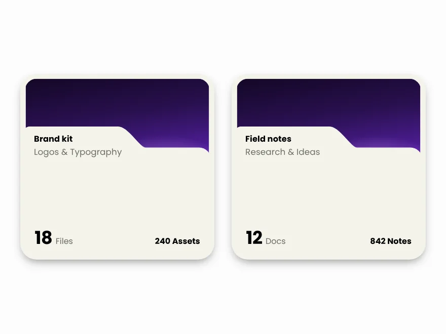 Pro
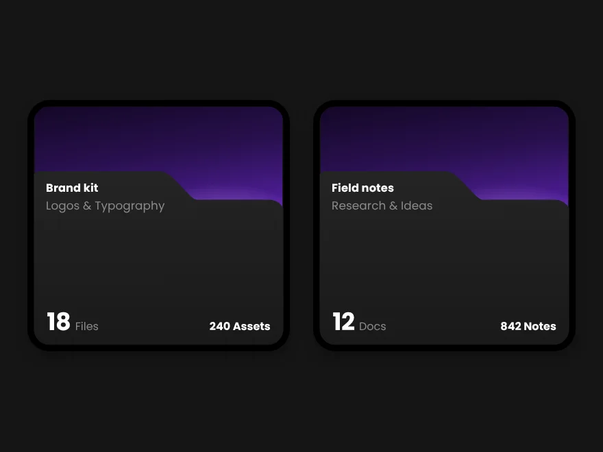
Folder Card
Folder card with file previews and count.
 Pro
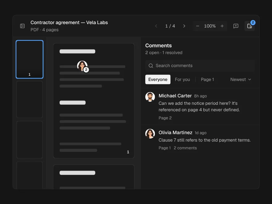
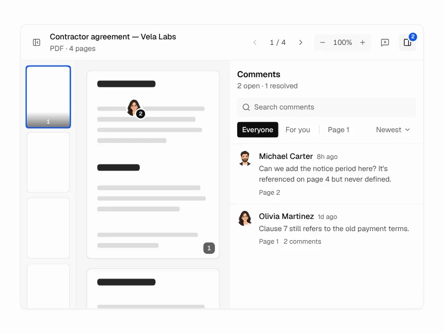
Document Viewer
PDF and document viewer with zoom and comments.
 Pro
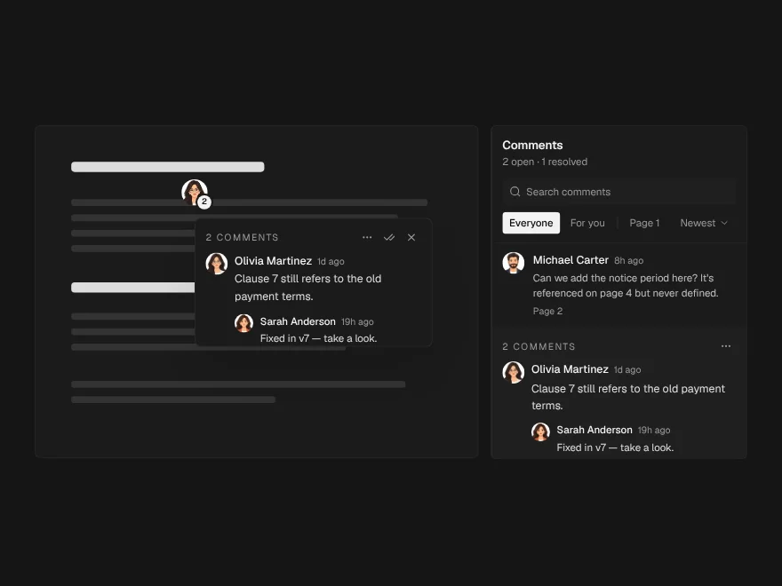
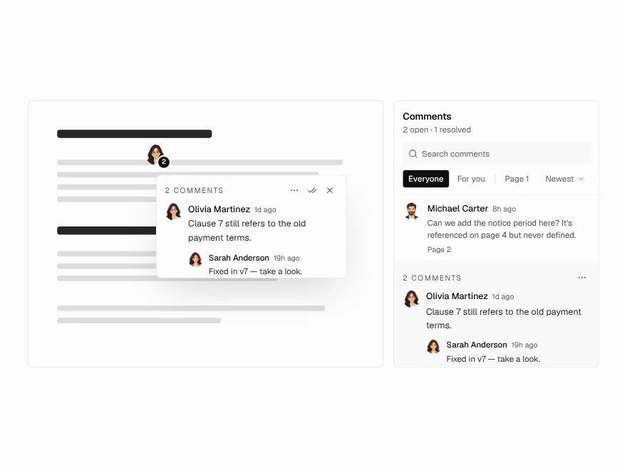
Annotation Pins
Pin comments on a document page.
 Pro
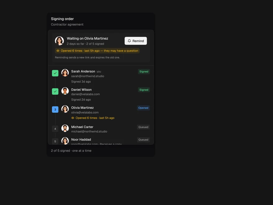
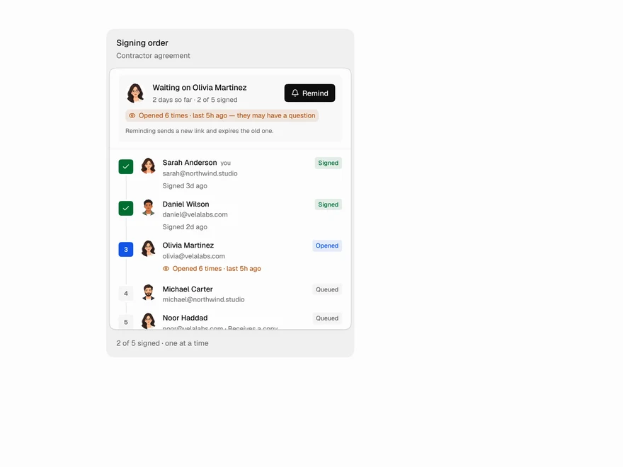
Signer Flow
E-signature status: who still needs to sign.
 Pro
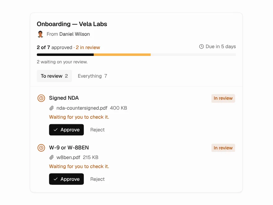
Document Request
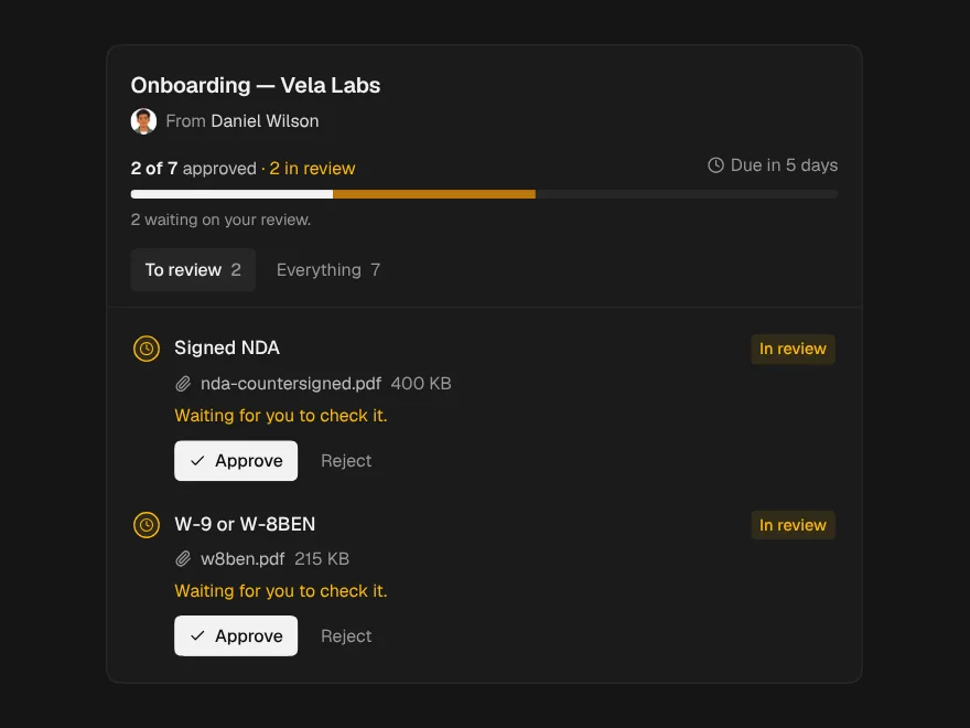
Checklist for requesting documents from clients.
 Pro
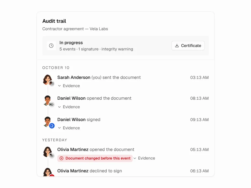
Audit Trail
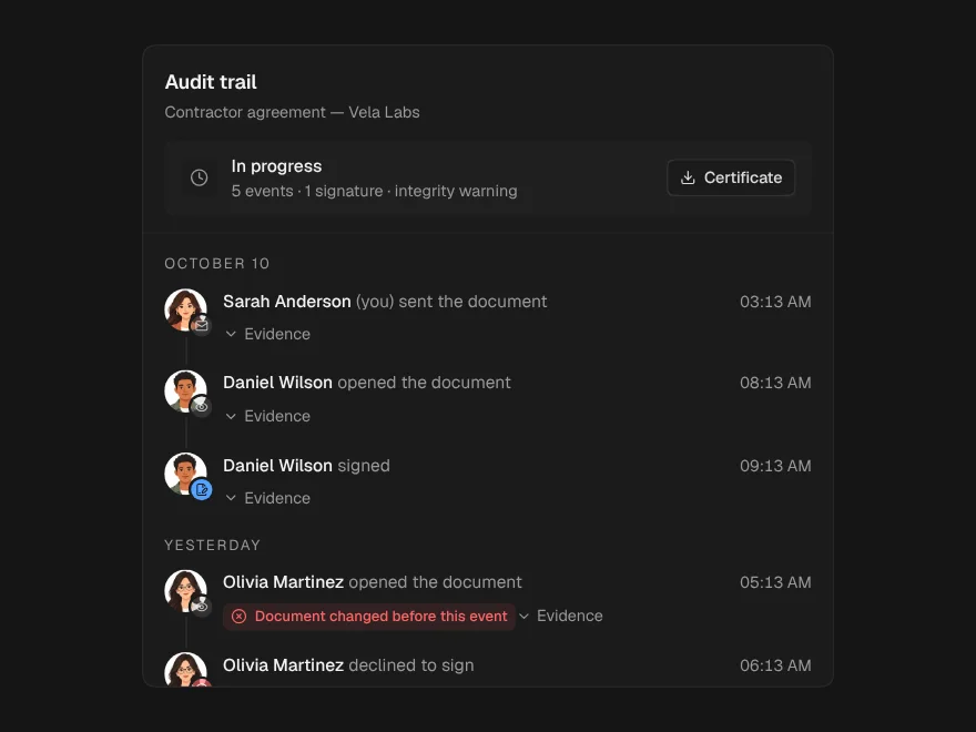
Tamper-evident audit trail for a document.