Document Viewer
Pages, zoom, thumbnails and a comment mode. You supply the renderer.
PROGet Document Viewer and 168 other Pro components with pro lifetime — Get Pro
- Category
- Documents
- Access
- ProPro · unlocked
- Source
- 870 lines · one file
The decision inside it
It does not bundle a PDF engine
Shipping one would add megabytes and pick your rendering strategy for you. The viewer takes a function and gets out of the way.
When to use it
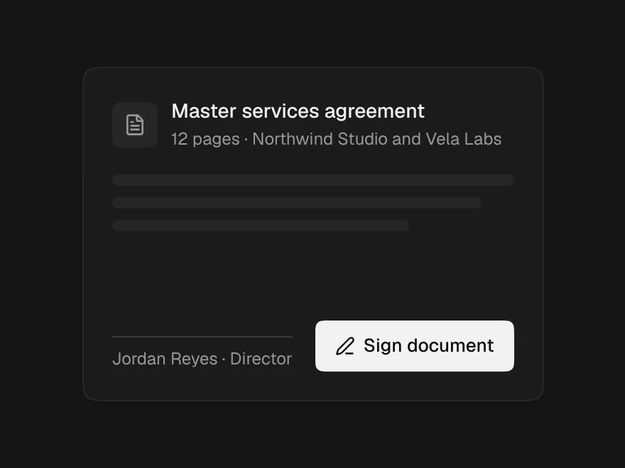
Use Document Viewer to show a multi-page document: pages from image URLs or your own renderPage, thumbnails, zoom, page controls, a side panel slot (for comments) and download.
Installation
How you get it
Paste this into Claude Code, Cursor, Codex or any coding agent. It installs the file and uses it as it is, instead of writing a new one.
Use Liro's Document Viewer for this.
Install it: npx shadcn@latest add @liro/document-viewer
(the @liro registry is set up in components.json, with LIRO_KEY in .env.local)
Import it from @/components/ui/document-viewer.
Do not rewrite or restyle it. Pass my data through its props
and keep its built-in states.
For the full brief with every prop and the mistakes assistants usually make, use Copy prompt above. Pro components install through the @liro registry with your CLI token: see the Namespaced tab.
Usage
import { DocumentViewer } from "@/components/ui/document-viewer";

export function ContractViewer({ download }: { download: () => void }) {
  return (
    <DocumentViewer
      title="Master Services Agreement"
      subtitle="Vertically · 3 pages"
      pages={[1, 2, 3].map((n) => ({ number: n, src: `/contracts/msa/page-${n}.png`, width: 816, height: 1056 }))}
      thumbnails
      onDownload={download}
    />
  );
}
API reference
“Copy prompt” above puts a full brief on your clipboard, install command, dependencies, props, and the mistakes an assistant usually makes with this component.
Props
Read from the component’s own TypeScript interface when the site is built, so this table cannot drift from the file you install.
| Type | Notes | ||
|---|---|---|---|
title | string | No | – |
subtitle | string | No | Shown under the title — page count is appended automatically. |
pages | DocumentPage[] | No | – |
loading | boolean | No | Nothing to show yet. |
renderPage | (page: DocumentPage, size: { width: number; height: number }) => React.ReactNode | No | Render one page yourself. Return any node — a canvas driven by pdf.js, an img, an iframe. It is given the box it must fill. |
overlay | (page: DocumentPage, size: { width: number; height: number }) => React.ReactNode | No | Drawn over each page, in page coordinates. This is where an annotation layer, signature fields or highlights go. |
defaultPage | number | No | Start on this page. |
page | number | No | Controlled page. |
onPageChange | (page: number) => void | No | – |
defaultZoom | number | No | Start zoom, 1 = fit width. |
thumbnails | boolean | No | Show the thumbnail rail. Auto-hidden on narrow widths. |
height | number | "auto" | No | How tall the viewer is, in pixels. It needs one. Left to grow with its content, a four-page document renders as four full-size pages down the host page and the scroller, the paging controls and the thumbnail rail all become decorative — which is exactly what it did before this prop existed. Pass a number, or `"auto"` to opt into the tall behaviour deliberately. |
commenting | boolean | No | Commenting mode. Controlled, because the toolbar button and the overlay layer are two different components and only the caller sees both. |
onCommentingChange | (commenting: boolean) => void | No | – |
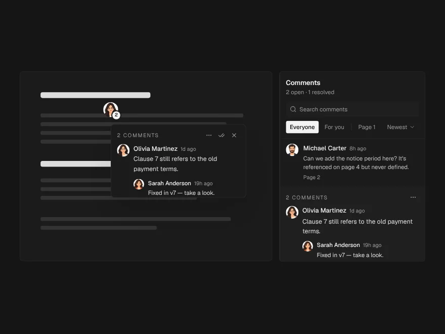
panel | React.ReactNode | No | The comments side panel, rendered to the right of the pages. The pin and the panel are not alternatives. A pin answers "what is wrong with this, here"; the panel answers "what is still open anywhere in this document". Pass `<CommentPanel/>` and the viewer makes room for it. |
panelOpen | boolean | No | Whether the panel is showing, for the toolbar toggle. |
onPanelOpenChange | (open: boolean) => void | No | – |
commentCount | number | No | Count shown on the panel toggle — open threads, not all threads. |
onDownload | () => void | No | – |
onClose | () => void | No | – |
look | Look | No | Layered sets the pages in a card resting in a tray, with the toolbar in the tray above it. Flat is one card with the toolbar as its top row. |
Dependencies
npm packages
clsxframer-motionlucide-reacttailwind-mergeLiro foundations, installed alongside it
liro-themedropdown-menutooltipAccessibility
- Keyboard reachable throughout, in visual order
- Focus trapped in overlays, Escape closes them
- Focus returns to whatever opened it
- Live regions announce what changed, not that something did
- Honours prefers-reduced-motion
Responsive behavior
- Sizes to its container, not the viewport
- Usable from 320px up
- Pointer-based interaction, so trackpad and touch both work
- No hover-only affordances
More like Document Viewer
All Documents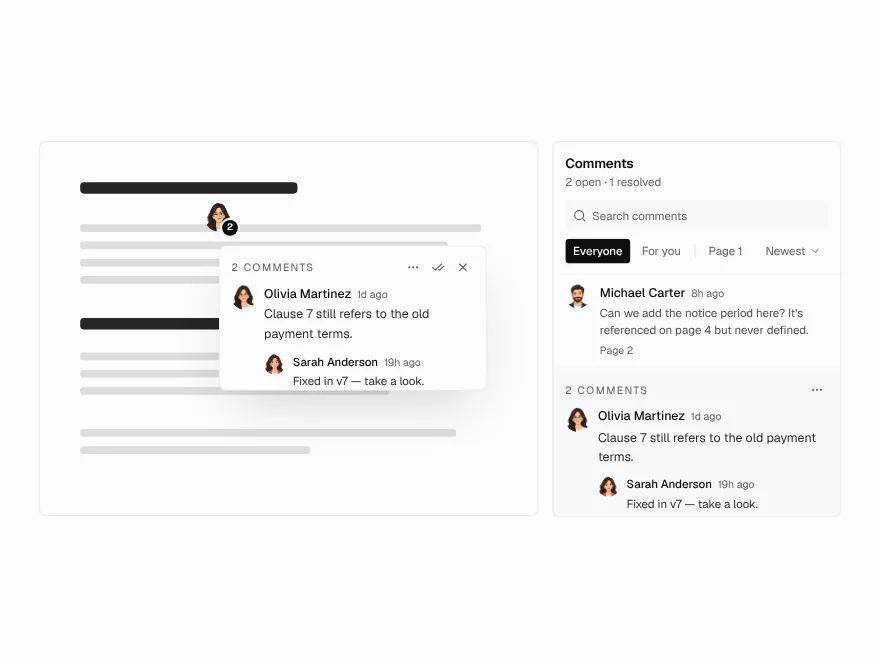 Pro
Annotation Pins
Pin comments on a document page.
 Pro
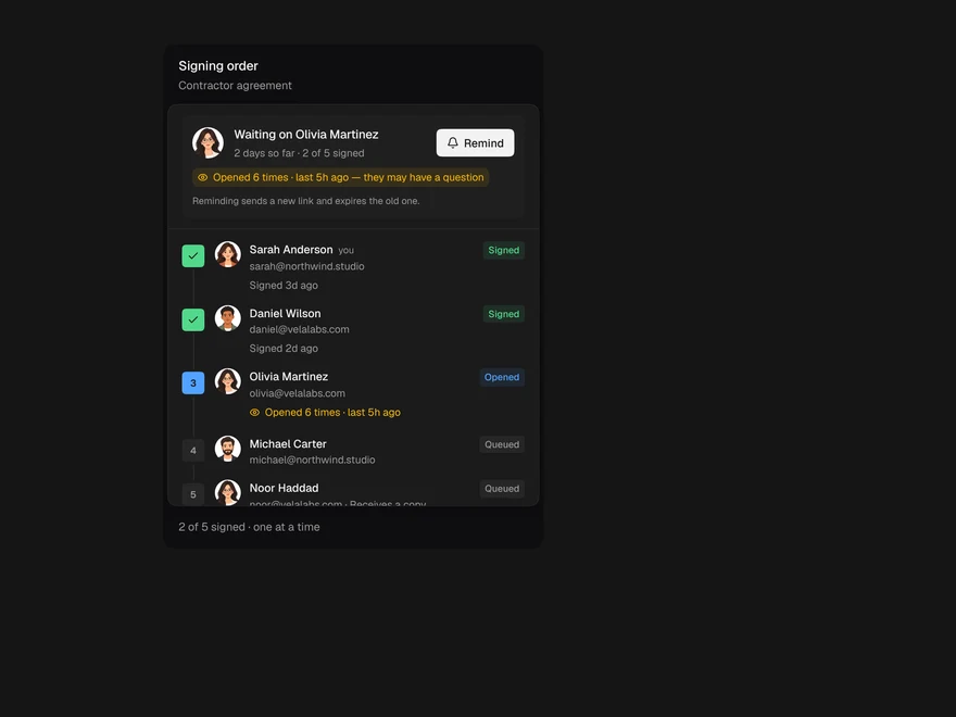
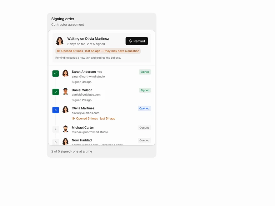
Signer Flow
E-signature status: who still needs to sign.
 Pro
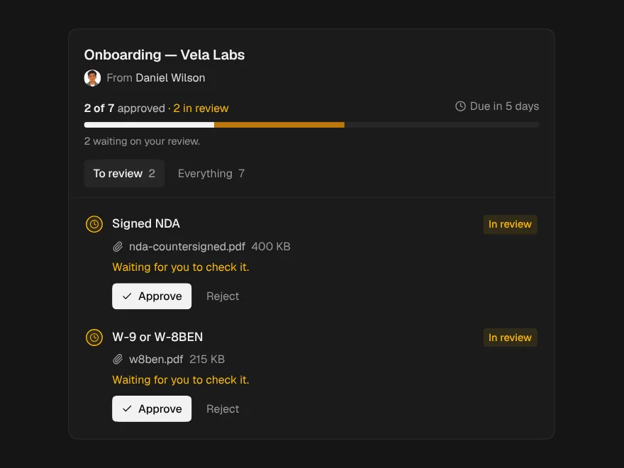
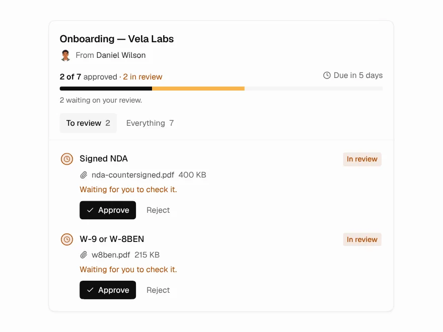
Document Request
Checklist for requesting documents from clients.
 Pro
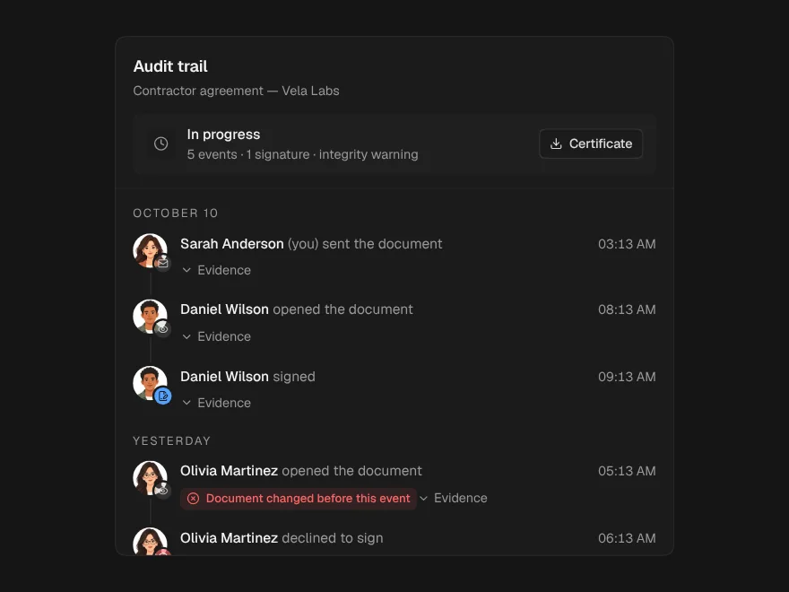
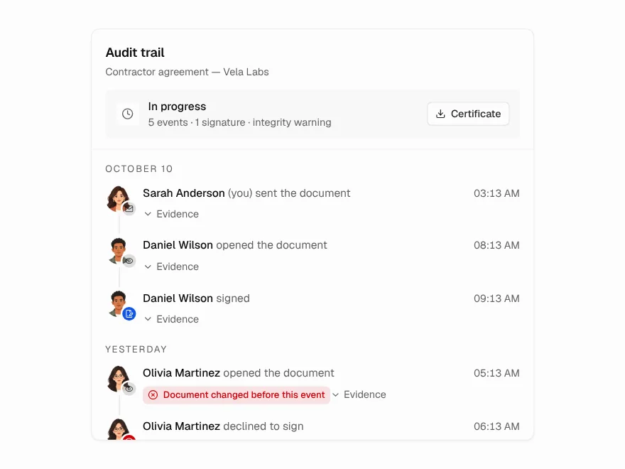
Audit Trail
Tamper-evident audit trail for a document.
 Pro
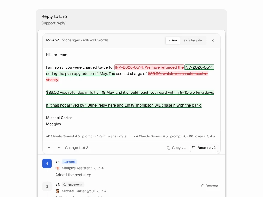
Version History
Compare and restore document versions.
 Free
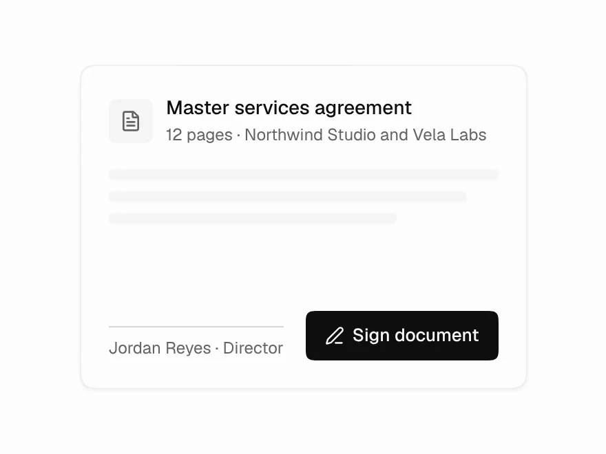
Signature Pad
Draw, type or upload a signature.