Folder Card
A folder tile with stacked previews and a file count.
PROGet Folder Card and 168 other Pro components with pro lifetime — Get Pro
- Category
- Documents
- Access
- ProPro · unlocked
- Source
- 256 lines · one file
When to use it
Use Folder Card for a folder or collection tile: a cover, title, item count and meta line, as a link or button when interactive.
Installation
How you get it
Paste this into Claude Code, Cursor, Codex or any coding agent. It installs the file and uses it as it is, instead of writing a new one.
Use Liro's Folder Card for this.
Install it: npx shadcn@latest add @liro/folder-card
(the @liro registry is set up in components.json, with LIRO_KEY in .env.local)
Import it from @/components/ui/folder-card.
Do not rewrite or restyle it. Pass my data through its props
and keep its built-in states.
For the full brief with every prop and the mistakes assistants usually make, use Copy prompt above. Pro components install through the @liro registry with your CLI token: see the Namespaced tab.
Usage
import { FolderCard } from "@/components/ui/folder-card";

export function Folders() {
  return (
    <div className="grid grid-cols-2 gap-4">
      <FolderCard title="Contracts" count={24} countLabel="files" meta="Updated today" interactive />
      <FolderCard title="Invoices" count={112} countLabel="files" meta="Updated 2 days ago" interactive />
    </div>
  );
}
API reference
“Copy prompt” above puts a full brief on your clipboard, install command, dependencies, props, and the mistakes an assistant usually makes with this component.
Props
Read from the component’s own TypeScript interface when the site is built, so this table cannot drift from the file you install.
| Type | Notes | ||
|---|---|---|---|
title | string | No | Headline shown inside the folder tab. |
subtitle | string | No | Supporting line under the title. |
count | React.ReactNode | No | Large figure in the footer, e.g. "24". |
countLabel | string | No | Word next to the figure, e.g. "Files". |
meta | string | No | Right-aligned footer text, e.g. "312 Assets". |
cover | string | No | Cover image URL. Falls back to a CSS aurora gradient when omitted. |
coverAlt | string | No | Alt text for the cover image. |
interactive | boolean | No | Hover motion. Default: true. |
Dependencies
npm packages
clsxframer-motiontailwind-mergeLiro foundations, installed alongside it
liro-themeAccessibility
- Keyboard reachable throughout, in visual order
- Focus trapped in overlays, Escape closes them
- Focus returns to whatever opened it
- Live regions announce what changed, not that something did
- Honours prefers-reduced-motion
Responsive behavior
- Sizes to its container, not the viewport
- Usable from 320px up
- Pointer-based interaction, so trackpad and touch both work
- No hover-only affordances
More like Folder Card
All Documents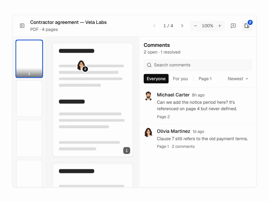 Pro
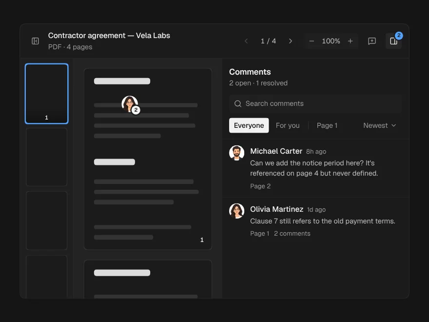
Document Viewer
PDF and document viewer with zoom and comments.
 Pro
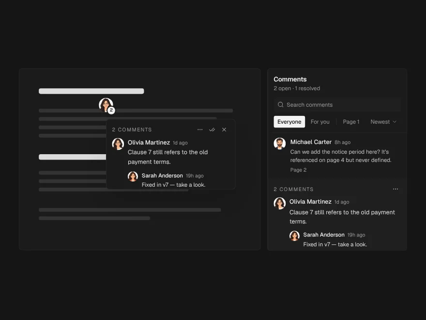
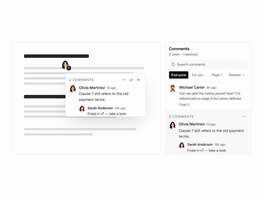
Annotation Pins
Pin comments on a document page.
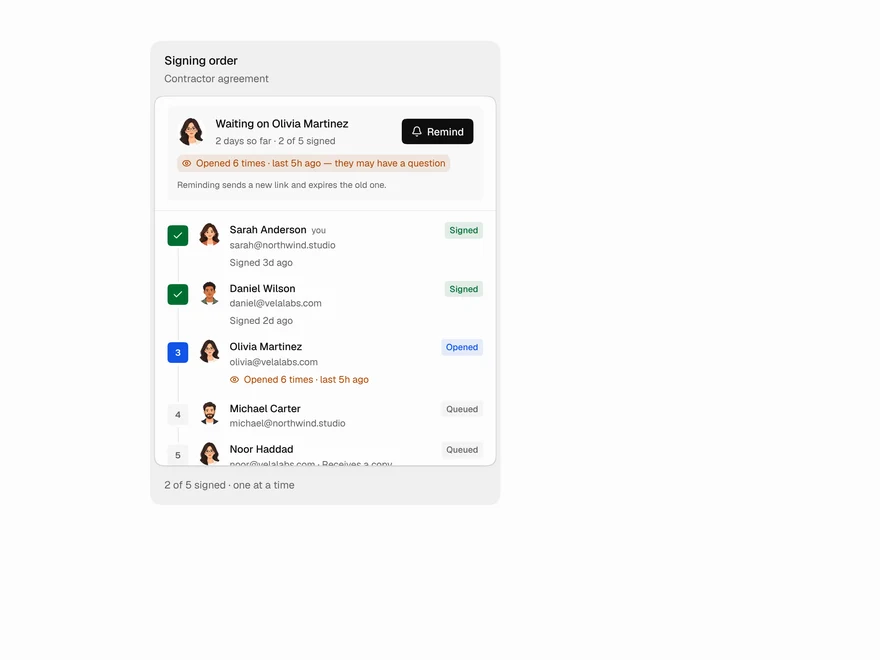 Pro
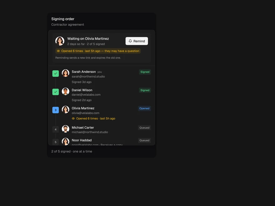
Signer Flow
E-signature status: who still needs to sign.
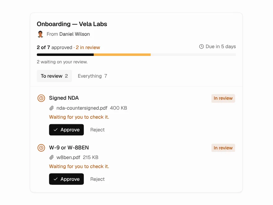 Pro
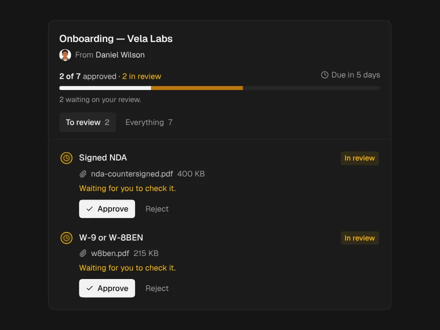
Document Request
Checklist for requesting documents from clients.
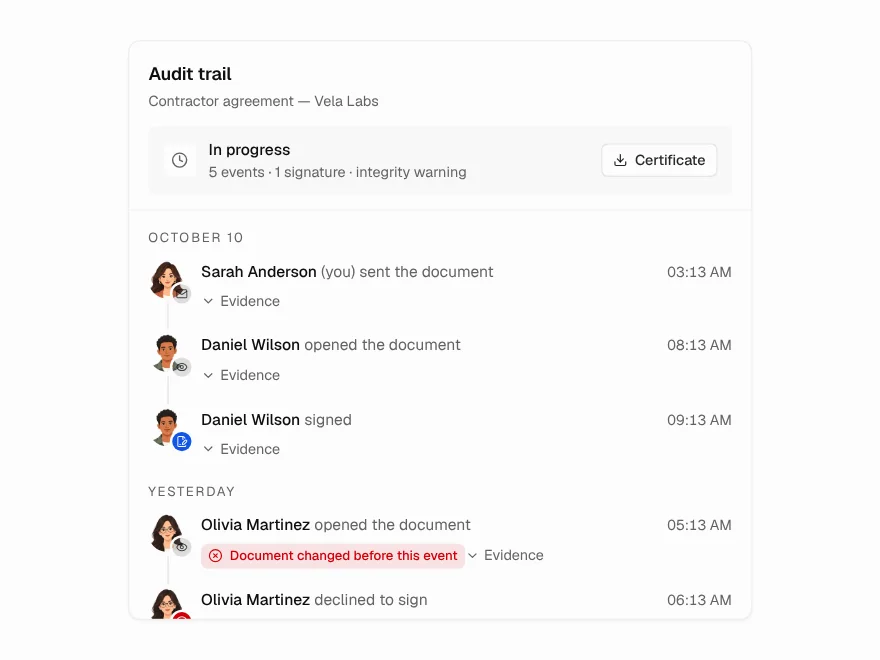 Pro
Audit Trail
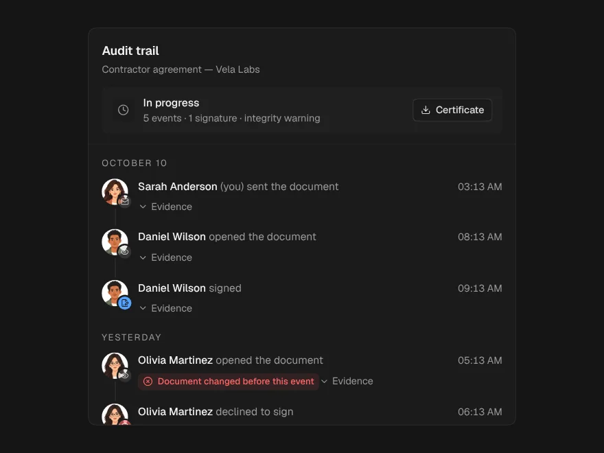
Tamper-evident audit trail for a document.
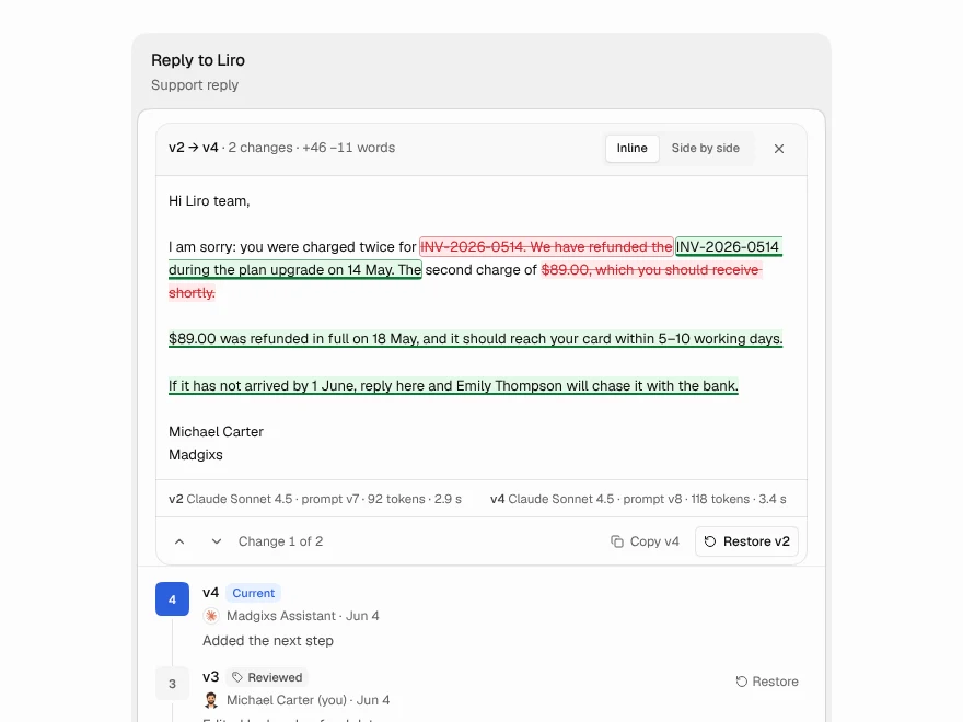 Pro
Version History
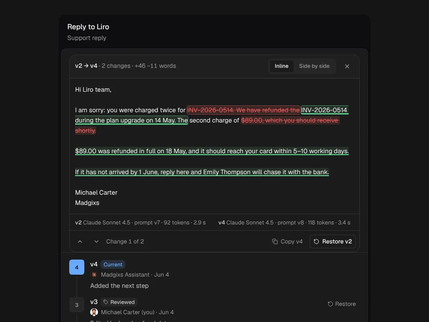
Compare and restore document versions.