Settings / Sign-in & Safety
Everything that protects an account in one page: a checklist of what is switched on, the password, two-step sign-in, passkeys, recovery codes, the devices still signed in and the last sign-ins, with unfamiliar ones marked.
When to use
- The security page of a product that holds anything valuable
- Getting people to turn on two-step sign-in
- Showing where an account is signed in and ending sessions
When not to use
- Only the two-step setup flow: use Two-Factor Setup
- Only the device list: use Sessions & Devices
The decision inside it
Weakening security asks if it's you, once
Turning protection off or showing recovery codes asks you to confirm it's you first, then trusts you for ten minutes with a visible countdown, so a stolen open laptop can't strip the account and you aren't asked on every click.
Installation
Settings / Sign-in & Safety is a Pro screen, included with pro lifetime. It is two files on top of the Liro components it is made of.
- Add the components it uses:
npx shadcn@latest add @liro/alert @liro/badge @liro/button @liro/dialog @liro/input @liro/password-strength @liro/sessions-devices @liro/two-factor-setup - Copy
screens/sign-in-safety-screen.tsxandscreens/data/sign-in-safety-screen.tsfrom the Code tab above into your project, at the same paths. - It also imports
@/lib,@/demos/liro-mark,@/demos/portraits,@/demos/screen-kitand@/demos/settings-shell: Liro’s shared helpers and the demo’s sample images. Point them at your own.
Usage
import { SignInSafetyScreen } from "@/screens/sign-in-safety-screen";

export default function Page() {
  /* A screen fills the box it is given: give it the window. */
  return (
    <main className="h-dvh">
      <SignInSafetyScreen className="h-full" />
    </main>
  );
}
Built from
Every Liro component this screen imports. Each has its own page, props and install command.
API reference
Read from SignInSafetyScreenProps when the site is built. It also takes every attribute a div does, such as className.
SignInSafetyScreen
| Type | Notes | ||
|---|---|---|---|
state | SignInSafetyState | No | – |
onConfirmIdentity | (password: string) => boolean | Promise<boolean> | No | Check the password before a sensitive change. Return false if it's wrong. |
loading | boolean | No | The data is on its way: the frame stays and the content is drawn as gray shapes in the shape of the real page. |
onNavigate | (label: string) => void | No | Called with the label of a sidebar or settings item when someone opens it ("Inbox", "Model policy"). Without it, a toast says where it would go. |
workspace | ScreenWorkspace | No | The workspace at the top of the sidebar. |
user | ScreenUser | No | The signed-in person, at the bottom of the sidebar. |
layout | ScreenLayout | No | "inset": the page on a card beside a gray sidebar. "flat": the page edge to edge. Default "inset". |
className | string | No | – |
Accessibility
- The checklist reads as a list with each item's state in words
- The confirm dialog traps focus and returns it when closed
- The trust countdown is shown and announced, never only coloured
- Movement follows the reduced-motion setting
Responsive behavior
- Fills the box it is given: mount it at the window's height
- Cards stack on narrow widths and keep their actions in reach
- Light and dark come from the Liro theme: it follows the dark class on <html>, like every component.
More screens
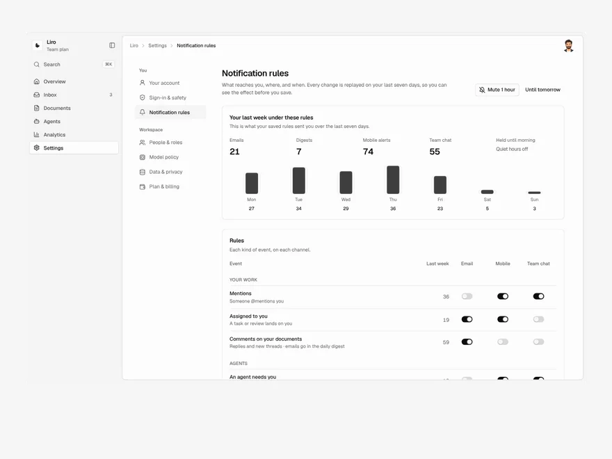
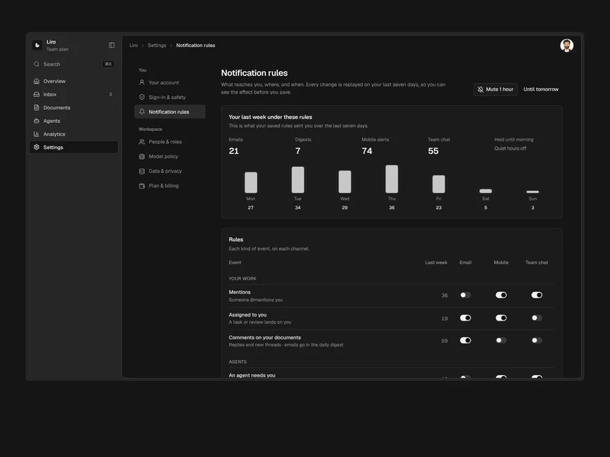
Settings / Notification Rules
What reaches you, on which channel and when, with a preview of your last week under the new rules.
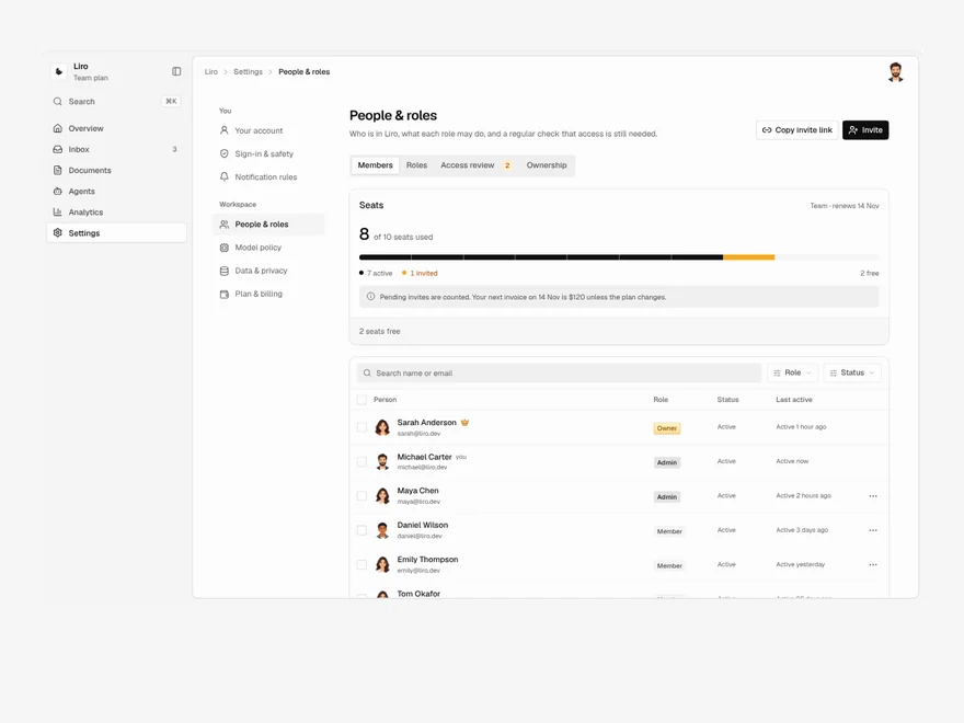
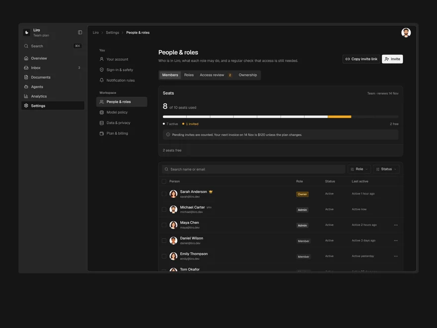
Settings / People & Roles
Members, invites, roles and access reviews, where removing someone first hands over everything they own.
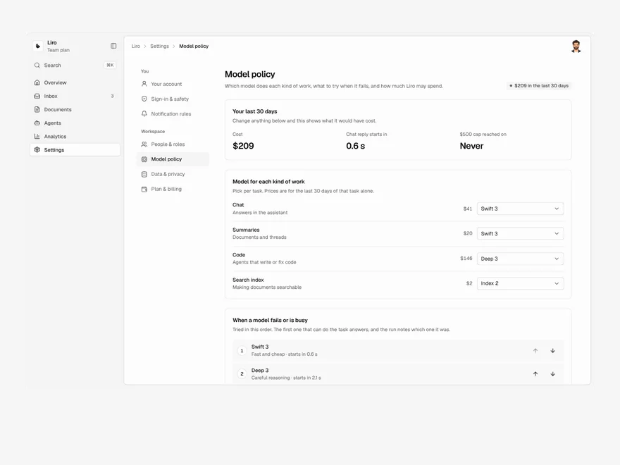
Settings / Model Policy
Default AI models per task, fallback order, spend caps and retention, priced on your last 30 days of real use.
Liro · 270 components · 17 screens · 4 templates