Settings / Model Policy
Where a workspace decides how it uses AI models: which model does which job, what takes over when one fails, how much may be spent and by whom, and how long prompts are kept. Every change shows what it would have cost.
When to use
- Admin settings of an AI product with more than one model
- Controlling AI spend per workspace or per member
- Setting fallbacks for when a provider fails
When not to use
- Picking a model for one chat: use Model Picker
- Showing one request's fallbacks: use Fallback Chain
The decision inside it
Every change is priced on last month's real usage
Switching a default or a cap shows what the last 30 days would have cost and how fast replies would have been, before saving. Teams choose on evidence from their own traffic, not on list prices.
Installation
Settings / Model Policy is a Pro screen, included with pro lifetime. It is two files on top of the Liro components it is made of.
- Add the components it uses:
npx shadcn@latest add @liro/alert @liro/state @liro/badge @liro/button @liro/input @liro/segmented-control @liro/select - Copy
screens/model-policy-screen.tsxandscreens/data/model-policy-screen.tsfrom the Code tab above into your project, at the same paths. - It also imports
@/lib,@/demos/liro-mark,@/demos/portraits,@/demos/screen-kitand@/demos/settings-shell: Liro’s shared helpers and the demo’s sample images. Point them at your own.
Usage
import { ModelPolicyScreen } from "@/screens/model-policy-screen";

export default function Page() {
  /* A screen fills the box it is given: give it the window. */
  return (
    <main className="h-dvh">
      <ModelPolicyScreen className="h-full" />
    </main>
  );
}
Built from
Every Liro component this screen imports. Each has its own page, props and install command.
API reference
Read from ModelPolicyScreenProps when the site is built. It also takes every attribute a div does, such as className.
ModelPolicyScreen
| Type | Notes | ||
|---|---|---|---|
state | ModelPolicyState | No | – |
onSave | (policy: Policy) => void | Promise<void> | No | – |
loading | boolean | No | The data is on its way: the frame stays and the content is drawn as gray shapes in the shape of the real page. |
empty | boolean | No | There is nothing yet: each screen says what goes here and offers the one action that fills it. |
onNavigate | (label: string) => void | No | Called with the label of a sidebar or settings item when someone opens it ("Inbox", "Model policy"). Without it, a toast says where it would go. |
workspace | ScreenWorkspace | No | The workspace at the top of the sidebar. |
user | ScreenUser | No | The signed-in person, at the bottom of the sidebar. |
layout | ScreenLayout | No | "inset": the page on a card beside a gray sidebar. "flat": the page edge to edge. Default "inset". |
className | string | No | – |
Accessibility
- The cost preview is written out, not only shown as bars
- Fallback order can be changed with buttons as well as dragging
- Every field has a label and errors are announced
- Movement follows the reduced-motion setting
Responsive behavior
- Fills the box it is given: mount it at the window's height
- The preview moves under each section on narrow widths
- Light and dark come from the Liro theme: it follows the dark class on <html>, like every component.
More screens
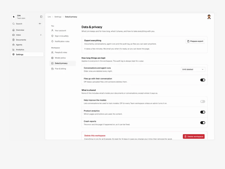
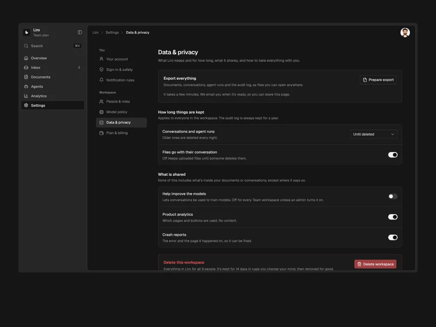
Settings / Data & Privacy
Data export, retention, training opt-out and deletion, where deleting is scheduled and shortening retention is previewed.
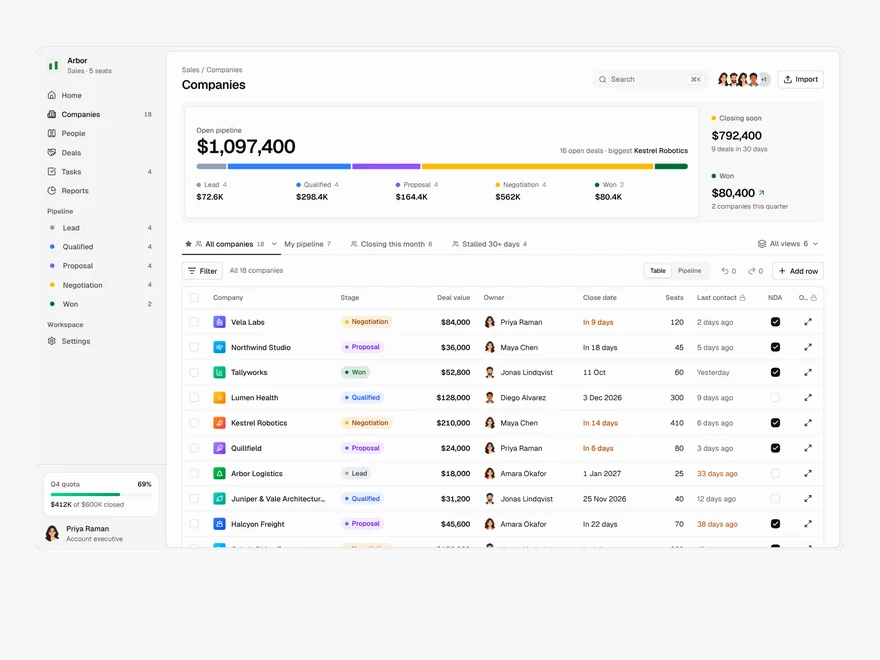
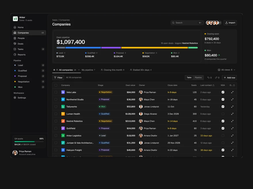
CRM
A sales pipeline: saved views as tabs, an editable company table, a board and a record drawer.
Analytics
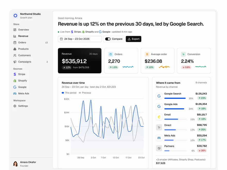
A revenue dashboard: four key figures, revenue over time, channels, top products and what moved.
Liro · 270 components · 17 screens · 4 templates