Empty & Loading States
Empty, error, success and loading states, plus skeletons.
- Category
- Data & feedback
- Access
- Free with an account
- Source
- 128 lines · one file
When to use it
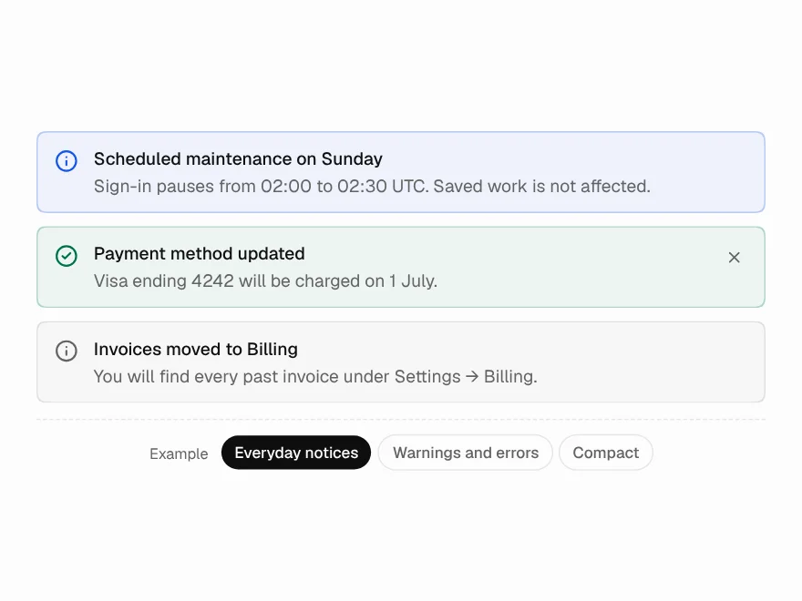
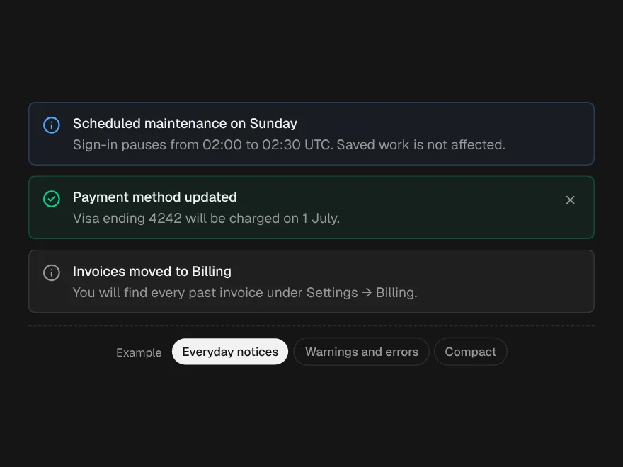
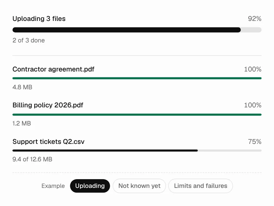
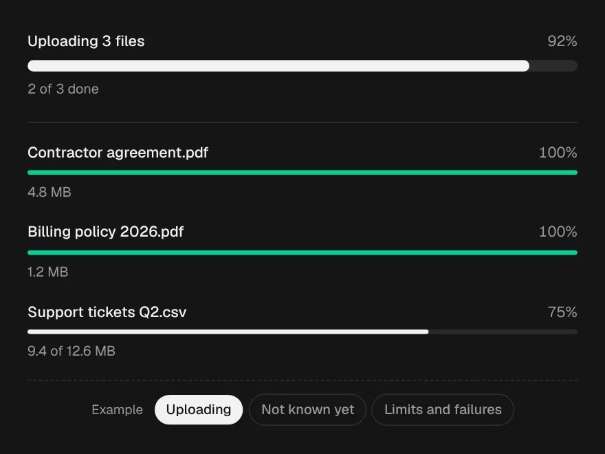
Use Empty & Loading States for what a region shows when there is nothing, it failed, it worked, or it is loading: an icon, title, description and actions. Skeleton is the shimmering placeholder for content on its way.
Installation
How you get it
Paste this into Claude Code, Cursor, Codex or any coding agent. It installs the file and uses it as it is, instead of writing a new one.
Use Liro's Empty & Loading States for this.
Install it: npx shadcn@latest add @liro/state
(the @liro registry is set up in components.json, with LIRO_KEY in .env.local)
Import it from @/components/ui/state.
Do not rewrite or restyle it. Pass my data through its props
and keep its built-in states.
For the full brief with every prop and the mistakes assistants usually make, use Copy prompt above. Free components install through the @liro registry with your CLI token: see the Namespaced tab.
Usage
import { Button } from "@/components/ui/button";
import { Skeleton, State } from "@/components/ui/state";

export function InvoicesEmpty({ loading, create }: { loading: boolean; create: () => void }) {
  if (loading) return <Skeleton lines={4} />;
  return (
    <State
      kind="empty"
      title="No invoices yet"
      description="Invoices appear here after your first charge."
      action={<Button onClick={create}>Create invoice</Button>}
      framed
    />
  );
}
API reference
“Copy prompt” above puts a full brief on your clipboard, install command, dependencies, props, and the mistakes an assistant usually makes with this component.
Props
Read from the component’s own TypeScript interface when the site is built, so this table cannot drift from the file you install.
| Type | Notes | ||
|---|---|---|---|
kind | StateKind | No | – |
title | React.ReactNode | Yes | – |
description | React.ReactNode | No | – |
icon | React.ReactNode | No | Replace the default icon. |
scene | EmptyIllustrationName | No | For an empty state: the drawn, gently animated scene to show (Empty States). Default "inbox"; "search" for no matches. |
action | React.ReactNode | No | The primary action — one. |
secondaryAction | React.ReactNode | No | A quieter second action, a link to docs. |
framed | boolean | No | Draw a dashed frame — for an empty region inside a page. |
size | "sm" | "md" | No | – |
Dependencies
npm packages
clsxlucide-reacttailwind-mergeLiro foundations, installed alongside it
liro-themeempty-statesAccessibility
- Keyboard reachable throughout, in visual order
- Focus trapped in overlays, Escape closes them
- Focus returns to whatever opened it
- Live regions announce what changed, not that something did
- Honours prefers-reduced-motion
Responsive behavior
- Sizes to its container, not the viewport
- Usable from 320px up
- Pointer-based interaction, so trackpad and touch both work
- No hover-only affordances
Used in screensAll screens
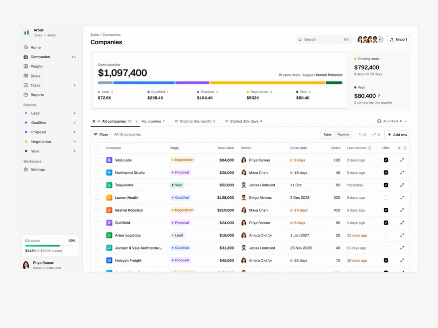
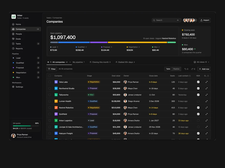
CRM
A sales pipeline: saved views as tabs, an editable company table, a board and a record drawer.

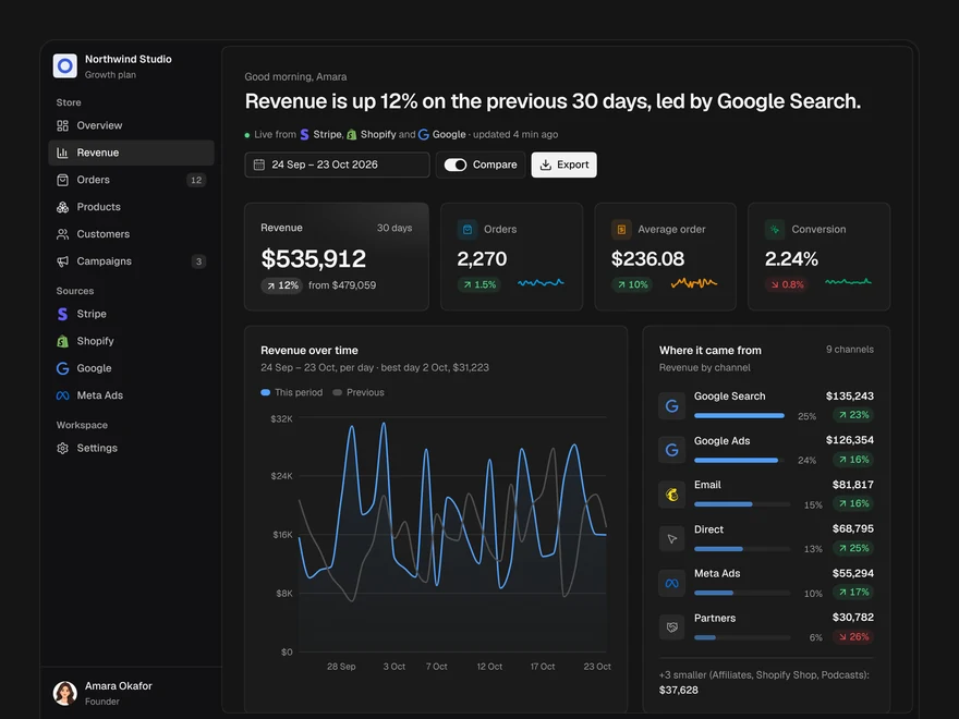
Analytics
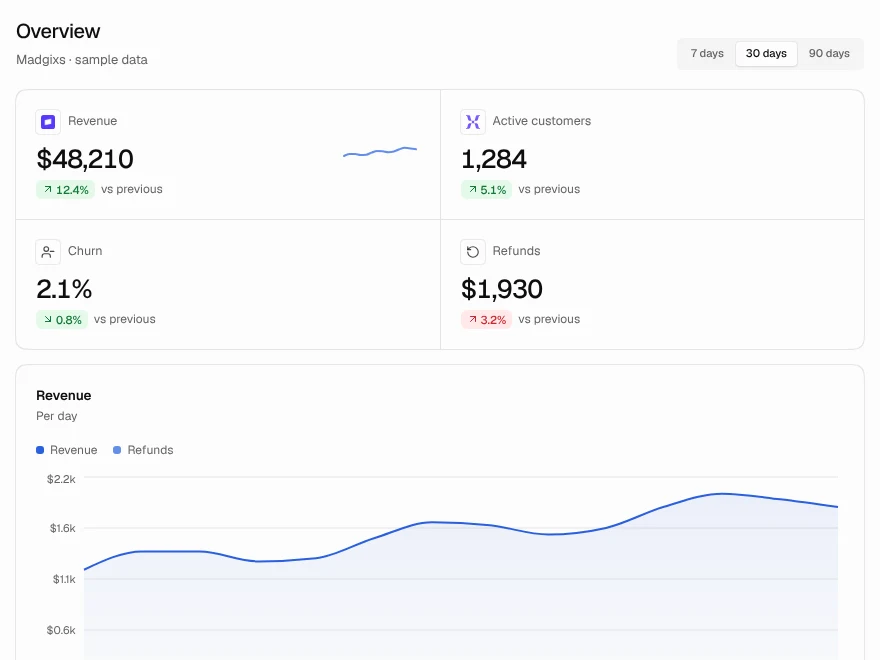
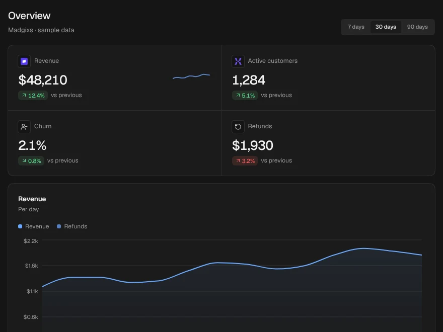
A revenue dashboard: four key figures, revenue over time, channels, top products and what moved.
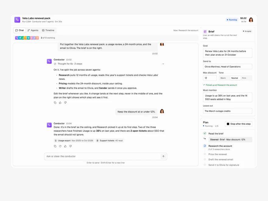
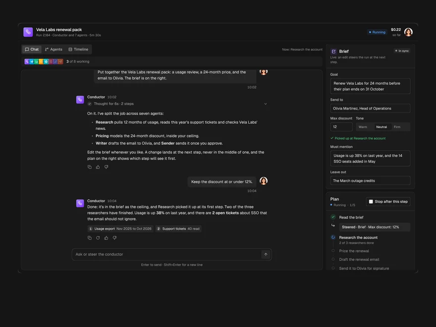
Multi-agent Chat
A chat with the agent running a job, the agents it handed work to, and the brief, side by side.
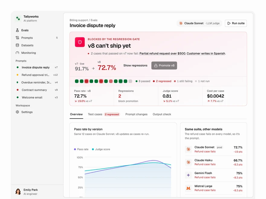
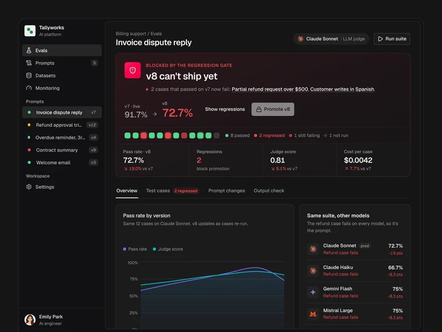
Evals
Decide whether a prompt version ships: a pass or block gate, pass rates, model checks and cases.
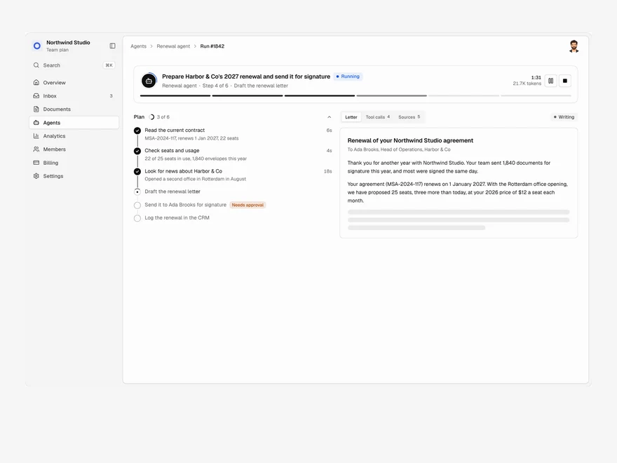
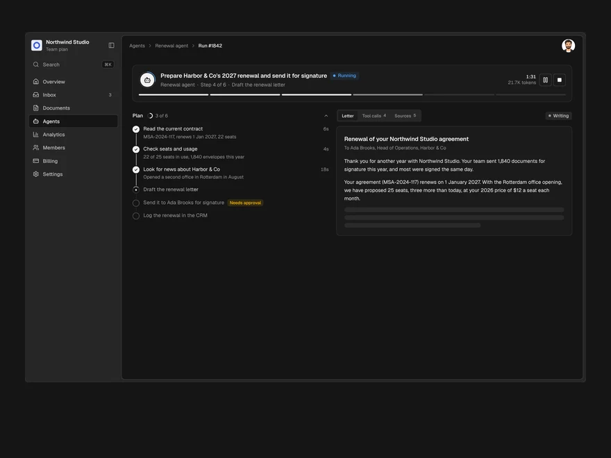
Agent Run
One agent run, live: its plan, every tool call, a pause for approval and the finished output.