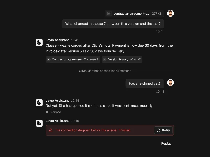
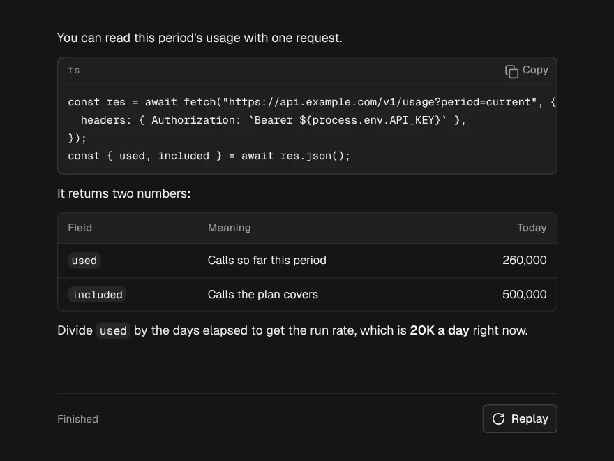
Quota Banner
What is left of a message or credit limit, with a live reset countdown.
PROGet Quota Banner and 168 other Pro components with pro lifetime — Get Pro
- Category
- AI Chat
- Access
- ProPro · unlocked
- Source
- 222 lines · one file
- States
- 5 drawn
The decision inside it
It says what is left, not what is used
"8 messages left" is the number someone plans with. At zero it says so plainly and when they come back, and it never disables anything itself: locking the composer is your app's decision.
When to use it
Use Quota Banner for a message or credit allowance: what is left, a meter, a live reset countdown and an upgrade button. It does not disable your composer; do that yourself when nothing is left. For metered usage with overage cost, use Usage & Overage.
Installation
How you get it
Paste this into Claude Code, Cursor, Codex or any coding agent. It installs the file and uses it as it is, instead of writing a new one.
Use Liro's Quota Banner for this.
Install it: npx shadcn@latest add @liro/quota-banner
(the @liro registry is set up in components.json, with LIRO_KEY in .env.local)
Import it from @/components/ui/quota-banner.
Do not rewrite or restyle it. Pass my data through its props
and keep its built-in states.
For the full brief with every prop and the mistakes assistants usually make, use Copy prompt above. Pro components install through the @liro registry with your CLI token: see the Namespaced tab.
Usage
import { QuotaBanner } from "@/components/ui/quota-banner";

export function MessageQuota({ used, resetsAt, upgrade }: { used: number; resetsAt: Date; upgrade: () => void }) {
  return <QuotaBanner used={used} limit={50} unit="messages" resetsAt={resetsAt} onUpgrade={upgrade} />;
}
API reference
“Copy prompt” above puts a full brief on your clipboard, install command, dependencies, props, and the mistakes an assistant usually makes with this component.
Props
Read from the component’s own TypeScript interface when the site is built, so this table cannot drift from the file you install.
| Type | Notes | ||
|---|---|---|---|
used | number | Yes | How much has been used this period. |
limit | number | Yes | The allowance for the period. |
unit | string | No | What is counted, plural. Default "messages". |
unitSingular | string | No | The unit for exactly one, when it is not `unit` without its s ("query" for "queries"). |
resetsAt | Date | string | No | When the allowance resets. Drives the live countdown. |
variant | "banner" | "compact" | No | "banner" is a full-width bar with a meter; "compact" is one line for a composer footer. Default banner. |
tone | "auto" | "info" | "warning" | "danger" | No | "auto" picks from the share used. Default auto. |
onUpgrade | () => void | No | Shows the upgrade button. |
upgradeLabel | string | No | The upgrade button's words. Default "Upgrade". |
dismissible | boolean | No | Adds a dismiss button. |
onDismiss | () => void | No | Called when dismissed. The banner hides itself either way. |
Dependencies
npm packages
clsxlucide-reacttailwind-mergeLiro foundations, installed alongside it
liro-themeStates
All of them are drawn by the component. None is left for you to design.
- Plenty left
- Running low
- Used up
- Reset
- Compact
Accessibility
- Keyboard reachable throughout, in visual order
- Focus trapped in overlays, Escape closes them
- Focus returns to whatever opened it
- Live regions announce what changed, not that something did
- Honours prefers-reduced-motion
Responsive behavior
- Sizes to its container, not the viewport
- Usable from 320px up
- Pointer-based interaction, so trackpad and touch both work
- No hover-only affordances
More like Quota Banner
All AI Chat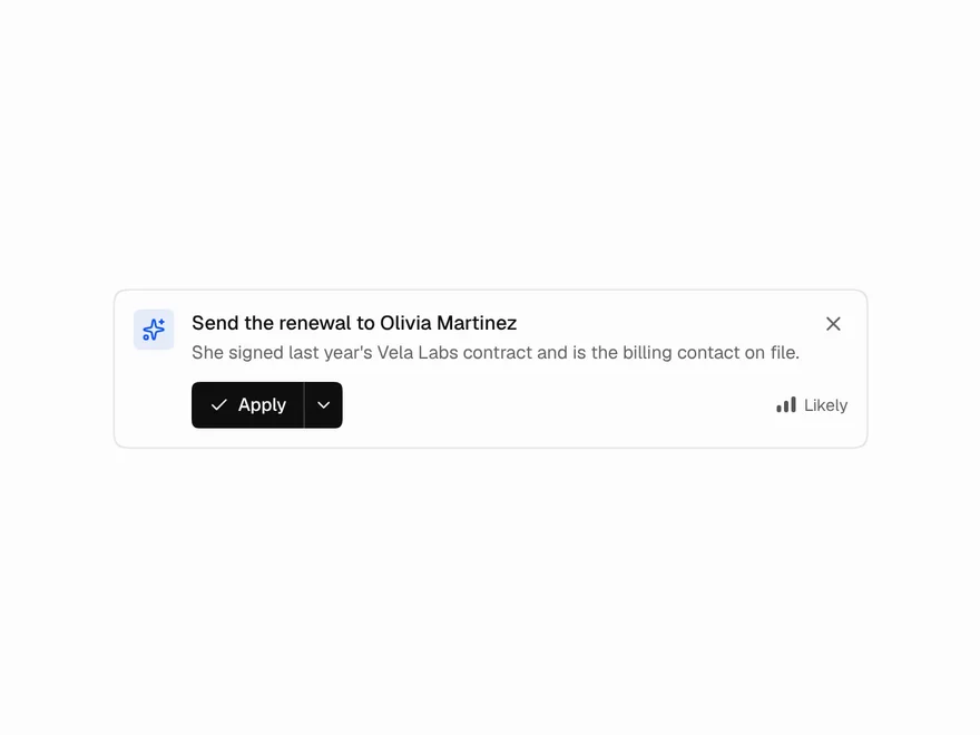 Pro
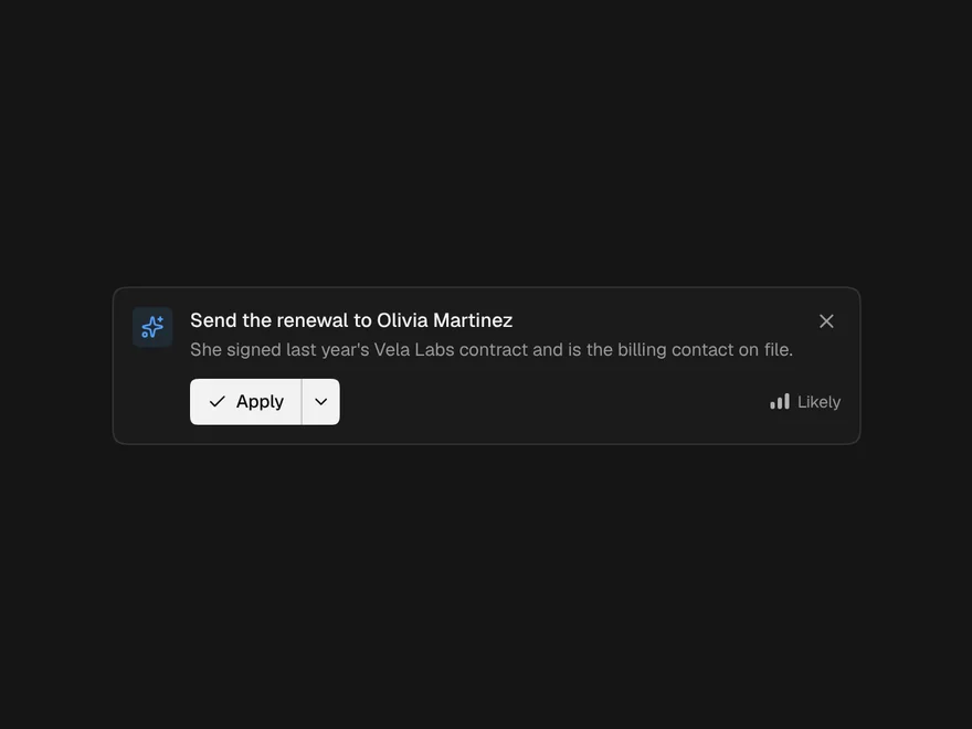
Suggestion Banner
Inline AI suggestion to apply, dismiss or undo.
 Pro
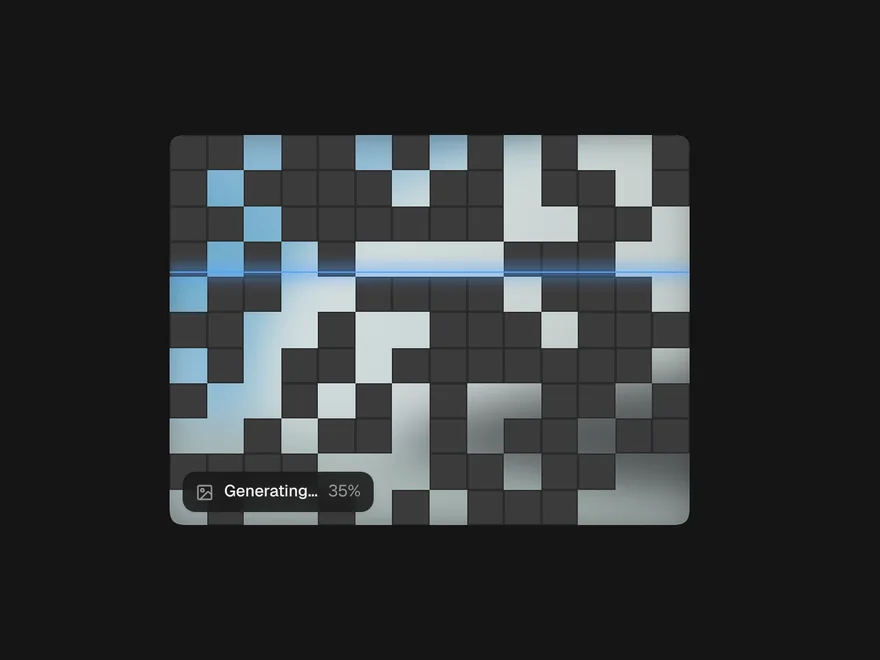
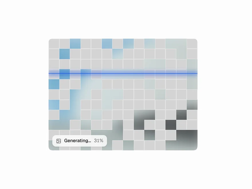
Image Generation Loader
Loading animation for AI image generation.
 BlockPro
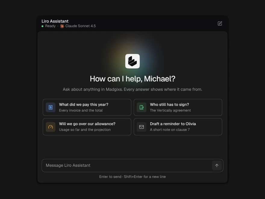
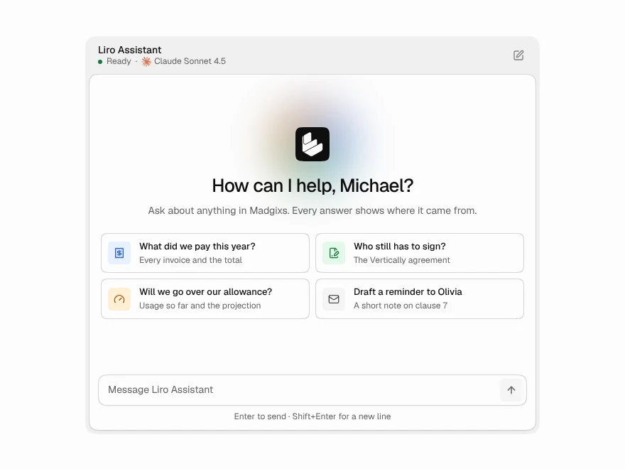
AI Chat
Complete AI chat window with streaming replies.
 BlockPro
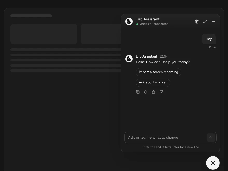
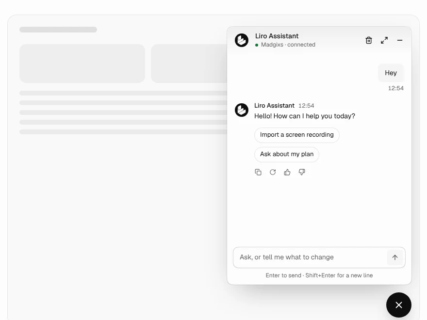
Chatbot
AI chatbot as a widget, panel, sidebar or page.
 Free
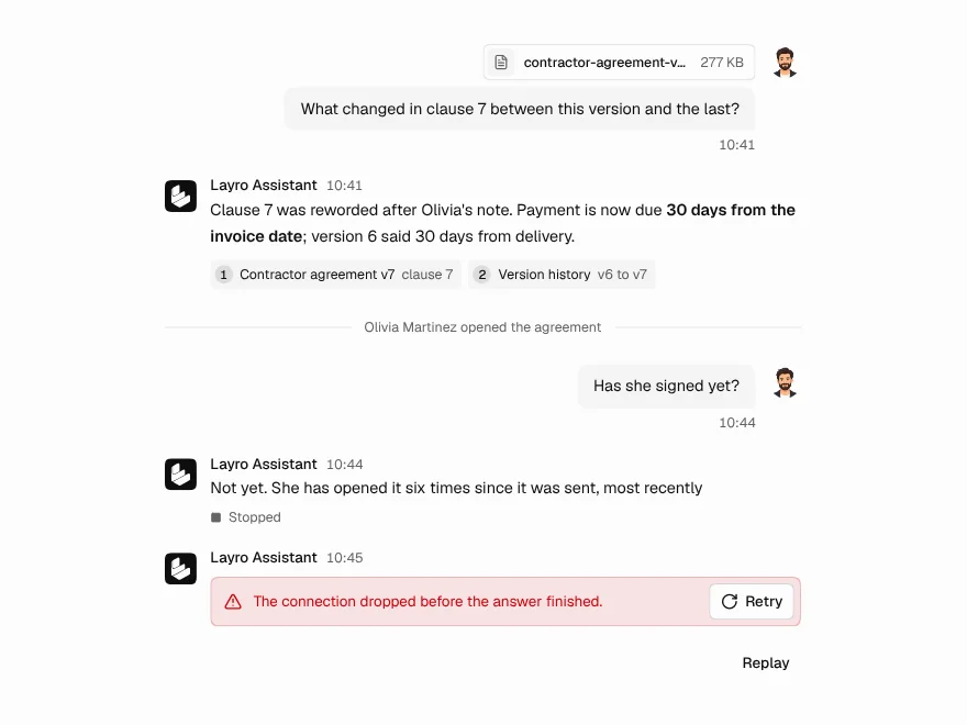
Chat Message
Chat message bubble with sources and attachments.
 Free
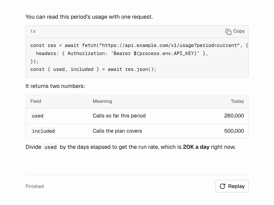
Streaming Response
AI answer that streams in word by word.