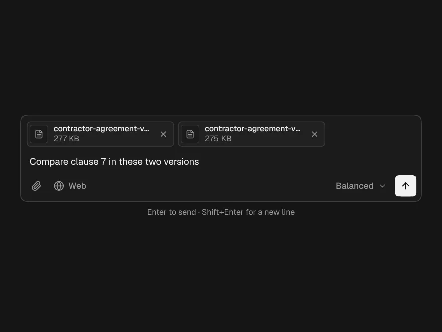
Chat Message
One turn in a conversation, for the person or the assistant, with sources and attachments.
- Category
- AI Chat
- Access
- Free with an account
- Source
- 315 lines · one file
- States
- 4 drawn
When to use it
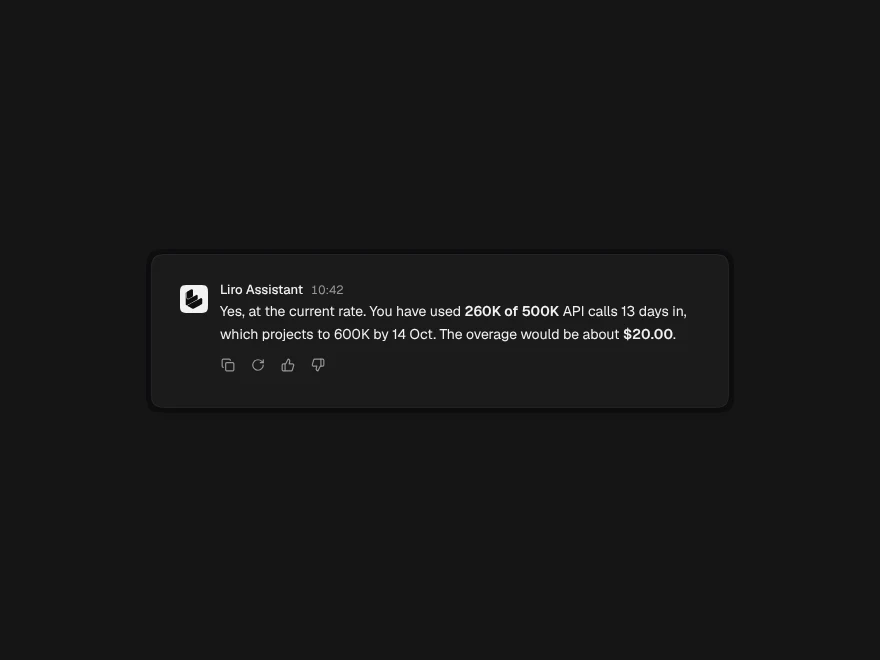
Use Chat Message to render one turn of a conversation you manage yourself: user bubbles on the right, assistant answers unboxed on the left, with sources, attachments, and stopped or failed states. For a whole working chat window with streaming and auto-scroll, use AI Chat instead.
Installation
How you get it
Paste this into Claude Code, Cursor, Codex or any coding agent. It installs the file and uses it as it is, instead of writing a new one.
Use Liro's Chat Message for this.
Install it: npx shadcn@latest add @liro/chat-message
(the @liro registry is set up in components.json, with LIRO_KEY in .env.local)
Import it from @/components/ui/chat-message.
Do not rewrite or restyle it. Pass my data through its props
and keep its built-in states.
For the full brief with every prop and the mistakes assistants usually make, use Copy prompt above. Free components install through the @liro registry with your CLI token: see the Namespaced tab.
Usage
import { ChatMessage, ChatMessageList } from "@/components/ui/chat-message";

export function Thread({ onRetry }: { onRetry: () => void }) {
  return (
    <ChatMessageList>
      <ChatMessage role="user">Which invoices are still unpaid?</ChatMessage>
      <ChatMessage
        role="assistant"
        sources={[{ title: "Invoices · October", meta: "billing.csv", href: "/billing" }]}
      >
        Two: INV-2041 for $1,200 and INV-2044 for $380.
      </ChatMessage>
      <ChatMessage role="assistant" status="failed" error="The model timed out." onRetry={onRetry} />
    </ChatMessageList>
  );
}
API reference
“Copy prompt” above puts a full brief on your clipboard, install command, dependencies, props, and the mistakes an assistant usually makes with this component.
Props
Read from the component’s own TypeScript interface when the site is built, so this table cannot drift from the file you install.
| Type | Notes | ||
|---|---|---|---|
role | ChatRole | Yes | Who is speaking. `system` is a centred line for events: "Context cleared". |
children | React.ReactNode | No | The message. Plain text, or `<StreamingResponse>` for an assistant's answer. |
name | string | No | Shown above an assistant message. Also read out before it. |
avatar | React.ReactNode | No | Replaces the default mark (assistant) or adds a face (user). |
time | string | No | Already formatted: "10:42". |
status | ChatMessageStatus | No | How the message ended, or that it has not yet. Default `complete`. |
error | string | No | Why it failed, in plain words. Shown when `status` is `failed`. |
onRetry | () => void | No | Shows Retry beside the error. Leave it out when retrying cannot help. |
attachments | ChatAttachment[] | No | Files sent with the message. |
sources | ChatSource[] | No | What the answer was drawn from, numbered in the order given. |
actions | React.ReactNode | No | The row under an assistant message — usually `<MessageActions>`. |
animate | boolean | No | Rise and fade in when mounted. Default true; reduced motion turns it off. |
Dependencies
npm packages
clsxframer-motionlucide-reacttailwind-mergeLiro foundations, installed alongside it
liro-themebuttonStates
All of them are drawn by the component. None is left for you to design.
- Complete
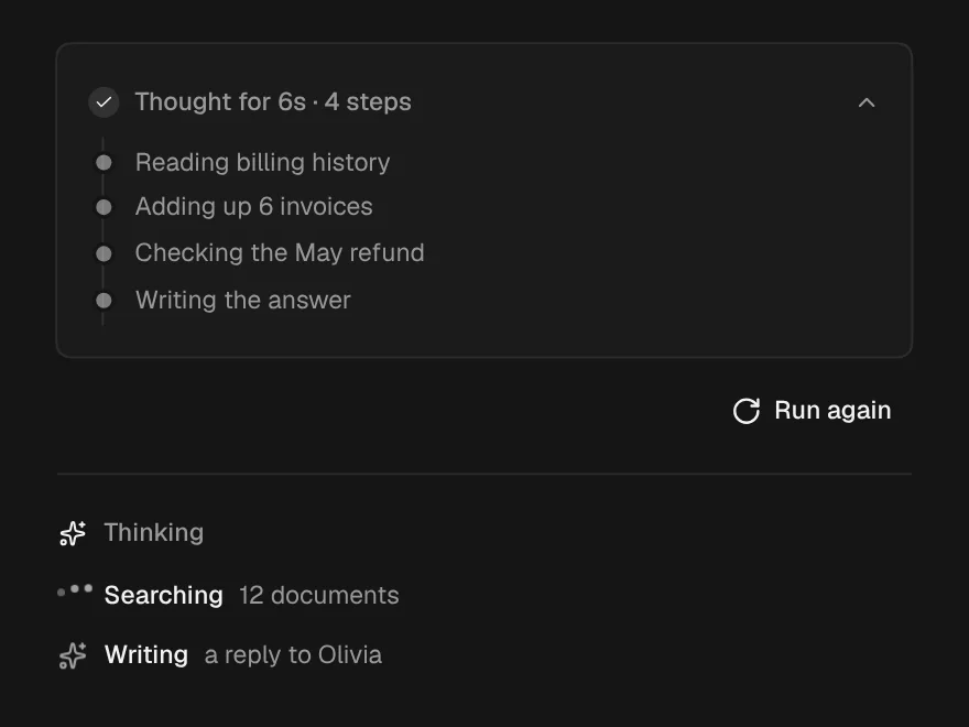
- Streaming
- Cancelled
- Failed
Accessibility
- Keyboard reachable throughout, in visual order
- Focus trapped in overlays, Escape closes them
- Focus returns to whatever opened it
- Live regions announce what changed, not that something did
- Honours prefers-reduced-motion
Responsive behavior
- Sizes to its container, not the viewport
- Usable from 320px up
- Pointer-based interaction, so trackpad and touch both work
- No hover-only affordances
More like Chat Message
All AI Chat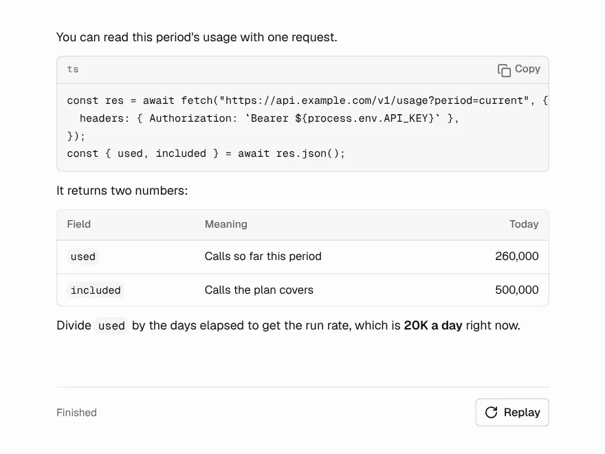 Free
Streaming Response
AI answer that streams in word by word.
 Free
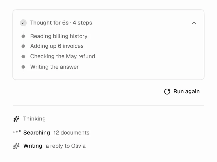
Thinking State
Loading state while the AI is thinking.
 Free
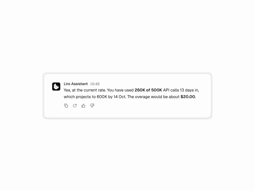
Message Actions
Copy, regenerate and rate buttons for AI replies.
 Free
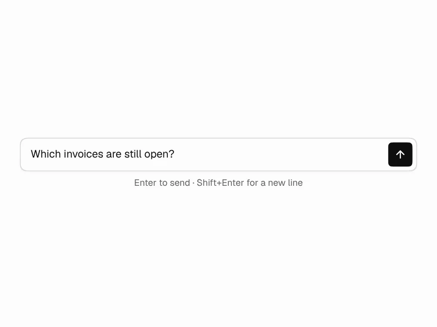
Prompt Input
Auto-growing prompt box with send and stop.
 Free
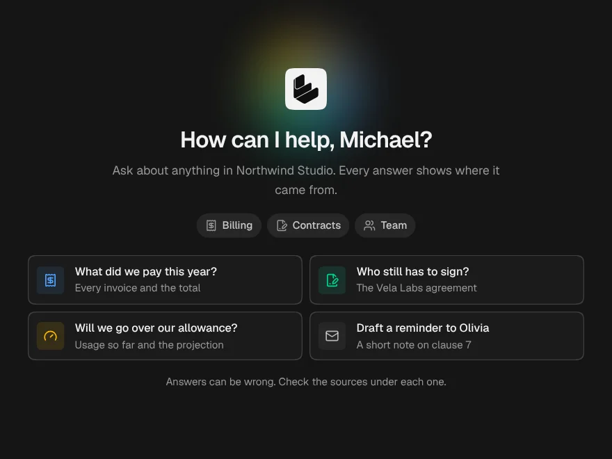
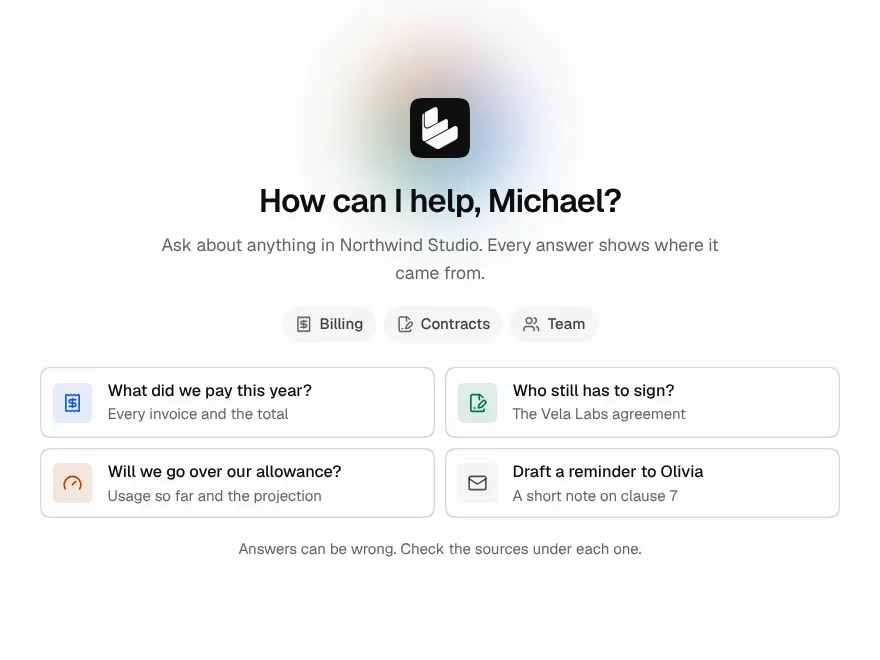
Chat Empty State
Welcome screen for a new AI chat.
 Pro
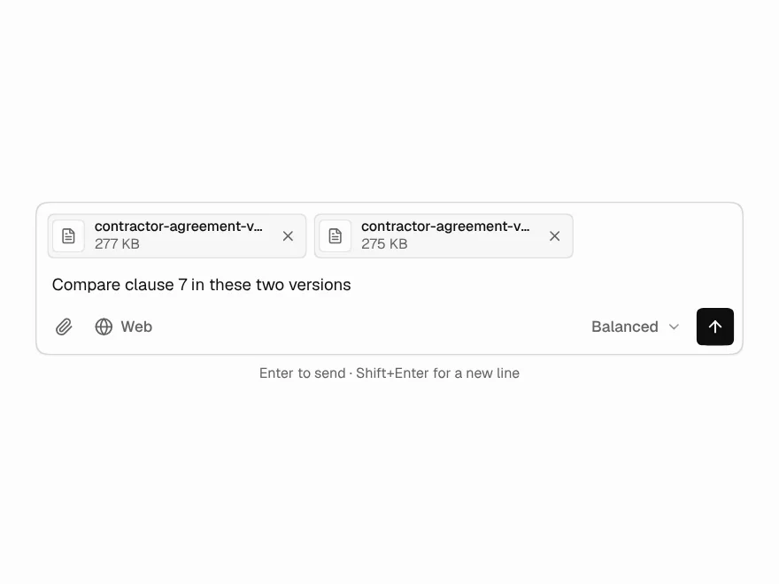
Prompt Composer
Prompt input with files, model picker and commands.