Prompt Composer
The full input: attach files, pick a model, slash commands and @mentions.
PROGet Prompt Composer and 168 other Pro components with pro lifetime — Get Pro
- Category
- AI Chat
- Access
- ProPro · unlocked
- Source
- 588 lines · one file
- States
- 7 drawn
The decision inside it
A refused file says why, and the rest still go through
Too large, the wrong type, one too many: each is named beside the file it applies to. Dropping five files where one is over the limit attaches four and explains the fifth.
When to use it
Use Prompt Composer when the prompt box needs more than text: attachments (button, drop or paste), a model menu, / commands and @ mentions. For a plain box with Send and Stop, use Prompt Input.
Installation
How you get it
Paste this into Claude Code, Cursor, Codex or any coding agent. It installs the file and uses it as it is, instead of writing a new one.
Use Liro's Prompt Composer for this.
Install it: npx shadcn@latest add @liro/prompt-composer
(the @liro registry is set up in components.json, with LIRO_KEY in .env.local)
Import it from @/components/ui/prompt-composer.
Do not rewrite or restyle it. Pass my data through its props
and keep its built-in states.
For the full brief with every prop and the mistakes assistants usually make, use Copy prompt above. Pro components install through the @liro registry with your CLI token: see the Namespaced tab.
Usage
import { PromptComposer, type ComposerMessage } from "@/components/ui/prompt-composer";

export function Composer({ onSend, busy, onStop }: { onSend: (m: ComposerMessage) => void; busy: boolean; onStop: () => void }) {
  return (
    <PromptComposer
      onSubmit={onSend}
      status={busy ? "streaming" : "idle"}
      onStop={onStop}
      models={[
        { id: "fast", name: "Fast", description: "Quick answers" },
        { id: "best", name: "Best", description: "Slower, more careful" },
      ]}
      defaultModel="fast"
      commands={[{ id: "summarise", label: "Summarise", insert: "Summarise this document: " }]}
      mentions={[{ id: "inv", label: "Invoices" }]}
      placeholder="Ask anything, / for commands, @ to mention"
    />
  );
}
API reference
“Copy prompt” above puts a full brief on your clipboard, install command, dependencies, props, and the mistakes an assistant usually makes with this component.
Props
Read from the component’s own TypeScript interface when the site is built, so this table cannot drift from the file you install.
| Type | Notes | ||
|---|---|---|---|
onSubmit | (message: ComposerMessage) => void | No | – |
attach | boolean | No | Show the attach button and accept dropped and pasted files. Default true. |
defaultAttachments | ComposerAttachment[] | No | – |
onAttachmentsChange | (attachments: ComposerAttachment[]) => void | No | – |
accept | string | No | As for a file input: ".pdf,.csv,image/*". |
maxFiles | number | No | Default 5. |
maxFileSize | number | No | Bytes. Default 10 MB. |
models | ComposerModel[] | No | – |
model | string | No | – |
defaultModel | string | No | – |
onModelChange | (id: string) => void | No | – |
commands | ComposerCommand[] | No | Opened by typing "/". |
mentions | ComposerMention[] | No | Opened by typing "@". |
toggles | ComposerToggle[] | No | – |
defaultToggles | string[] | No | – |
onTogglesChange | (ids: string[]) => void | No | – |
Dependencies
npm packages
clsxframer-motionlucide-reacttailwind-mergeLiro foundations, installed alongside it
liro-themebuttondropdown-menuprompt-inputStates
All of them are drawn by the component. None is left for you to design.
- Empty
- With files
- File refused
- Dragging over
- Command list
- Mention list
- Streaming
Accessibility
- Keyboard reachable throughout, in visual order
- Focus trapped in overlays, Escape closes them
- Focus returns to whatever opened it
- Live regions announce what changed, not that something did
- Honours prefers-reduced-motion
Responsive behavior
- Sizes to its container, not the viewport
- Usable from 320px up
- Pointer-based interaction, so trackpad and touch both work
- No hover-only affordances
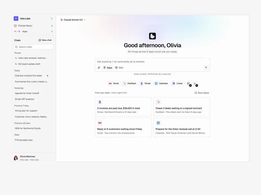
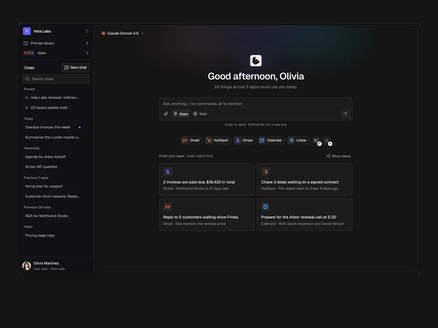
Used in a screenAll screens
More like Prompt Composer
All AI Chat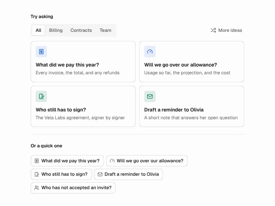 Pro
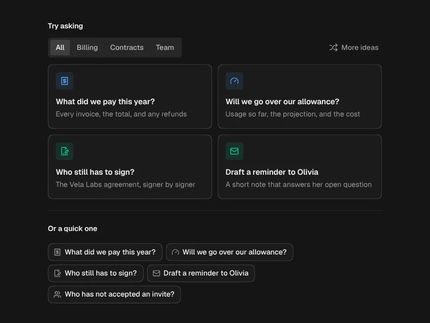
Suggested Prompts
Starter prompt cards and chips for AI chat.
 Pro
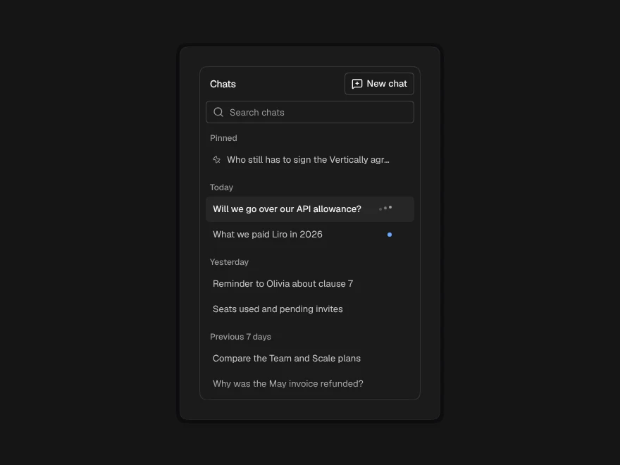
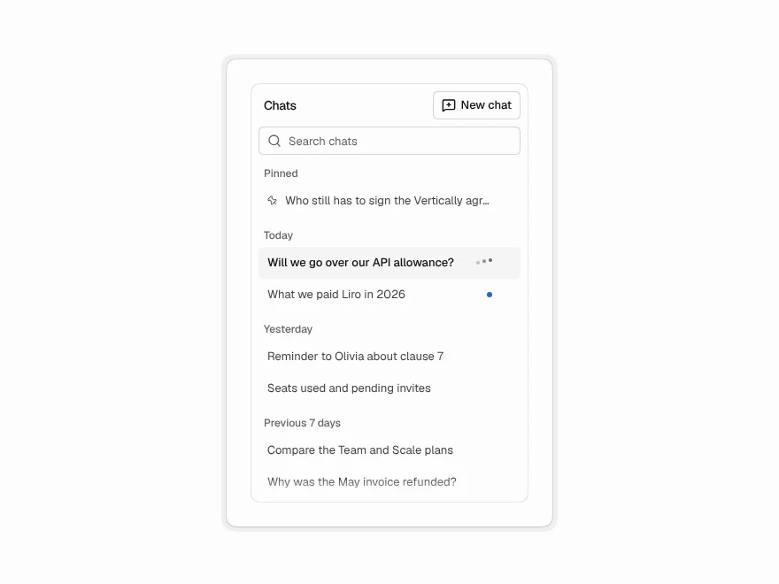
Conversation History
Chat history sidebar with search, pin and rename.
 Pro
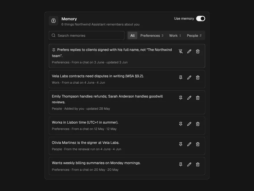
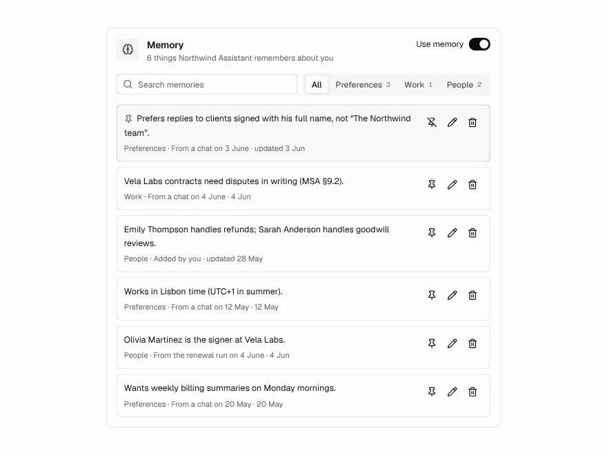
Memory Manager
View and edit what an AI assistant remembers.
 NewPro
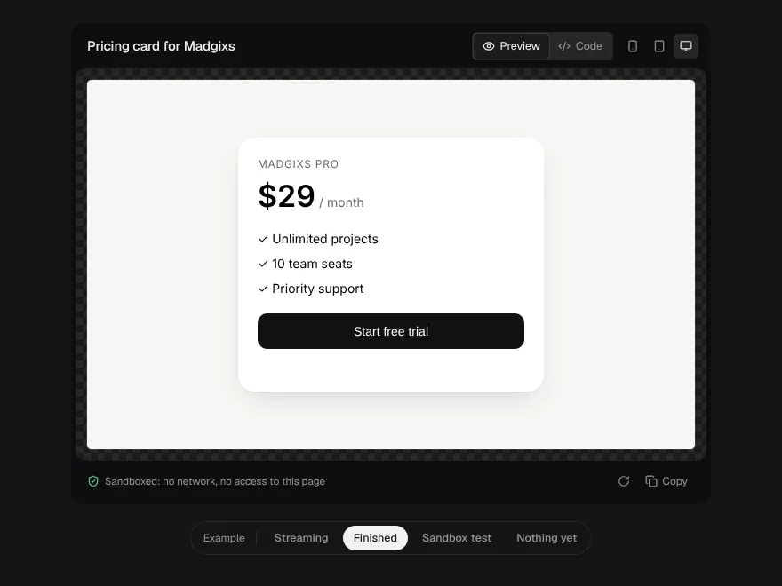
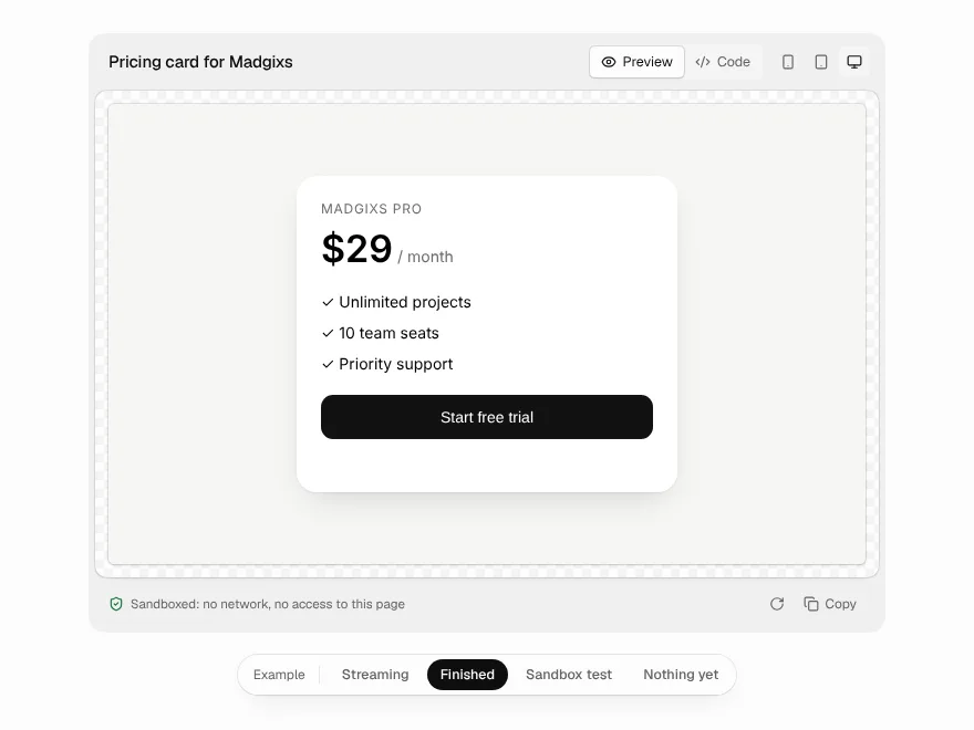
Generative Preview
HTML a model is writing, rendered live in a locked-down frame, with the code beside it.
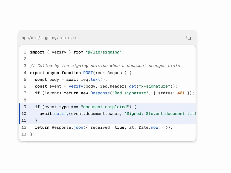 Free
Code Block
Syntax-highlighted code block with copy and tabs.
 Pro
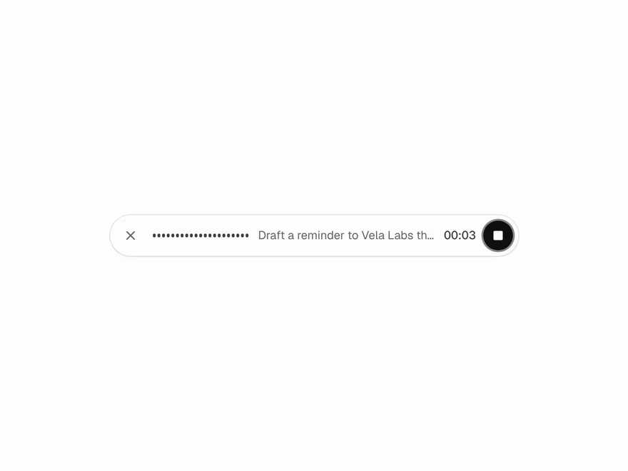
Voice Input
Voice recording button with live audio levels.