Dry-Run Preview
Everything an agent would change, field by field, before any of it happens.
PROGet Dry-Run Preview and 168 other Pro components with pro lifetime — Get Pro
- Category
- AI Agent
- Access
- ProPro · unlocked
- Source
- 431 lines · one file
- States
- 7 drawn
- Added
- 12 Oct 2026
The decision inside it
Deletes are loud
Every deletion is red, counted at the top and confirmed again before it goes, because it is the one change that cannot be taken back from here.
When to use it
Use Dry-Run Preview before an agent applies changes: every proposed create, update and delete with before and after, warnings, and approve, reject or apply for all or a selection.
Installation
How you get it
Paste this into Claude Code, Cursor, Codex or any coding agent. It installs the file and uses it as it is, instead of writing a new one.
Use Liro's Dry-Run Preview for this.
Install it: npx shadcn@latest add @liro/dry-run-preview
(the @liro registry is set up in components.json, with LIRO_KEY in .env.local)
Import it from @/components/ui/dry-run-preview.
Do not rewrite or restyle it. Pass my data through its props
and keep its built-in states.
For the full brief with every prop and the mistakes assistants usually make, use Copy prompt above. Pro components install through the @liro registry with your CLI token: see the Namespaced tab.
Usage
import { DryRunPreview, type DryRunPreviewData } from "@/components/ui/dry-run-preview";

const preview: DryRunPreviewData = {
  id: "dr-1",
  title: "Update 2 contacts",
  impactSummary: "2 records change; nothing is deleted.",
  changes: [
    { id: "c1", resource: "Ada Moss", resourceType: "contact", operation: "update", before: { stage: "Lead" }, after: { stage: "Customer" } },
    { id: "c2", resource: "Orbit Labs", resourceType: "company", operation: "create", after: { plan: "Team" } },
  ],
};

export function PreviewChanges({ apply }: { apply: (ids: string[]) => Promise<void> }) {
  return <DryRunPreview preview={preview} selectable onApply={apply} />;
}
API reference
“Copy prompt” above puts a full brief on your clipboard, install command, dependencies, props, and the mistakes an assistant usually makes with this component.
Props
Read from the component’s own TypeScript interface when the site is built, so this table cannot drift from the file you install.
| Type | Notes | ||
|---|---|---|---|
preview | DryRunPreviewData | Yes | – |
selectable | boolean | No | Each change gets a checkbox, and only ticked ones are sent. |
onChangeSelect | (id: string, selected: boolean) => void | No | – |
onApprove | (ids: string[]) => void | Promise<void> | No | Approve the ticked changes. May return a promise. |
onReject | (reason?: string) => void | Promise<void> | No | Reject the whole batch, with an optional reason. May return a promise. |
onApply | (ids: string[]) => void | Promise<void> | No | Apply the ticked changes. May return a promise. |
isSubmitting | boolean | No | Submitting, if you track it yourself. |
actionError | React.ReactNode | No | An error from your side. |
look | Look | No | Layered sets it in a tray, the heading above the card and the status in the strip below. Flat is one card. |
Dependencies
npm packages
clsxframer-motionlucide-reacttailwind-mergeLiro foundations, installed alongside it
liro-themebadgebuttoncheckboxstateStates
All of them are drawn by the component. None is left for you to design.
- Proposed
- Deselected
- Approved
- Confirm delete
- Applied
- Partly failed
- Rejected
Accessibility
- Keyboard reachable throughout, in visual order
- Focus trapped in overlays, Escape closes them
- Focus returns to whatever opened it
- Live regions announce what changed, not that something did
- Honours prefers-reduced-motion
Responsive behavior
- Sizes to its container, not the viewport
- Usable from 320px up
- Pointer-based interaction, so trackpad and touch both work
- No hover-only affordances
More like Dry-Run Preview
All AI Agent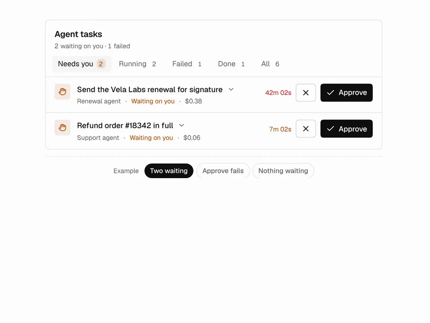 Pro
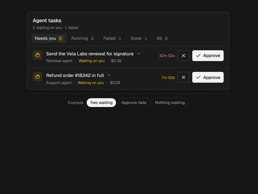
Agent Inbox
Inbox of background agent tasks awaiting you.
 NewPro
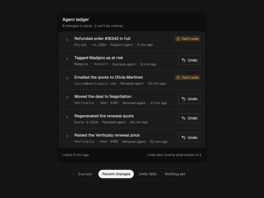
Agent Ledger
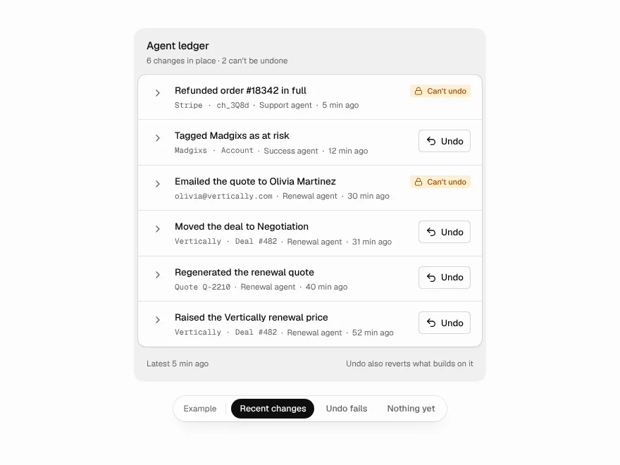
Everything an agent changed, each change with its before, after and an undo.
 NewPro
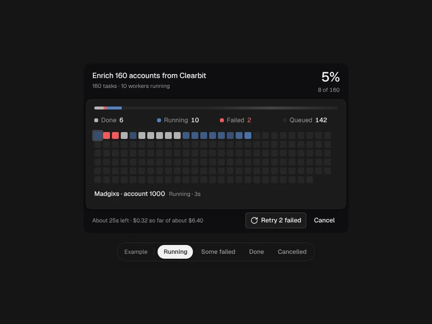
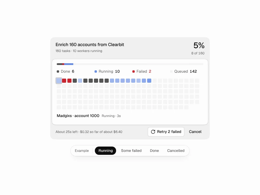
Fan-out Grid
One job split across many workers, every task a cell on a live grid.
 NewPro
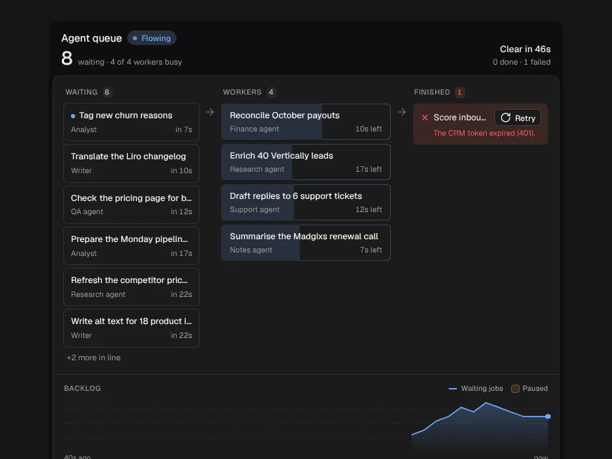
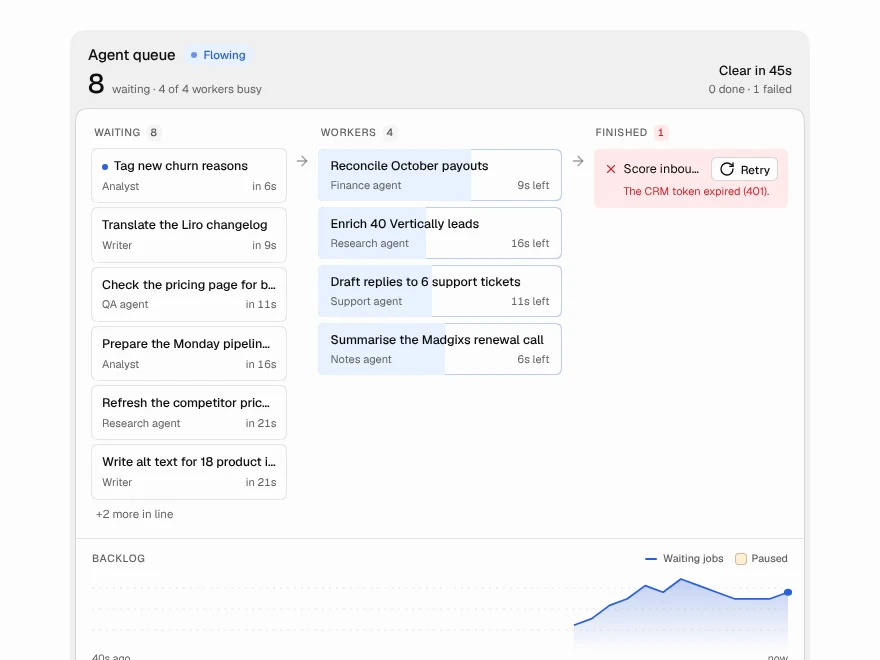
Agent Queue
The work waiting for your agents: worker slots, the line behind them and the backlog.
 NewPro
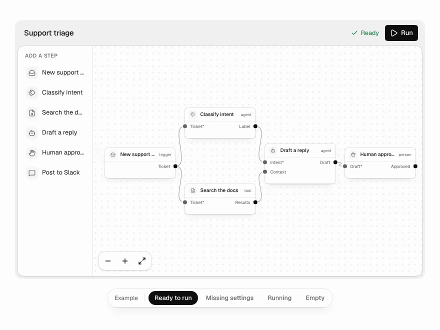
Workflow Builder
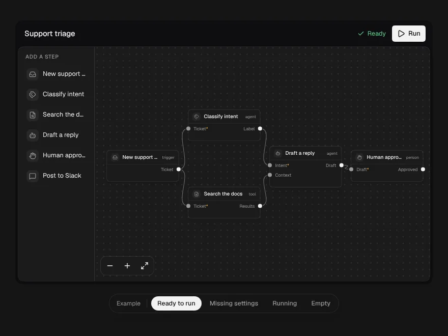
A node canvas for agent workflows that refuses broken wiring as you draw it.
 NewPro
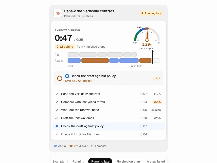
Plan vs Actual
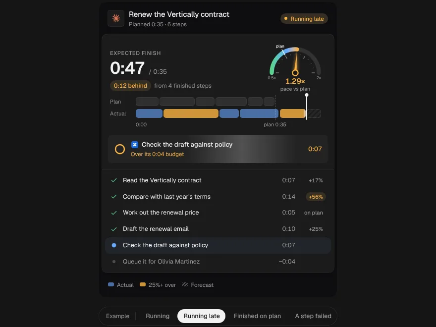
An agent's plan and its real run as two lanes on one clock, with a pace dial and a finish time that rolls over.