Agent Permissions
What an agent asked for, what it is allowed, and the change before you save.
PROGet Agent Permissions and 168 other Pro components with pro lifetime — Get Pro
- Category
- AI Agent
- Access
- ProPro · unlocked
- Source
- 362 lines · one file
- States
- 7 drawn
- Added
- 12 Oct 2026
The decision inside it
Asked for is not allowed
Nothing is switched on because the agent requested it. The two are separate on every row, and the editor never pretends to be the authority: your server decides.
When to use it
Use Agent Permissions to show and change what an agent may touch: each resource with read, write or admin access, what was requested versus granted, the risk, and a save step.
Installation
How you get it
Paste this into Claude Code, Cursor, Codex or any coding agent. It installs the file and uses it as it is, instead of writing a new one.
Use Liro's Agent Permissions for this.
Install it: npx shadcn@latest add @liro/agent-permissions
(the @liro registry is set up in components.json, with LIRO_KEY in .env.local)
Import it from @/components/ui/agent-permissions.
Do not rewrite or restyle it. Pass my data through its props
and keep its built-in states.
For the full brief with every prop and the mistakes assistants usually make, use Copy prompt above. Pro components install through the @liro registry with your CLI token: see the Namespaced tab.
Usage
import { AgentPermissions, type AgentPermission } from "@/components/ui/agent-permissions";

const permissions: AgentPermission[] = [
  { id: "inv-read", resource: "invoices", label: "Read invoices", capability: "read", requested: true, granted: true, riskLevel: "low" },
  { id: "mail-send", resource: "email", label: "Send email", capability: "write", requested: true, granted: false, riskLevel: "high" },
];

export function AgentAccess({ save }: { save: (changes: { id: string; granted: boolean }[]) => Promise<void> }) {
  return <AgentPermissions agentName="Billing agent" permissions={permissions} onSave={save} />;
}
API reference
“Copy prompt” above puts a full brief on your clipboard, install command, dependencies, props, and the mistakes an assistant usually makes with this component.
Props
Read from the component’s own TypeScript interface when the site is built, so this table cannot drift from the file you install.
| Type | Notes | ||
|---|---|---|---|
permissions | AgentPermission[] | Yes | – |
agentName | string | No | – |
readOnly | boolean | No | Show, do not edit. |
onPermissionChange | (id: string, granted: boolean) => void | No | Told about each switch as it moves, before saving. |
onSave | (changes: PermissionChange[]) => void | Promise<void> | No | Save the changes. May return a promise; reject to show why it failed. |
onCancel | () => void | No | – |
isSaving | boolean | No | Saving, if you track it yourself. |
saveError | React.ReactNode | No | An error from your side. |
resourceIcons | Record<string, React.ReactNode> | No | A logo or icon for each integration, keyed by `resource`: `{ Gmail: <img src="/logos/gmail.svg" alt="" /> }`. Anything missing gets its first letter. |
look | Look | No | Layered sets it in a tray, the heading above the card and the status in the strip below. Flat is one card. |
Dependencies
npm packages
clsxframer-motionlucide-reacttailwind-mergeLiro foundations, installed alongside it
liro-themebadgebuttoninputsegmented-controlstateswitchStates
All of them are drawn by the component. None is left for you to design.
- Asked for
- Allowed
- Changed
- Broad access
- Locked
- Saving
- Refused
Accessibility
- Keyboard reachable throughout, in visual order
- Focus trapped in overlays, Escape closes them
- Focus returns to whatever opened it
- Live regions announce what changed, not that something did
- Honours prefers-reduced-motion
Responsive behavior
- Sizes to its container, not the viewport
- Usable from 320px up
- Pointer-based interaction, so trackpad and touch both work
- No hover-only affordances
More like Agent Permissions
All AI Agent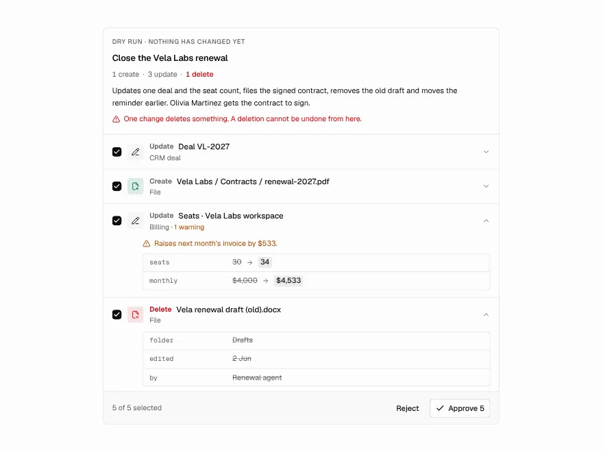 Pro
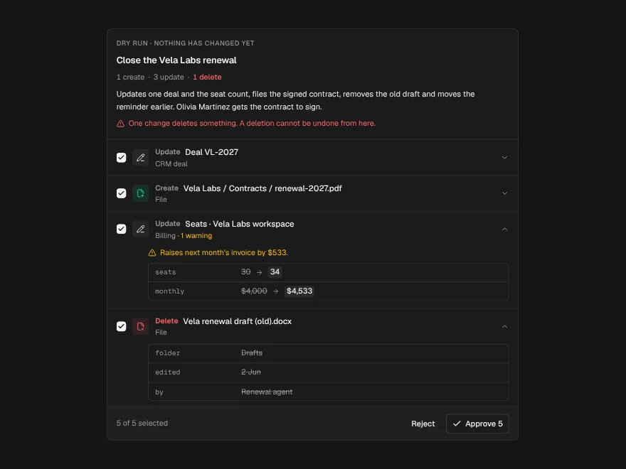
Dry-Run Preview
Preview every change an agent will make.
 Pro
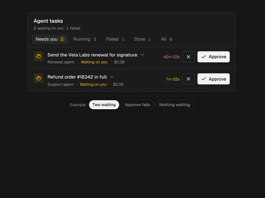
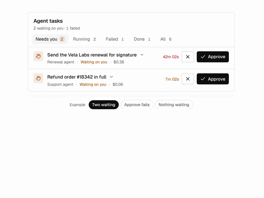
Agent Inbox
Inbox of background agent tasks awaiting you.
 NewPro
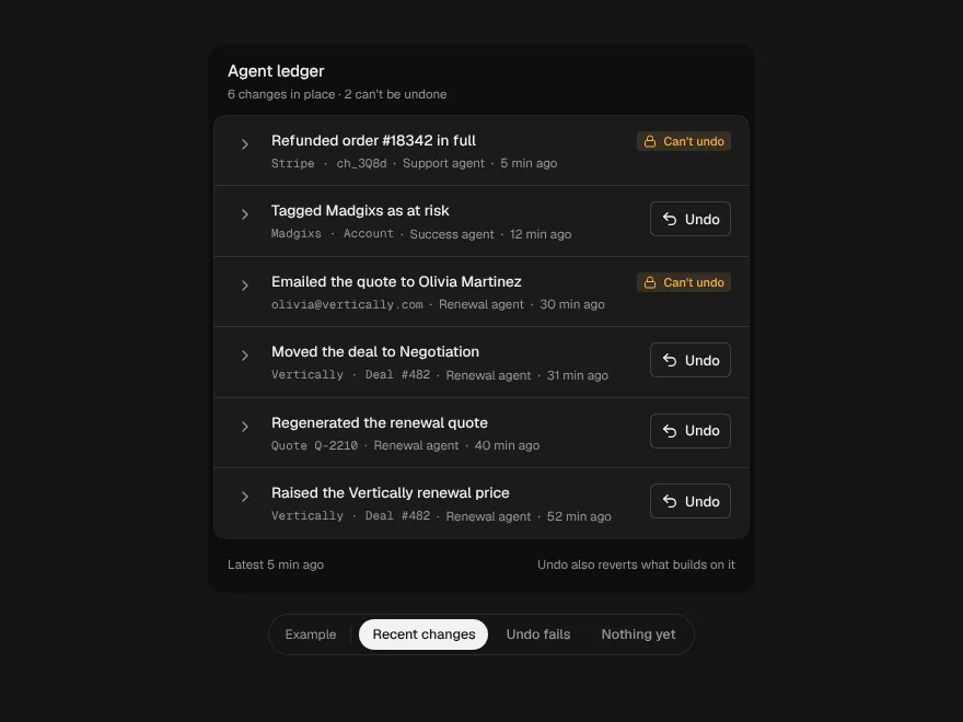
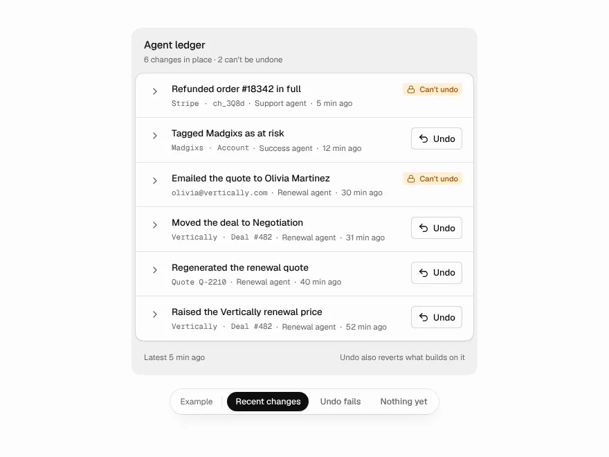
Agent Ledger
Everything an agent changed, each change with its before, after and an undo.
 NewPro
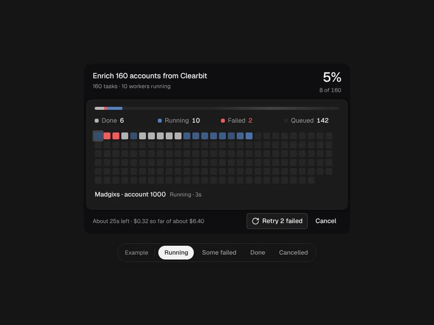
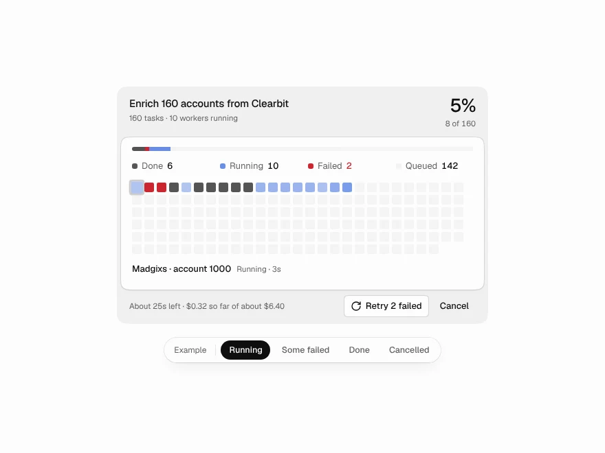
Fan-out Grid
One job split across many workers, every task a cell on a live grid.
 NewPro
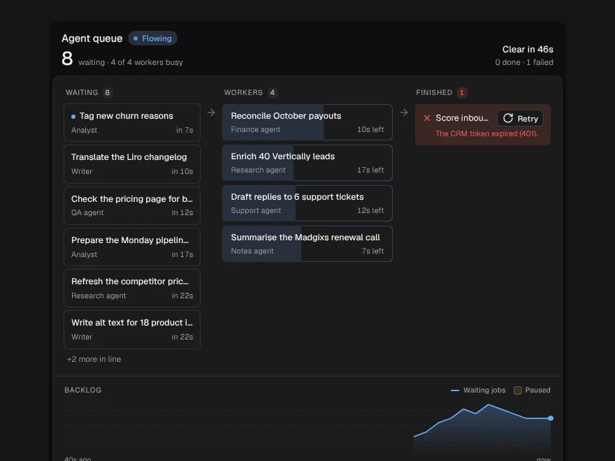
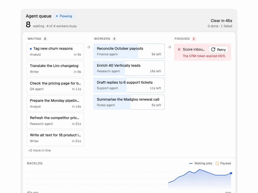
Agent Queue
The work waiting for your agents: worker slots, the line behind them and the backlog.
 NewPro
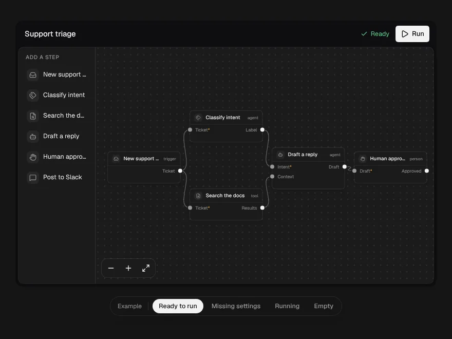
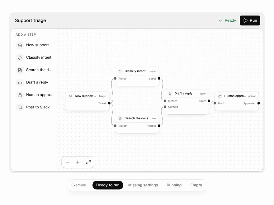
Workflow Builder
A node canvas for agent workflows that refuses broken wiring as you draw it.