Integrations
Where a team sees the tools its agents reach and fixes the ones that broke. It opens on whether anything needs attention, then the healthy connections, then the app directory. Each connection's settings open in a drawer.
When to use
- Settings pages for a product that connects to other tools
- Agent products whose agents read and write through integrations
- Anywhere a failed sync needs to be noticed and fixed
When not to use
- Picking apps during sign-up: use Integration Picker
- A first-run flow: the Onboarding screen covers connecting tools
The decision inside it
Broken connections come first
A grid of logos marked Connected hides the one that stopped syncing yesterday. Here the page opens on a health summary and a list of what needs you, sorted failing, then stale, then paused, each saying what broke and what it affects.
Installation
Integrations is a Pro screen, included with pro lifetime. It is two files on top of the Liro components it is made of.
- Add the components it uses:
npx shadcn@latest add @liro/app-directory @liro/integration-settings @liro/integration-picker @liro/toast @liro/drawer @liro/avatar @liro/button - Copy
screens/integrations-screen.tsxandscreens/data/integrations-screen.tsfrom the Code tab above into your project, at the same paths. - It also imports
@/lib,@/demos/liro-markand@/demos/portraits: Liro’s shared helpers and the demo’s sample images. Point them at your own.
Usage
import { IntegrationsScreen } from "@/screens/integrations-screen";

export default function Page() {
  /* A screen fills the box it is given: give it the window. */
  return (
    <main className="h-dvh">
      <IntegrationsScreen className="h-full" />
    </main>
  );
}
Built from
Every Liro component this screen imports. Each has its own page, props and install command.
API reference
Read from IntegrationsScreenProps when the site is built. It also takes every attribute a div does, such as className.
IntegrationsScreen
| Type | Notes | ||
|---|---|---|---|
state | IntegrationsState | No | Which moment to open on. Default `default`. |
Accessibility
- Every connect, sync and disconnect is confirmed in an announced toast
- Settings open in a drawer that traps focus and closes on Escape
- Logos are decorative; each tile is named by its service
Responsive behavior
- Fills the box it is given: mount it at the window's height
- The directory grid drops columns as the width narrows
- Light and dark come from the Liro theme: it follows the dark class on <html>, like every component.
More screens
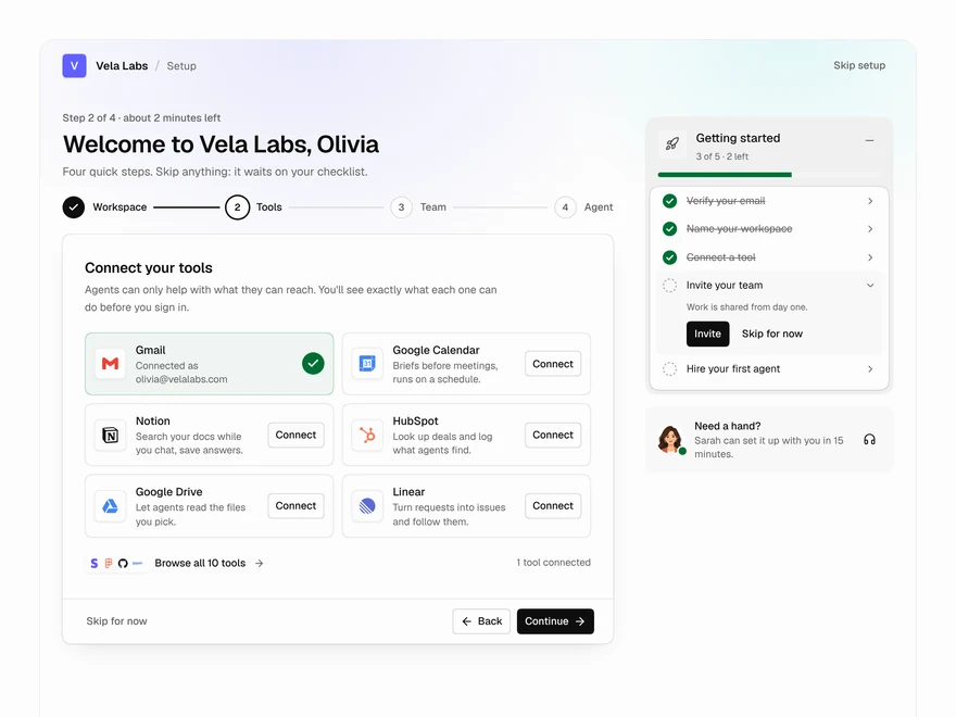
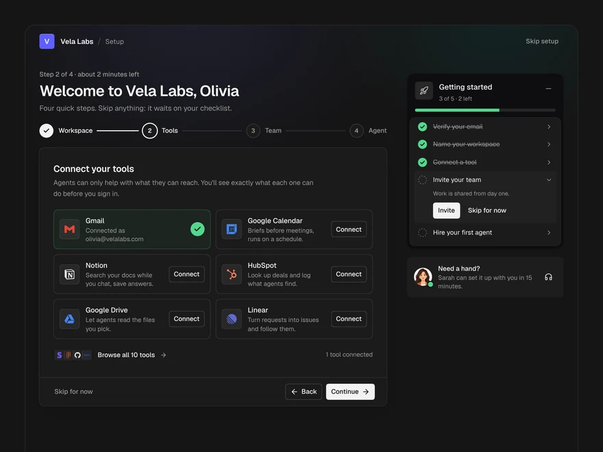
Onboarding
The first run of an AI workspace: name it, connect tools, invite the team, hire a first agent.
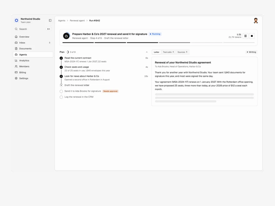
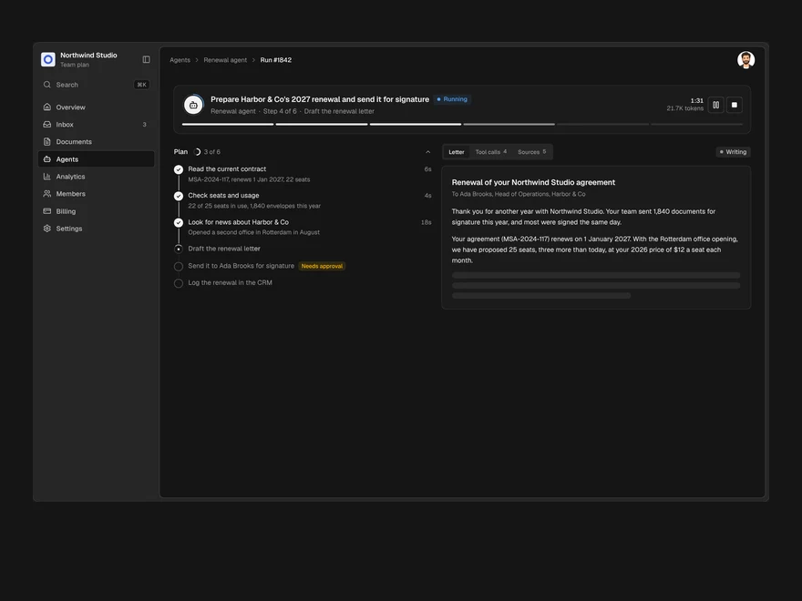
Agent Run
One agent run, live: its plan, every tool call, a pause for approval and the finished output.
Files
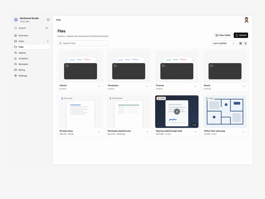
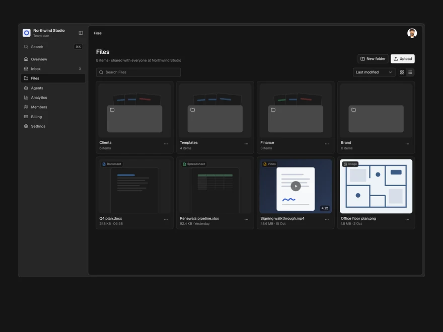
A shared drive: folders and files in a grid or a list, drag to upload, rename, move and delete.
Liro · 258 components · 11 screens · 4 templates