Signal Grid
A dot grid that carries signals: move across it and pulses travel the lines.
- Category
- Creative
- Access
- Free with an account
- Source
- 439 lines · one file
- States
- 5 drawn
The decision inside it
Signals travel, they don't follow
A glow pinned under the cursor is what every grid background does. Here movement sends something that keeps going after the pointer stops, so the grid looks like it is doing work. It stops drawing when it is off screen or the tab is hidden, holds still for reduced motion, and takes taps instead of hover on a phone.
When to use it
Use Signal Grid behind a hero or a section that should feel alive: a dot grid that carries signals along its lines and answers the pointer. Put your heading inside it. For a calmer backdrop use Contour Field.
Installation
How you get it
Paste this into Claude Code, Cursor, Codex or any coding agent. It installs the file and uses it as it is, instead of writing a new one.
Use Liro's Signal Grid for this.
Install it: npx shadcn@latest add @liro/signal-grid
(the @liro registry is set up in components.json, with LIRO_KEY in .env.local)
Import it from @/components/ui/signal-grid.
Do not rewrite or restyle it. Pass my data through its props
and keep its built-in states.
For the full brief with every prop and the mistakes assistants usually make, use Copy prompt above. Free components install through the @liro registry with your CLI token: see the Namespaced tab.
Usage
import { SignalGrid } from "@/components/ui/signal-grid";

export function Hero() {
  return (
    <SignalGrid className="h-[520px]" signalClassName="text-neutral-950 dark:text-white">
      <div className="flex h-full flex-col items-center justify-center text-center">
        <h1 className="text-5xl font-bold tracking-tight">Every request finds the shortest way.</h1>
      </div>
    </SignalGrid>
  );
}
API reference
“Copy prompt” above puts a full brief on your clipboard, install command, dependencies, props, and the mistakes an assistant usually makes with this component.
Props
Read from the component’s own TypeScript interface when the site is built, so this table cannot drift from the file you install.
| Type | Notes | ||
|---|---|---|---|
spacing | number | No | Distance between dots, in px. Default 28. |
ambient | number | No | Signals that drift in on their own, per second. 0 for none. Default 0.8. |
maxPulses | number | No | Most signals on the grid at once. Default 28. |
speed | number | No | Grid points a signal crosses per second. Default 11. |
signalClassName | string | No | Colour class for the signals, read as `color`. Default blue. |
fade | boolean | No | Fade the grid out toward the edges. Default true. |
interactive | boolean | No | Send signals from pointer movement and taps. Default true. |
Dependencies
npm packages
clsxtailwind-mergeLiro foundations, installed alongside it
liro-themeStates
All of them are drawn by the component. None is left for you to design.
- Ambient
- Pointer
- Tap burst
- Reduced motion
- Off screen
Accessibility
- Keyboard reachable throughout, in visual order
- Focus trapped in overlays, Escape closes them
- Focus returns to whatever opened it
- Live regions announce what changed, not that something did
- Honours prefers-reduced-motion
Responsive behavior
- Sizes to its container, not the viewport
- Usable from 320px up
- Pointer-based interaction, so trackpad and touch both work
- No hover-only affordances
More like Signal Grid
All Creative Free
Ink Bleed Heading
Heading that spreads in like ink.
 Free
Pressure Button
Button that presses down and ripples.
 NewFree
Web Shot Button
Glass button that shoots silk at the pointer.
 Pro
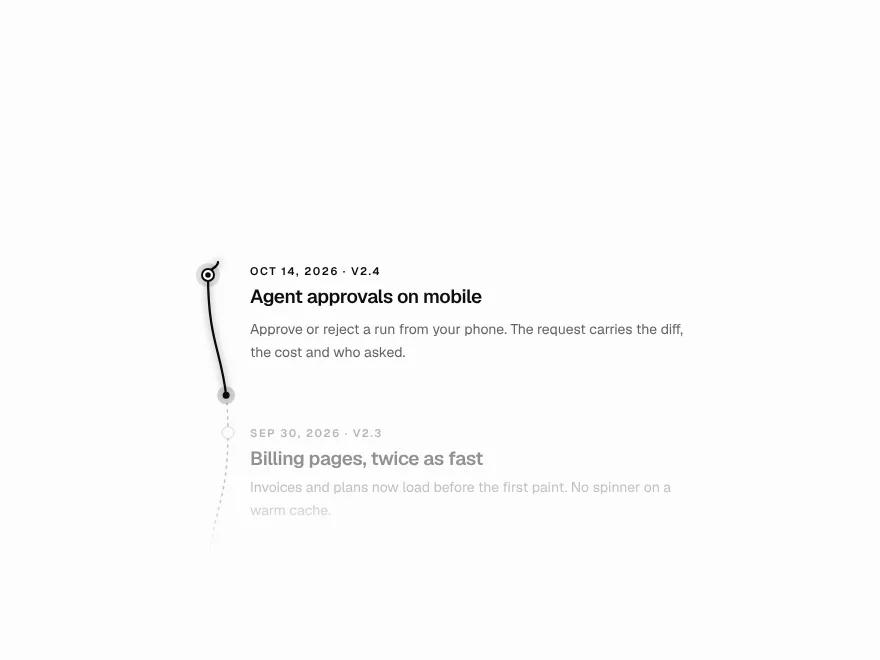
Scroll Thread
Line that draws through the page on scroll.
 Pro
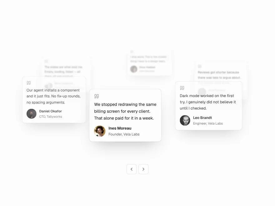
Orbit Stack
Testimonial cards orbiting a headline.
 Pro
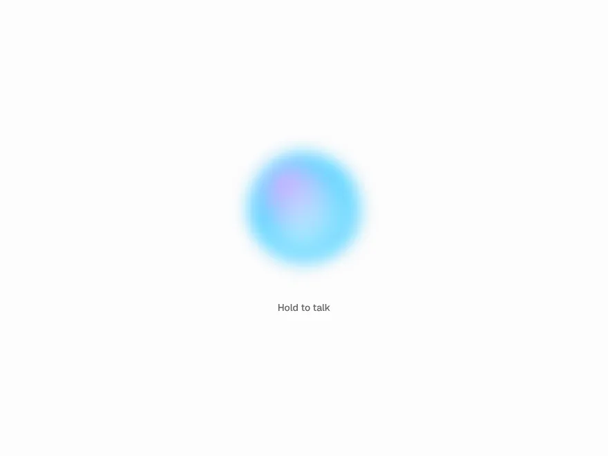
Agent Orb
Animated orb for a voice AI assistant.