Web Shot Button
A red glass button that shoots silk at the pointer.
- Category
- Creative
- Access
- Free with an account
- Source
- 350 lines · one file
- States
- 7 drawn
- Added
- 26 Oct 2026
The decision inside it
The threads leave from the edge that faces you
Each anchor sits on the outline nearest the pointer and slides around the curve as it moves, so a thread never crosses the label or cuts through the glass. Threads drawn from the centre look glued on as soon as the pointer goes above or below the button. The loop stops when nothing is moving, so a resting button costs nothing.
When to use it
Use Web Shot Button for one call to action people should want to play with, like the main action on a landing page. Red glass by default; pass color="clear" or any tint. Not for everyday buttons.
Installation
How you get it
Paste this into Claude Code, Cursor, Codex or any coding agent. It installs the file and uses it as it is, instead of writing a new one.
Use Liro's Web Shot Button for this.
Install it: npx shadcn@latest add @liro/web-shot-button
(the @liro registry is set up in components.json, with LIRO_KEY in .env.local)
Import it from @/components/ui/web-shot-button.
Do not rewrite or restyle it. Pass my data through its props
and keep its built-in states.
For the full brief with every prop and the mistakes assistants usually make, use Copy prompt above. Free components install through the @liro registry with your CLI token: see the Namespaced tab.
Usage
import { ArrowRight } from "lucide-react";
import { WebShotButton } from "@/components/ui/web-shot-button";

export function ExploreButton({ onExplore }: { onExplore: () => void }) {
  return (
    <WebShotButton onClick={onExplore}>
      Explore components
      <ArrowRight />
    </WebShotButton>
  );
}
API reference
“Copy prompt” above puts a full brief on your clipboard, install command, dependencies, props, and the mistakes an assistant usually makes with this component.
Props
Read from the component’s own TypeScript interface when the site is built, so this table cannot drift from the file you install.
| Type | Notes | ||
|---|---|---|---|
size | "md" | "lg" | No | `md` (44px) or `lg` (56px). Default `lg`. |
color | string | No | A hex or rgb() colour to tint the glass, or `"clear"` for untinted glass. Default red. The label turns black on light tints. |
reach | number | No | How far from the pill, in pixels, the pointer is noticed. Default 140. |
threads | number | No | Number of threads. Default 5. |
Dependencies
npm packages
clsxframer-motiontailwind-mergeLiro foundations, installed alongside it
liro-themeStates
All of them are drawn by the component. None is left for you to design.
- Rest
- Reaching
- Springing back
- Tinted glass
- Light tint
- Disabled
- Reduced motion
Accessibility
- Keyboard reachable throughout, in visual order
- Focus trapped in overlays, Escape closes them
- Focus returns to whatever opened it
- Live regions announce what changed, not that something did
- Honours prefers-reduced-motion
Responsive behavior
- Sizes to its container, not the viewport
- Usable from 320px up
- Pointer-based interaction, so trackpad and touch both work
- No hover-only affordances
More like Web Shot Button
All Creative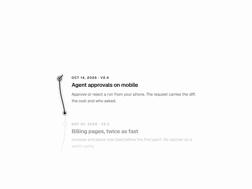 Pro
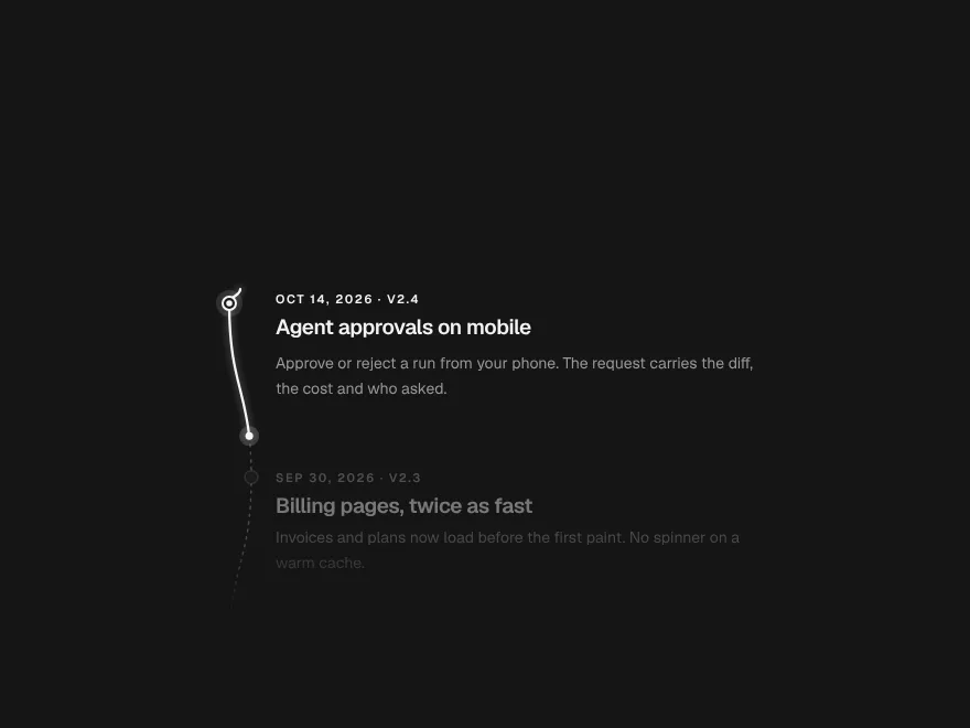
Scroll Thread
Line that draws through the page on scroll.
 Pro
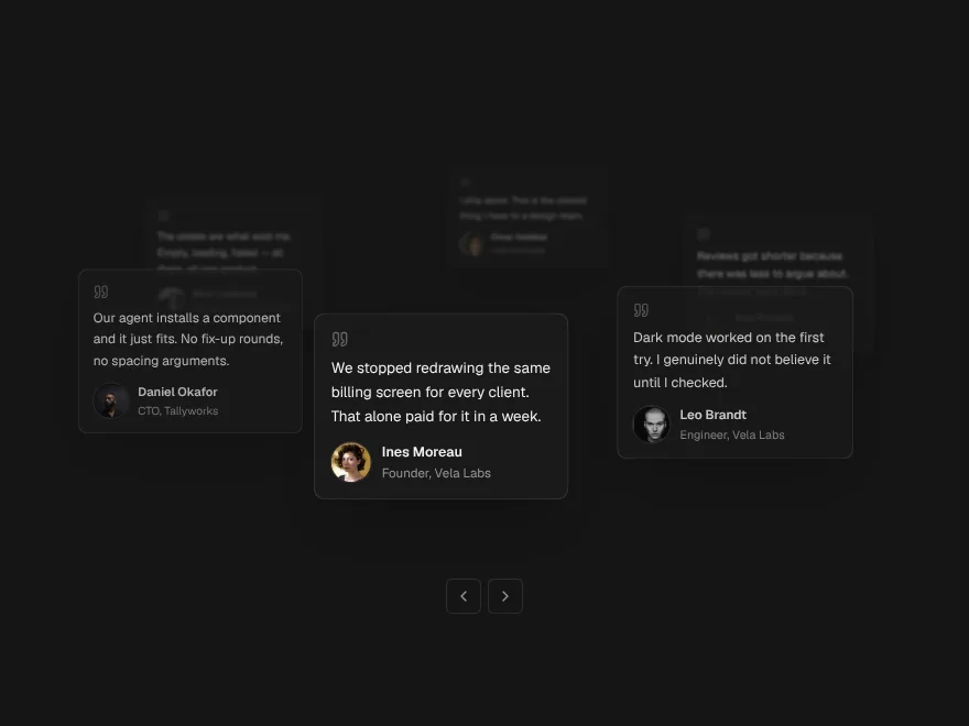
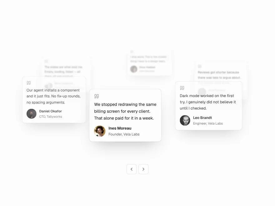
Orbit Stack
Testimonial cards orbiting a headline.
 Pro
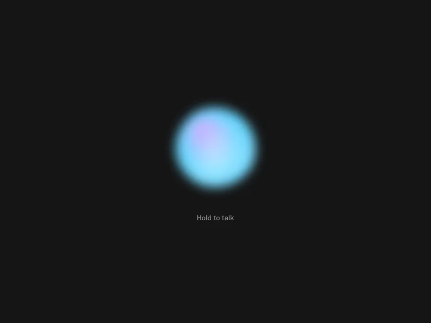
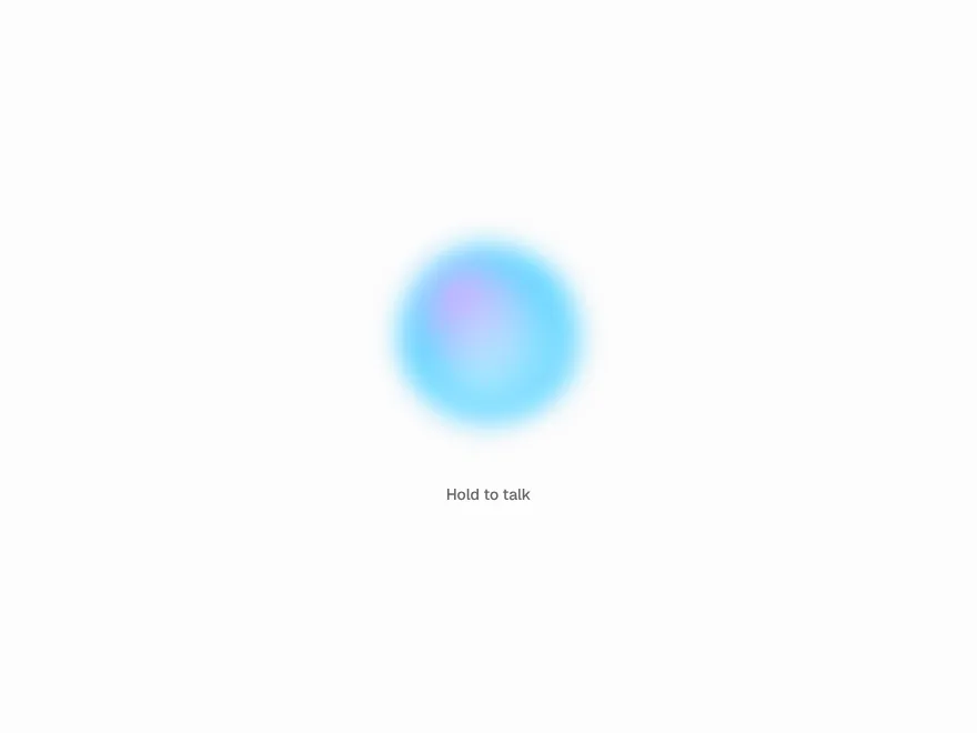
Agent Orb
Animated orb for a voice AI assistant.
 Free
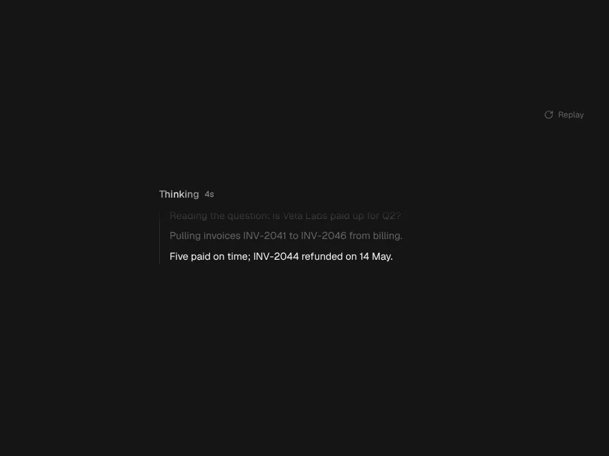
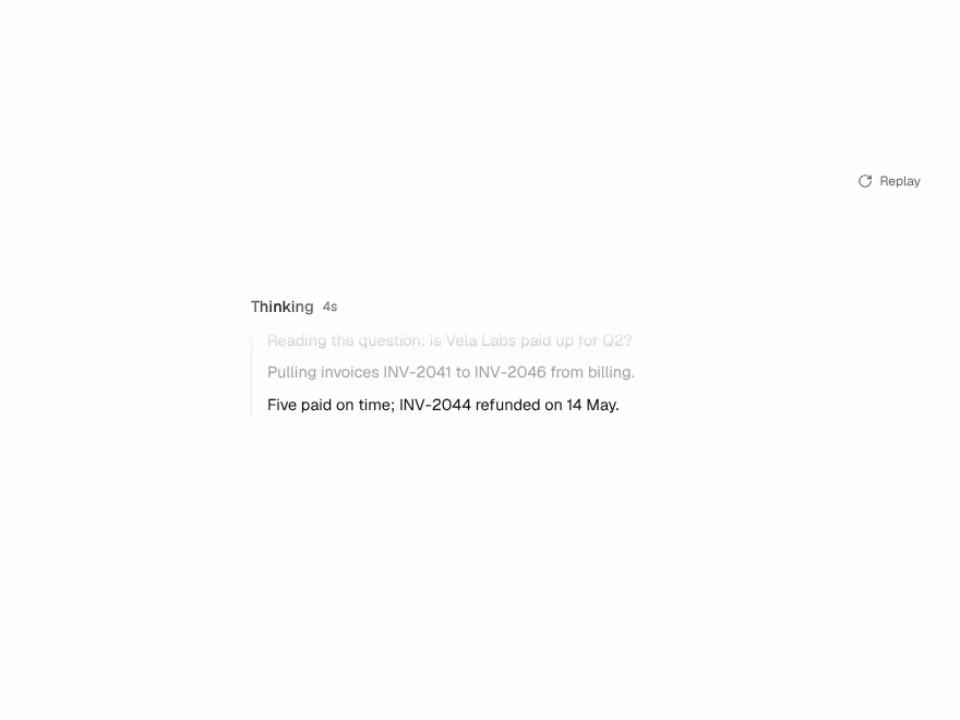
Thinking Shimmer
Shimmering text for AI reasoning.
 Pro
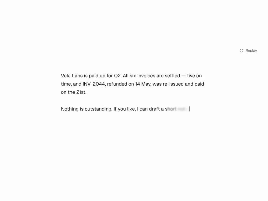
Token Stream
Smooth streaming text animation.
 Pro
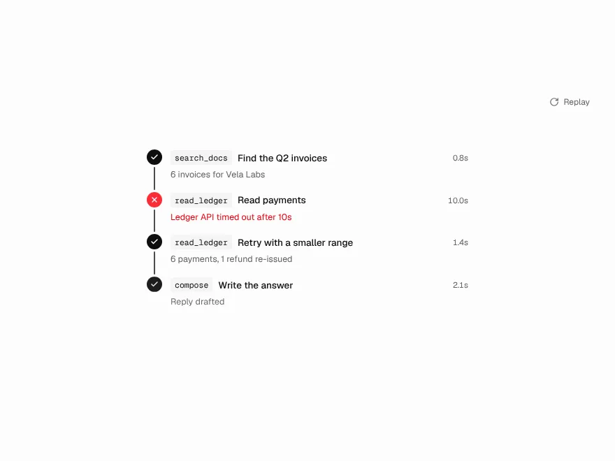
Tool Call Trail
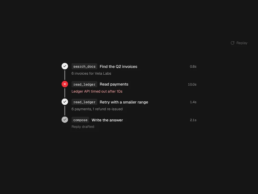
Animated path of an agent's tool calls.