Member Card
One person's standing in a workspace, as a row, and a menu derived from it.
- Category
- Workspace
- Access
- Free with an account
- Source
- 398 lines · one file
The decision inside it
The menu is derived from the row
A generic View / Edit / Remove is identical on every row and so tells an admin nothing. “Remove from workspace” on someone who never accepted the invite is a lie about what is being undone.
When to use it
Use Member Card for one person in a workspace: avatar, name, email, role, status (pending, external, suspended) and a menu of actions. For a list of members with bulk actions, use Members Table.
Installation
How you get it
Paste this into Claude Code, Cursor, Codex or any coding agent. It installs the file and uses it as it is, instead of writing a new one.
Use Liro's Member Card for this.
Install it: npx shadcn@latest add @liro/member-card
(the @liro registry is set up in components.json, with LIRO_KEY in .env.local)
Import it from @/components/ui/member-card.
Do not rewrite or restyle it. Pass my data through its props
and keep its built-in states.
For the full brief with every prop and the mistakes assistants usually make, use Copy prompt above. Free components install through the @liro registry with your CLI token: see the Namespaced tab.
Usage
import { MemberCard } from "@/components/ui/member-card";

export function Member({ onMenu }: { onMenu: (action: string) => void }) {
  return (
    <MemberCard
      name="Ada Moss"
      email="ada@vertically.dev"
      role="admin"
      status="active"
      title="Head of Finance"
      lastActive="2 hours ago"
      showMenu
      onMenuSelect={onMenu}
    />
  );
}
API reference
“Copy prompt” above puts a full brief on your clipboard, install command, dependencies, props, and the mistakes an assistant usually makes with this component.
Props
Read from the component’s own TypeScript interface when the site is built, so this table cannot drift from the file you install.
| Type | Notes | ||
|---|---|---|---|
name | string | No | Display name. Falls back to the local part of the email. |
email | string | Yes | Email address. Doubles as the avatar seed, so a face is stable per person. |
avatar | string | No | Photo. The drawn portrait stands in until there is one. |
role | MemberRole | No | What they may do. |
status | MemberStatus | No | Where they stand. |
title | string | No | Job title or team, shown under the name when there is room. |
lastActive | string | No | Free-text activity line, e.g. "Active 2 hours ago". |
invitedAgo | string | No | How long a pending invite has been waiting, e.g. "6 days". |
accessEnds | string | No | When external access ends, e.g. "12 Oct". |
you | boolean | No | Marks the signed-in person; the name gets "(you)" and the menu is hidden. |
premium | boolean | No | The seat is on the paid plan. Drawn in gold, which is the one thing in this card that is neither neutral nor a warning. It is deliberately the last badge on the line: a pending invite is something an admin has to act on, a premium seat is something they are paying for, and the thing to act on comes first. |
showMenu | boolean | No | Show the overflow menu button. Ignored for an owner. Default: true. |
menuItems | MenuItem[] | No | Replace the menu's contents. The default list is derived from `status`, because the useful action on a row is almost always the one its standing implies — resend a stale invite, extend an expiring access, reactivate a suspended seat. |
interactive | boolean | No | Hover lift and press feedback. Default: true. |
onOpen | () => void | No | – |
onMenuSelect | (id: string, item: MenuItem) => void | No | Fired with the chosen item's `id`. |
onResend | () => void | No | The inline Resend on a pending invite. Falls back to `onMenuSelect("resend")`. |
Dependencies
npm packages
clsxframer-motionlucide-reacttailwind-mergeLiro foundations, installed alongside it
liro-themeavatarbuttonmenurole-chipAccessibility
- Keyboard reachable throughout, in visual order
- Focus trapped in overlays, Escape closes them
- Focus returns to whatever opened it
- Live regions announce what changed, not that something did
- Honours prefers-reduced-motion
Responsive behavior
- Sizes to its container, not the viewport
- Usable from 320px up
- Pointer-based interaction, so trackpad and touch both work
- No hover-only affordances
Used in a screenAll screens
More like Member Card
All Workspace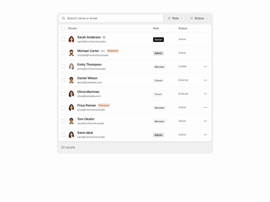 Pro
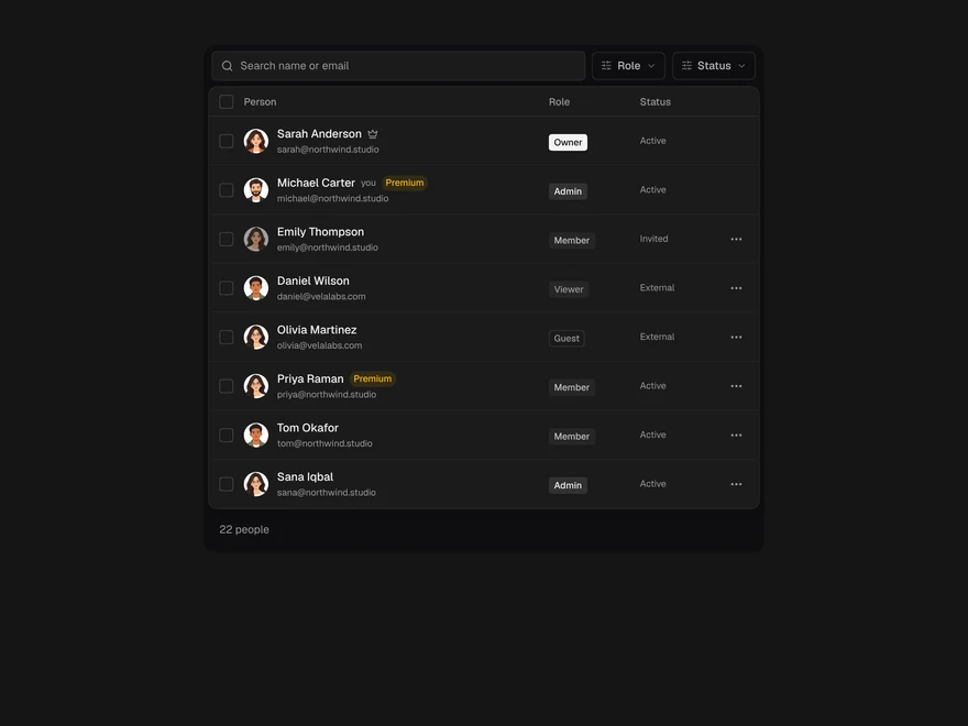
Members Table
Team members table with search and bulk actions.
 Pro
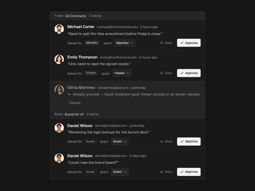
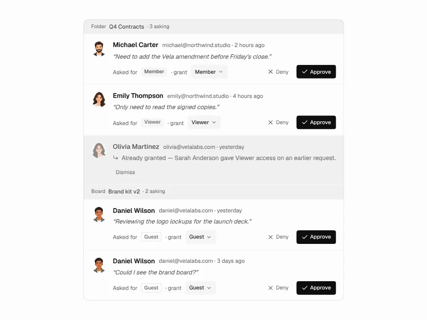
Access Request Inbox
Approve or deny access requests.
 Pro
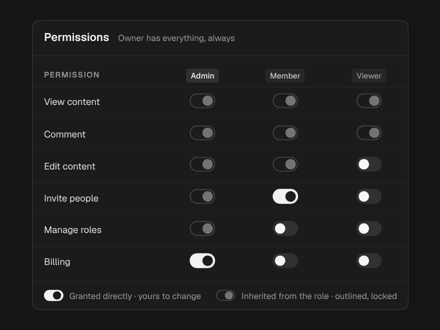
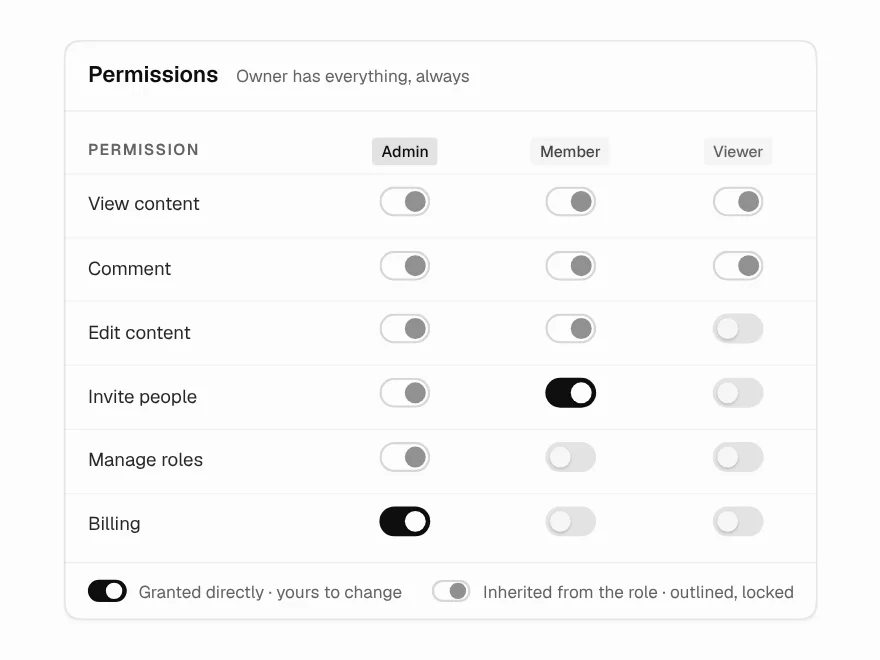
Roles & Permissions Matrix
Roles and permissions matrix.
 Pro
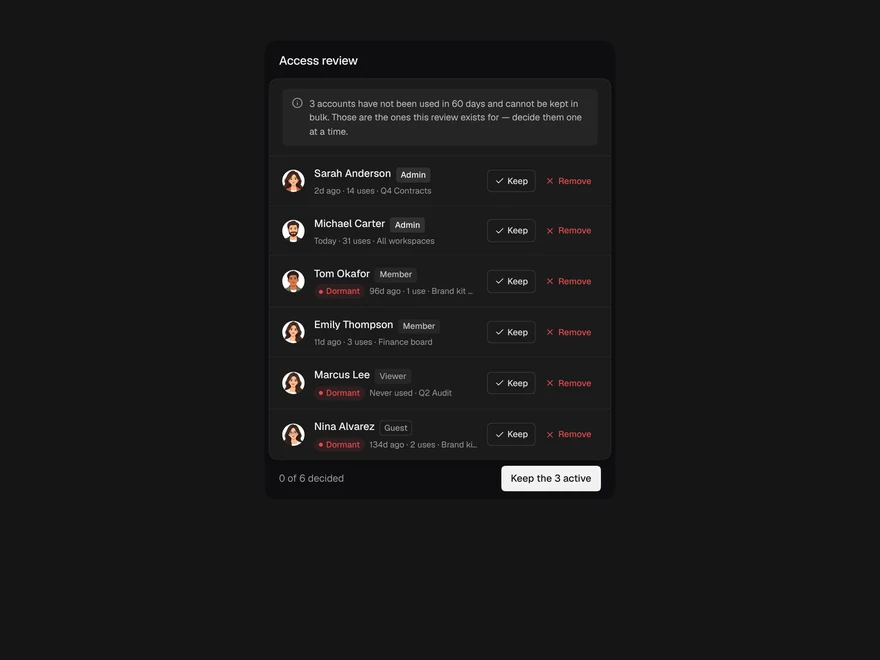
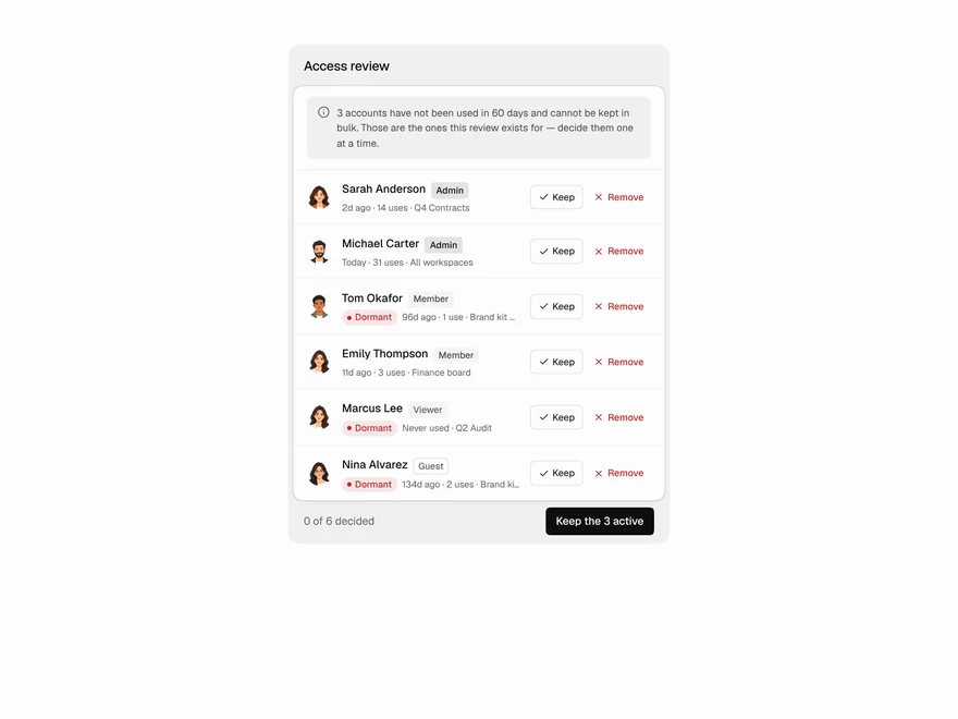
Access Review
Periodic access review for team accounts.
 Pro
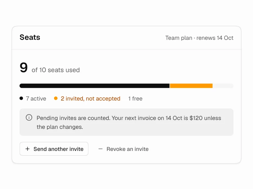
Seat Usage & Limits
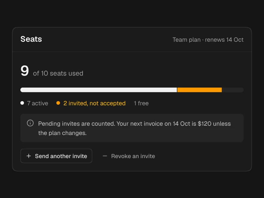
Seat usage meter with pending invites.
 Pro
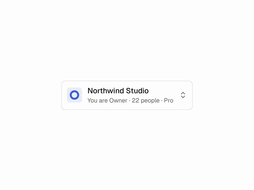
Team Switcher
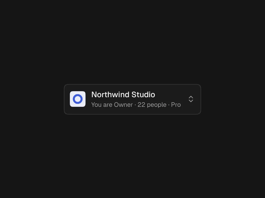
Workspace switcher showing your role in each.