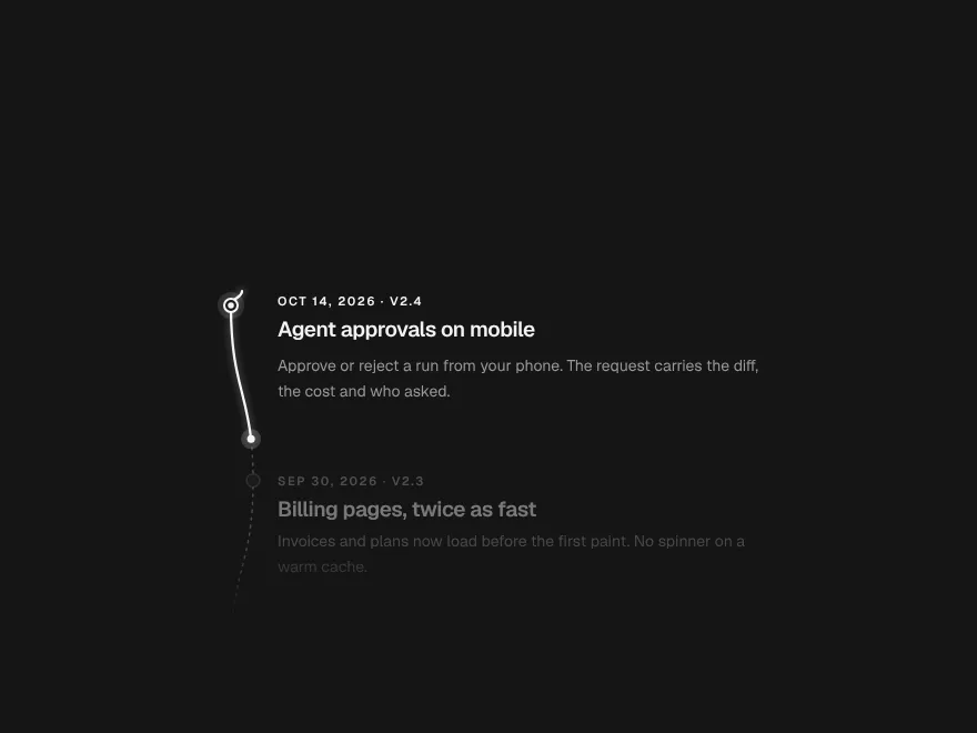
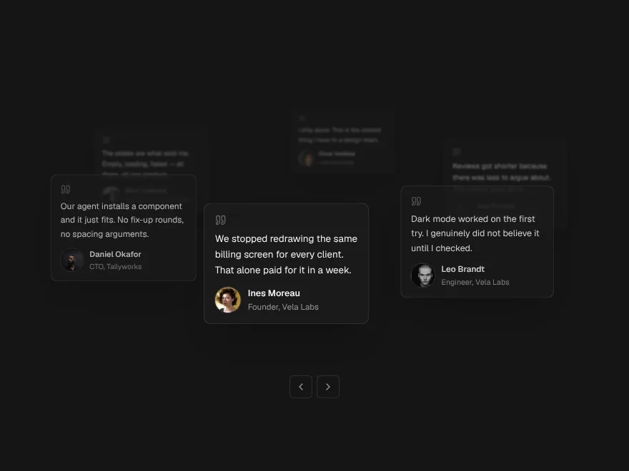
Gradient Floor
A soft colour glow rising from the bottom edge, two layers that drift.
A blurred gradient that glows up from the bottom of a section, made of two layers that drift and breathe at different speeds. Put a heading or a product shot on top; the colours come from your theme.
- Category
- Creative
- Access
- Free with an account
- Source
- 119 lines · one file
- States
- 5 drawn
- Added
- 13 Nov 2026
The decision inside it
It stops when nobody sees it
The drift pauses when the floor scrolls out of view or the tab is hidden, and holds still under reduced motion, so a decorative glow never costs battery. Colours read from theme variables, so it fits dark mode without a second set.
When to use it
Use Gradient Floor behind a hero or a call to action for a soft glow rising from the bottom. For light from the top use Aurora Background; for a grid use Grid Background.
Installation
How you get it
Paste this into Claude Code, Cursor, Codex or any coding agent. It installs the file and uses it as it is, instead of writing a new one.
Use Liro's Gradient Floor for this.
Install it: npx shadcn@latest add @liro/gradient-floor
(the @liro registry is set up in components.json, with LIRO_KEY in .env.local)
Import it from @/components/ui/gradient-floor.
Do not rewrite or restyle it. Pass my data through its props
and keep its built-in states.
For the full brief with every prop and the mistakes assistants usually make, use Copy prompt above. Free components install through the @liro registry with your CLI token: see the Namespaced tab.
Usage
import { GradientFloor } from "@/components/ui/gradient-floor";

export function Hero() {
  return (
    <GradientFloor className="rounded-3xl px-6 py-24 text-center">
      <h1 className="text-4xl font-semibold">Ask for a screen. Get the components.</h1>
    </GradientFloor>
  );
}
API reference
“Copy prompt” above puts a full brief on your clipboard, install command, dependencies, props, and the mistakes an assistant usually makes with this component.
Props
Read from the component’s own TypeScript interface when the site is built, so this table cannot drift from the file you install.
| Type | Notes | ||
|---|---|---|---|
colors | string[] | No | Three CSS colours, left to right. Default the theme's info blue, a violet and a teal mixed from it. |
height | number | No | How high the glow reaches, 0 to 1 of the box. Default 0.55. |
intensity | number | No | How strong the light is, 0 to 1. Default 0.7. |
speed | number | No | Seconds for one slow drift. Default 14. |
children | React.ReactNode | No | – |
Dependencies
npm packages
clsxtailwind-mergeLiro foundations, installed alongside it
liro-themeStates
All of them are drawn by the component. None is left for you to design.
- Default
- Calm
- Warm colours
- Tall
- Still (reduced motion)
Accessibility
- Keyboard reachable throughout, in visual order
- Focus trapped in overlays, Escape closes them
- Focus returns to whatever opened it
- Live regions announce what changed, not that something did
- Honours prefers-reduced-motion
Responsive behavior
- Sizes to its container, not the viewport
- Usable from 320px up
- Pointer-based interaction, so trackpad and touch both work
- No hover-only affordances
More like Gradient Floor
All Creative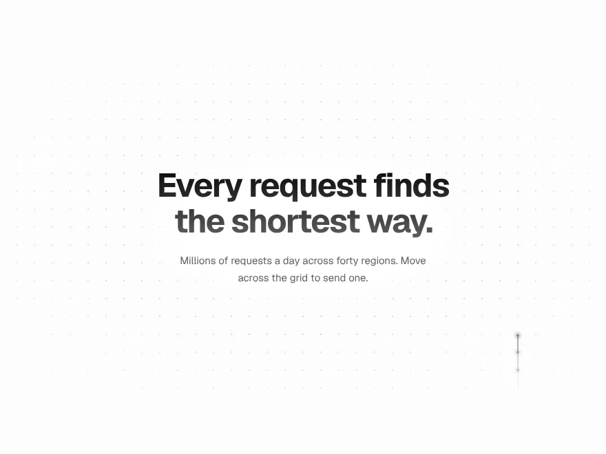 Free
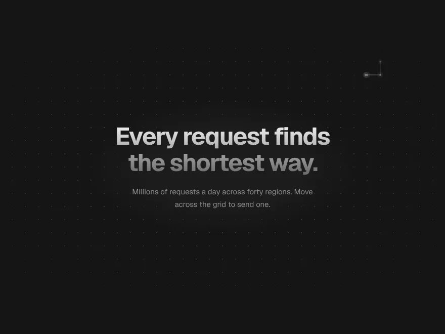
Signal Grid
Interactive dot grid with travelling pulses.
 Free
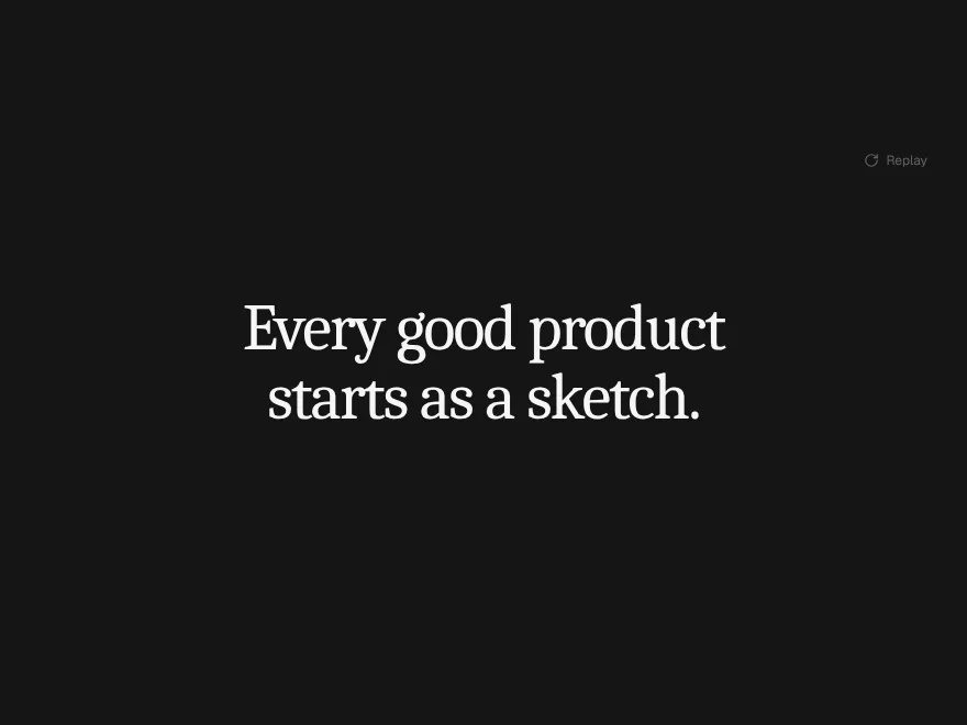
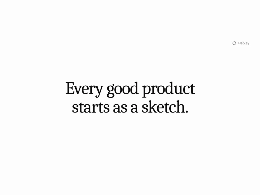
Ink Bleed Heading
Heading that spreads in like ink.
 Free
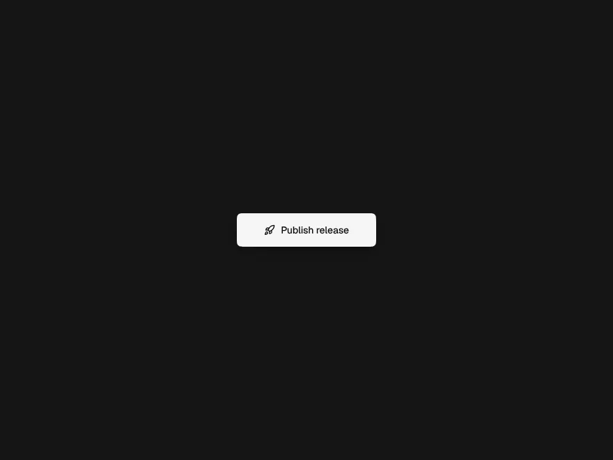
Pressure Button
Button that presses down and ripples.
 Free
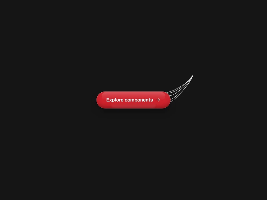
Web Shot Button
Glass button that shoots silk at the pointer.
 Pro
Scroll Thread
Line that draws through the page on scroll.
 Pro
Orbit Stack
Testimonial cards orbiting a headline.