Deployments Table
Builds by commit with environment, status, age and author; Redeploy on failures.
PROGet Deployments Table and 168 other Pro components with pro lifetime — Get Pro
- Category
- Data Tables
- Access
- ProPro · unlocked
- Source
- 245 lines · one file
- States
- 7 drawn
- Kind
- Block
The decision inside it
Production is the loud one
Preview and development badges stay quiet, so in a long list the deployments that reach users are the ones you see first.
When to use it
Use Deployments Table for a project's builds: commit message with short SHA and branch, environment, status, build time, age and author, with Redeploy on failed rows. For the steps inside one run use Run History or Trace Waterfall.
Installation
How you get it
Paste this into Claude Code, Cursor, Codex or any coding agent. It installs the file and uses it as it is, instead of writing a new one.
Use Liro's Deployments Table for this.
Install it: npx shadcn@latest add @liro/deployments-table
(the @liro registry is set up in components.json, with LIRO_KEY in .env.local)
Import it from @/components/ui/deployments-table.
Do not rewrite or restyle it. Pass my data through its props
and keep its built-in states.
For the full brief with every prop and the mistakes assistants usually make, use Copy prompt above. Pro components install through the @liro registry with your CLI token: see the Namespaced tab.
Usage
import { DeploymentsTable, type Deployment } from "@/components/ui/deployments-table";

export function Deployments({ rows }: { rows: Deployment[] }) {
  return (
    <DeploymentsTable
      rows={rows}
      onRowClick={(d) => console.info("open", d.id)}
      onRedeploy={(d) => console.info("redeploy", d.sha)}
    />
  );
}
API reference
“Copy prompt” above puts a full brief on your clipboard, install command, dependencies, props, and the mistakes an assistant usually makes with this component.
Props
Read from the component’s own TypeScript interface when the site is built, so this table cannot drift from the file you install.
| Type | Notes | ||
|---|---|---|---|
rows | Deployment[] | Yes | – |
now | Date | No | The time ages are counted from. Default: the time of first render. |
loading | boolean | No | – |
error | React.ReactNode | No | – |
onRetry | () => void | No | – |
onRowClick | (row: Deployment) => void | No | – |
onRedeploy | (row: Deployment) => void | No | Shown on failed rows. Leave out to hide the button. |
density | "comfortable" | "compact" | No | – |
variant | "default" | "striped" | "bordered" | No | – |
pageSize | number | No | Rows per page. Default 8. |
className | string | No | – |
Dependencies
npm packages
clsxlucide-reacttailwind-mergeLiro foundations, installed alongside it
liro-themeavatarbadgebuttondata-tabledropdown-menuStates
All of them are drawn by the component. None is left for you to design.
- All deployments
- Building
- Failed with Redeploy
- Production only
- Loading
- Empty
- Error
Accessibility
- Keyboard reachable throughout, in visual order
- Focus trapped in overlays, Escape closes them
- Focus returns to whatever opened it
- Live regions announce what changed, not that something did
- Honours prefers-reduced-motion
Responsive behavior
- Sizes to its container, not the viewport
- Usable from 320px up
- Pointer-based interaction, so trackpad and touch both work
- No hover-only affordances
More like Deployments Table
All Data Tables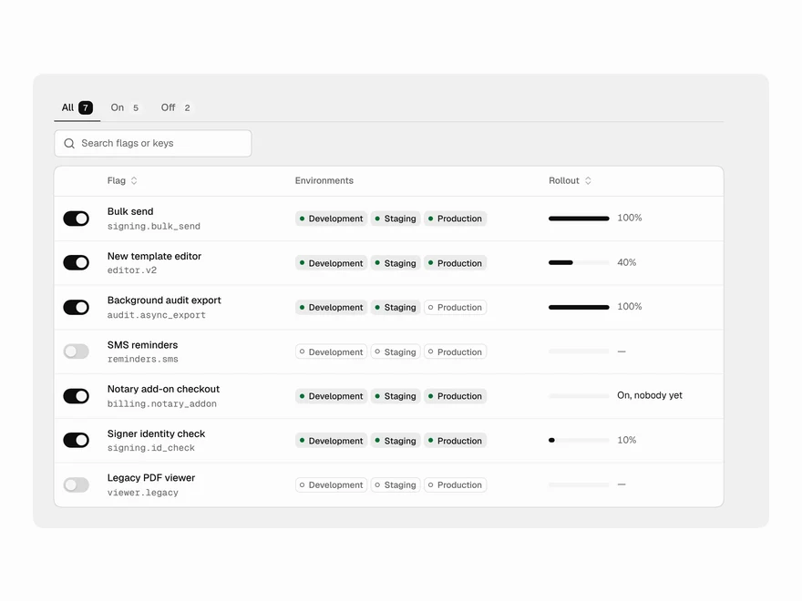 BlockPro
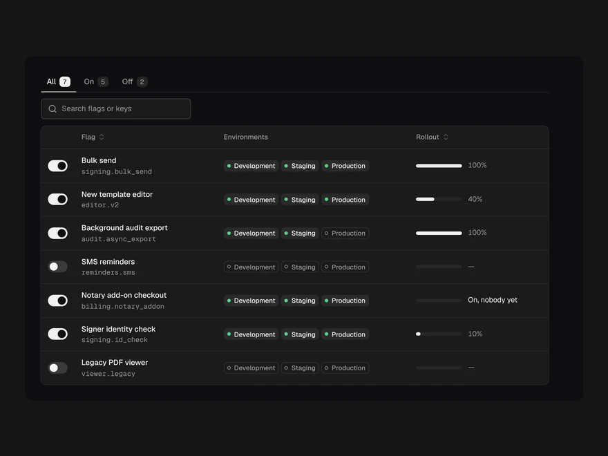
Feature Flags Table
Feature flags table with rollout and toggles.
 BlockPro
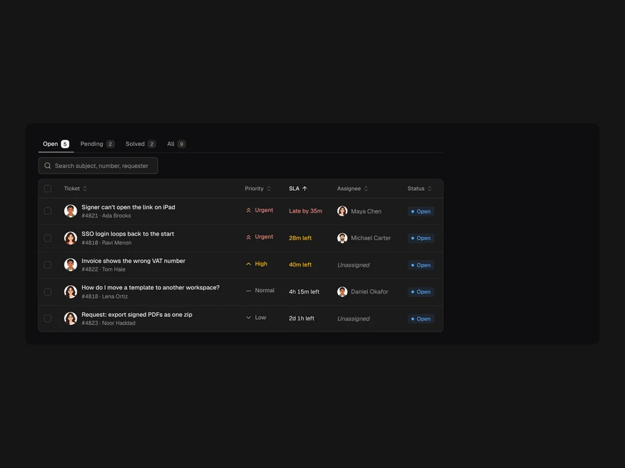
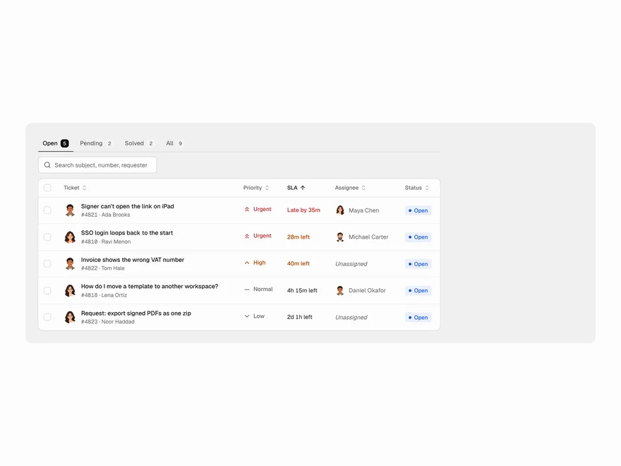
Support Tickets Table
Support ticket queue sorted by SLA.
 BlockPro
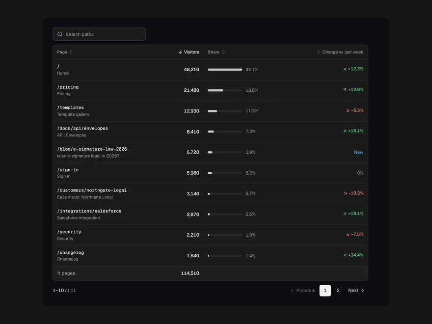
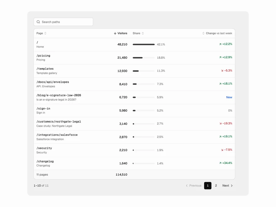
Top Pages Table
Top pages table with traffic share and change.
 BlockPro
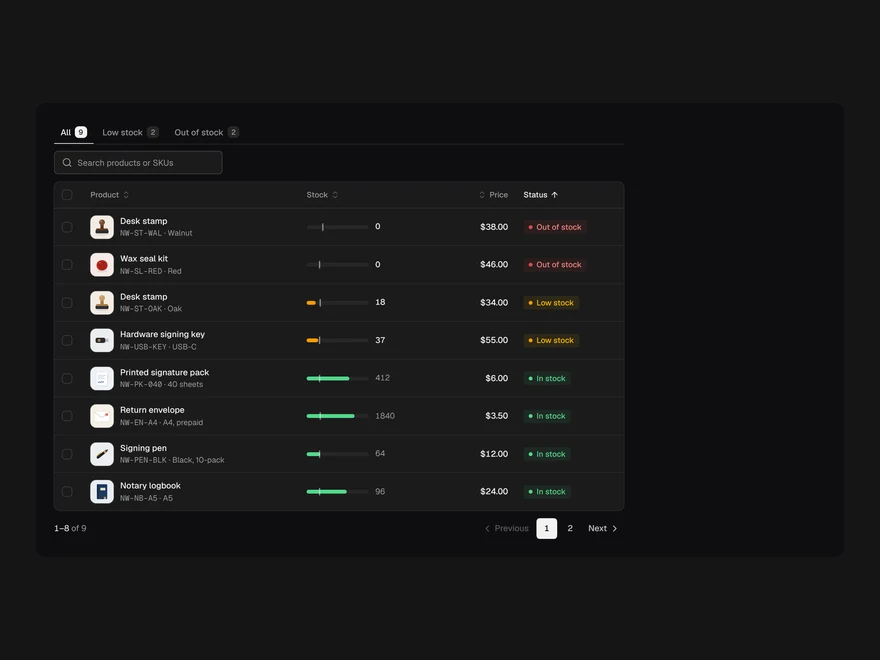
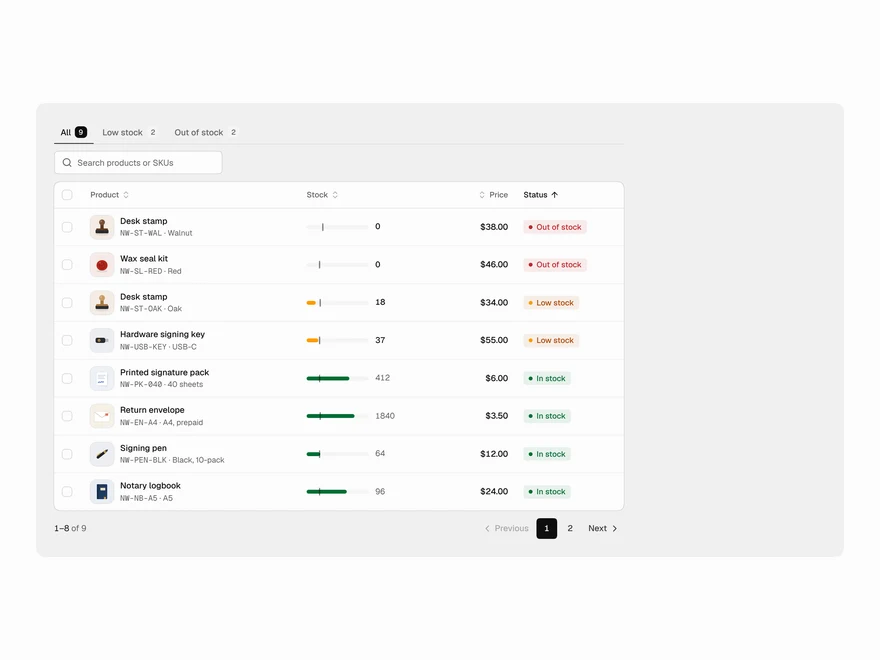
Inventory Table
Inventory table with stock levels and reorder points.
 BlockPro
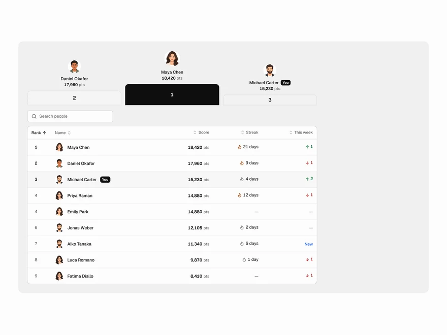
Leaderboard Table
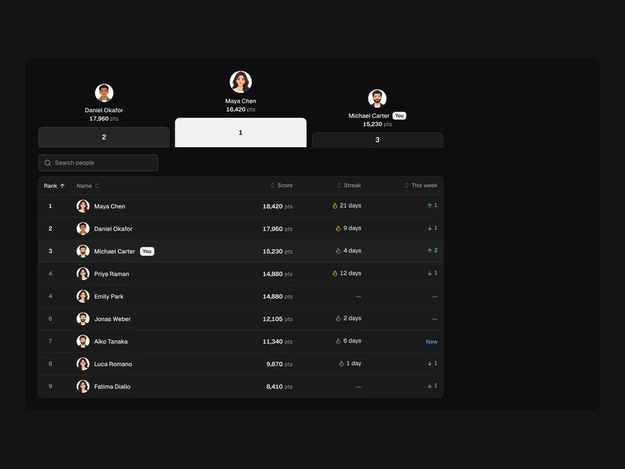
Leaderboard table with ranks, medals and streaks.
 Pro
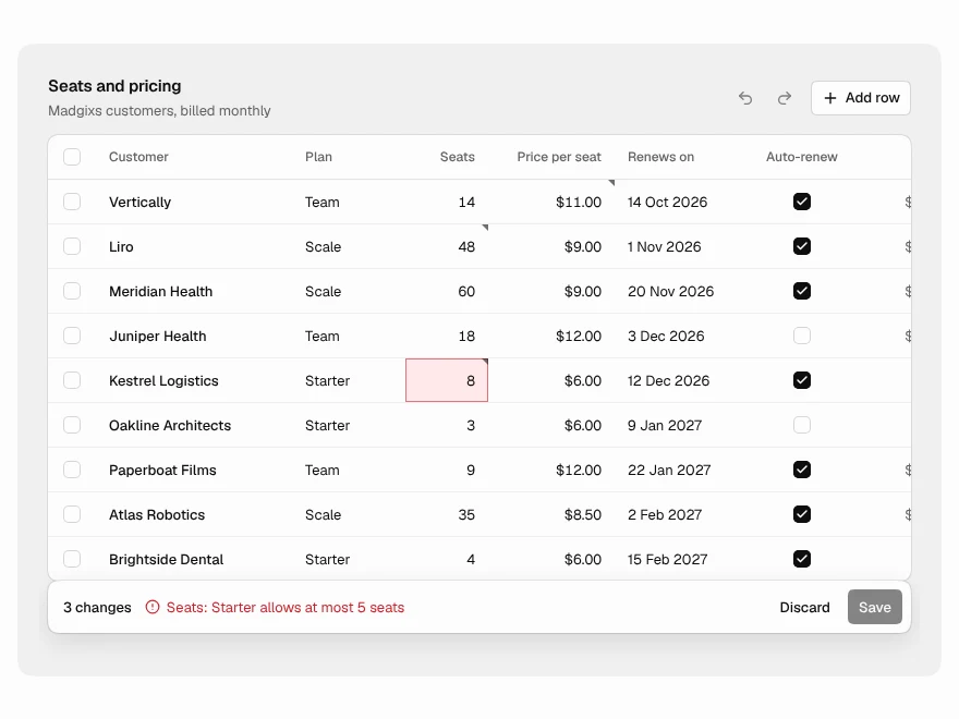
Editable Table
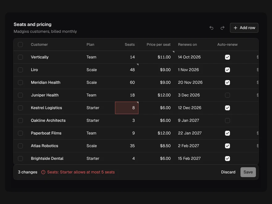
Spreadsheet-style editable table with undo and save.