Activity Feed
Who did what in a workspace, grouped by day, filtered, and live.
PROGet Activity Feed and 168 other Pro components with pro lifetime — Get Pro
- Category
- Workspace
- Access
- ProPro · unlocked
- Source
- 629 lines · one file
- States
- 6 drawn
The decision inside it
It never moves what you are reading
Events that arrive while you are further down wait behind a small pill that says how many are new. Press it, or scroll back up, and they open in. At the top there is nobody to interrupt, so they appear straight away.
When to use it
Use Activity Feed for "who did what" in a workspace: grouped by day, sentence rows with avatars, repeated actions folded, tabs by kind, search, an "N new" pill and load earlier.
Installation
How you get it
Paste this into Claude Code, Cursor, Codex or any coding agent. It installs the file and uses it as it is, instead of writing a new one.
Use Liro's Activity Feed for this.
Install it: npx shadcn@latest add @liro/activity-feed
(the @liro registry is set up in components.json, with LIRO_KEY in .env.local)
Import it from @/components/ui/activity-feed.
Do not rewrite or restyle it. Pass my data through its props
and keep its built-in states.
For the full brief with every prop and the mistakes assistants usually make, use Copy prompt above. Pro components install through the @liro registry with your CLI token: see the Namespaced tab.
Usage
import { ActivityFeed, type ActivityEvent } from "@/components/ui/activity-feed";

const events: ActivityEvent[] = [
  { id: "1", at: "2026-10-18T09:12:00Z", actor: { name: "Ada Moss" }, kind: "signature", verb: "signed", target: { label: "Vertically MSA" } },
  { id: "2", at: "2026-10-18T08:40:00Z", actor: { name: "Michael Carter" }, kind: "comment", verb: "commented on", target: { label: "Q4 plan" }, detail: { quote: "Let's ship Friday." } },
];

export function Activity({ loadMore, hasMore }: { loadMore: () => Promise<void>; hasMore: boolean }) {
  return <ActivityFeed events={events} searchable onLoadMore={loadMore} hasMore={hasMore} maxHeight={480} />;
}
API reference
“Copy prompt” above puts a full brief on your clipboard, install command, dependencies, props, and the mistakes an assistant usually makes with this component.
Props
Read from the component’s own TypeScript interface when the site is built, so this table cannot drift from the file you install.
| Type | Notes | ||
|---|---|---|---|
events | ActivityEvent[] | Yes | In any order. The feed sorts them newest first. |
onOpen | (target: ActivityTarget, event: ActivityEvent) => void | No | Called when a target is pressed. Without it, targets are plain text. |
now | Date | number | No | "Now", for the relative times and for Today and Yesterday. Defaults to the clock, and then keeps time. |
locale | string | No | A BCP 47 tag for dates and times: "en-GB". Defaults to the reader's own. |
title | React.ReactNode | false | No | The heading. Pass `false` to hide it. |
filter | string | No | The kind being shown, or "all". Leave it out and the feed keeps its own. |
defaultFilter | string | No | Default "all". |
onFilterChange | (filter: string) => void | No | Called with the kind, or "all", when a filter is chosen. |
searchable | boolean | No | Show the search field. Default true. |
kinds | Record<string, ActivityKindInfo> | No | Name, icon and plural for your own kinds, or to rename the six built in. |
groupWindowMs | number | No | How close together one person's repeats must be to share a row. Default ten minutes. |
unreadSince | Date | number | string | No | Draws one "New" line under everything later than this moment. |
onLoadMore | () => void | Promise<void> | No | Adds "Show earlier activity". Return a promise: it shows the wait, and a rejection offers Retry. |
hasMore | boolean | No | Whether there is anything earlier to load. Default false. |
maxHeight | number | string | No | Scrolls the feed inside itself at this height. Leave it out and it grows with the page. |
loading | boolean | No | Waiting for the first page. Shows rows shaped like the feed. |
look | Look | No | Layered sets the feed on a card in a tray, the title, search and filter above it. Flat is the card alone. |
Dependencies
npm packages
clsxframer-motionlucide-reacttailwind-mergeLiro foundations, installed alongside it
liro-themeavatarbadgebuttondropdown-menuinputstateStates
All of them are drawn by the component. None is left for you to design.
- All activity
- Filtered
- Group expanded
- New activity waiting
- Loading earlier
- Nothing matches
Accessibility
- Keyboard reachable throughout, in visual order
- Focus trapped in overlays, Escape closes them
- Focus returns to whatever opened it
- Live regions announce what changed, not that something did
- Honours prefers-reduced-motion
Responsive behavior
- Sizes to its container, not the viewport
- Usable from 320px up
- Pointer-based interaction, so trackpad and touch both work
- No hover-only affordances
More like Activity Feed
All Workspace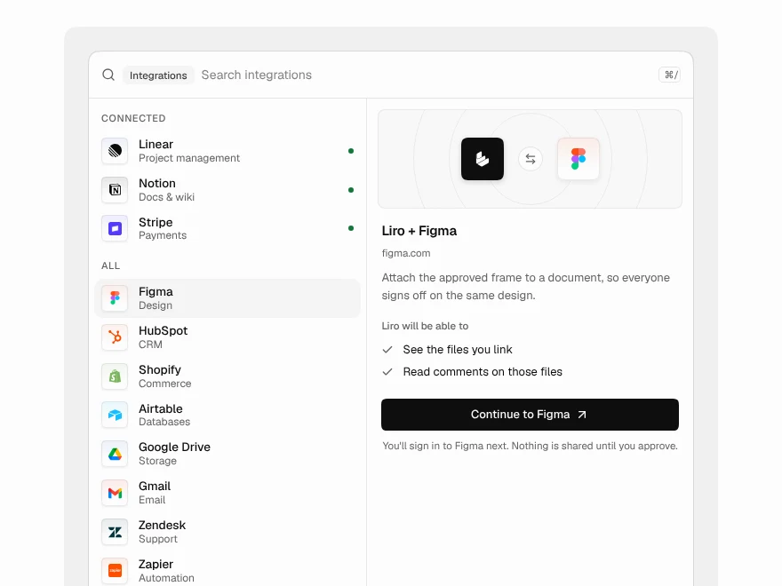 Pro
Integration Picker
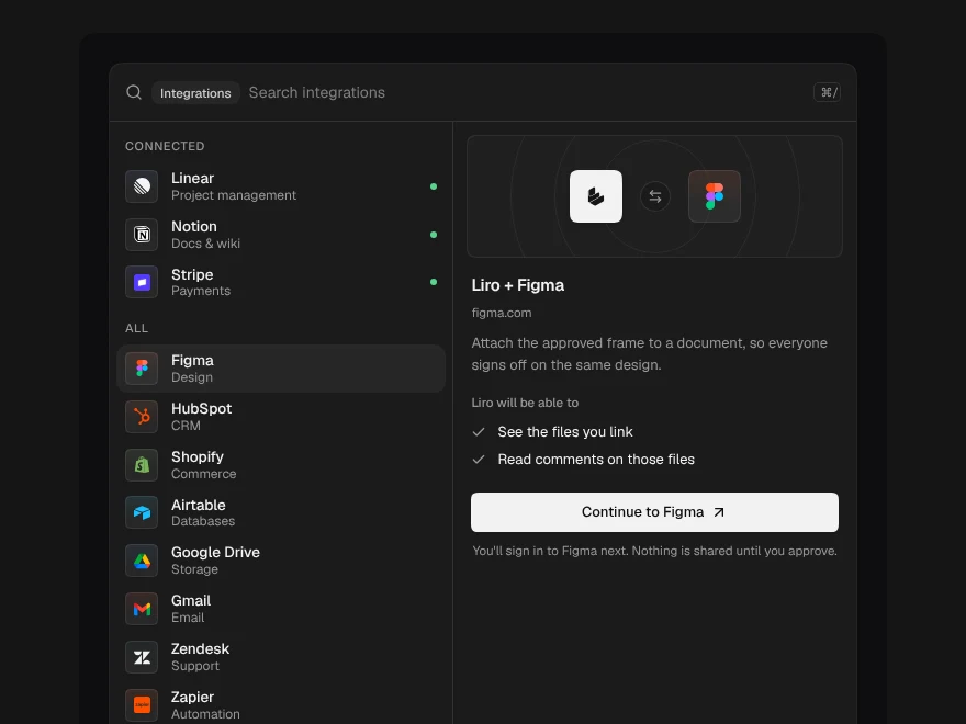
Search and connect app integrations.
 Pro
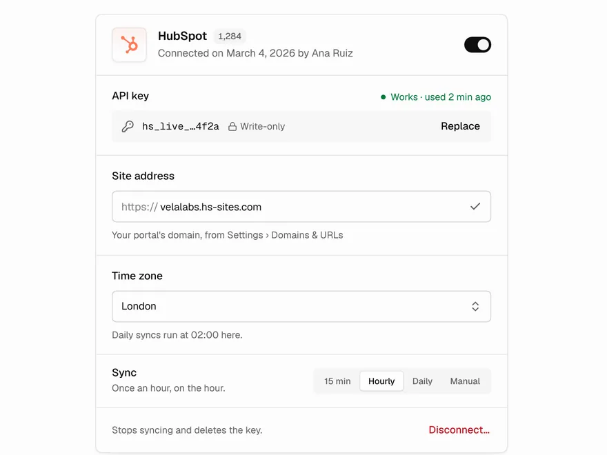
Integration Settings
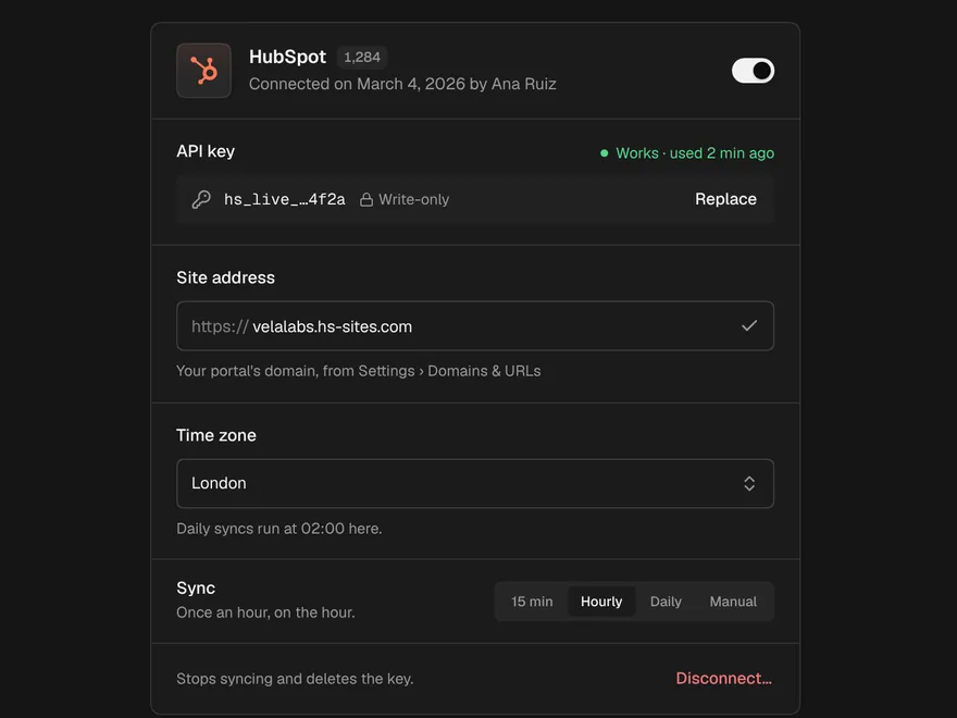
Settings card for one connected integration.
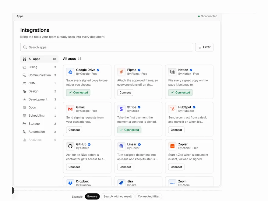 Pro
App Directory
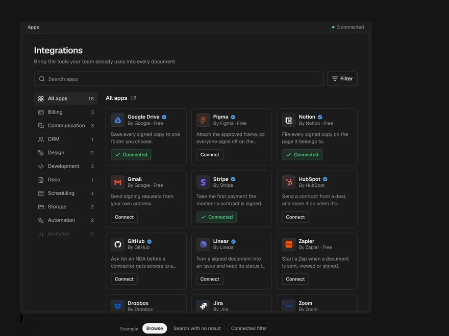
Searchable directory of app integrations.
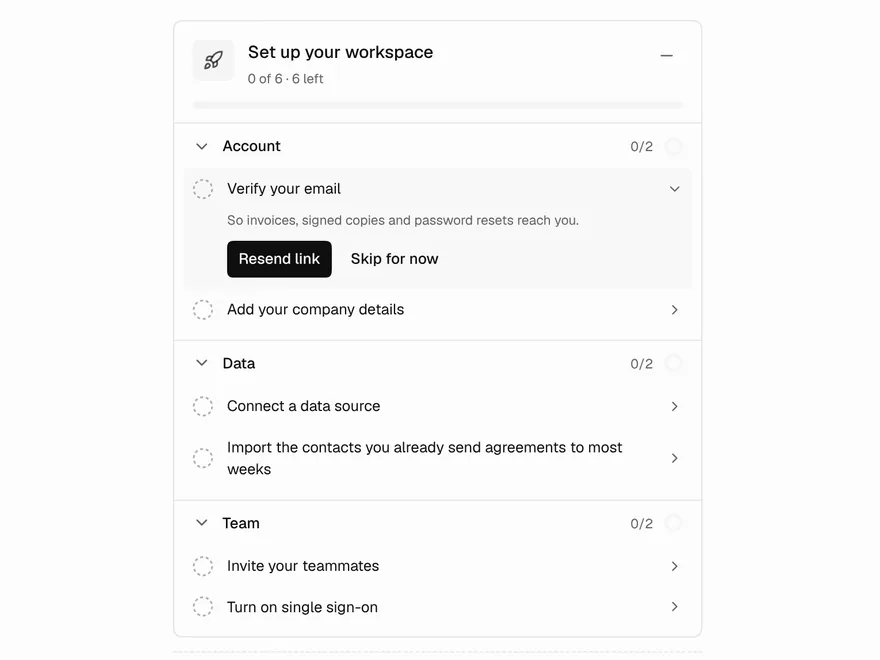 Pro
Setup Guide
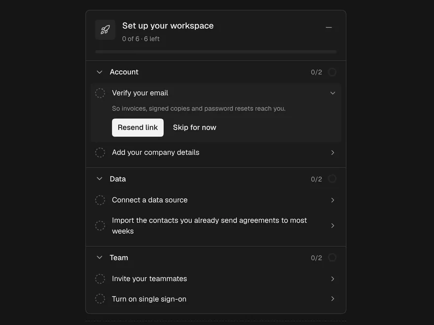
Onboarding checklist for new accounts.
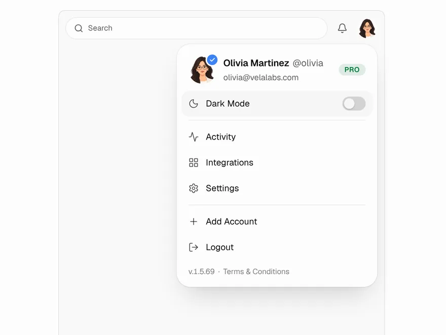 Pro
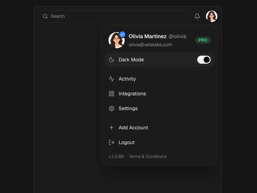
Profile Menu
Account menu behind the user avatar.
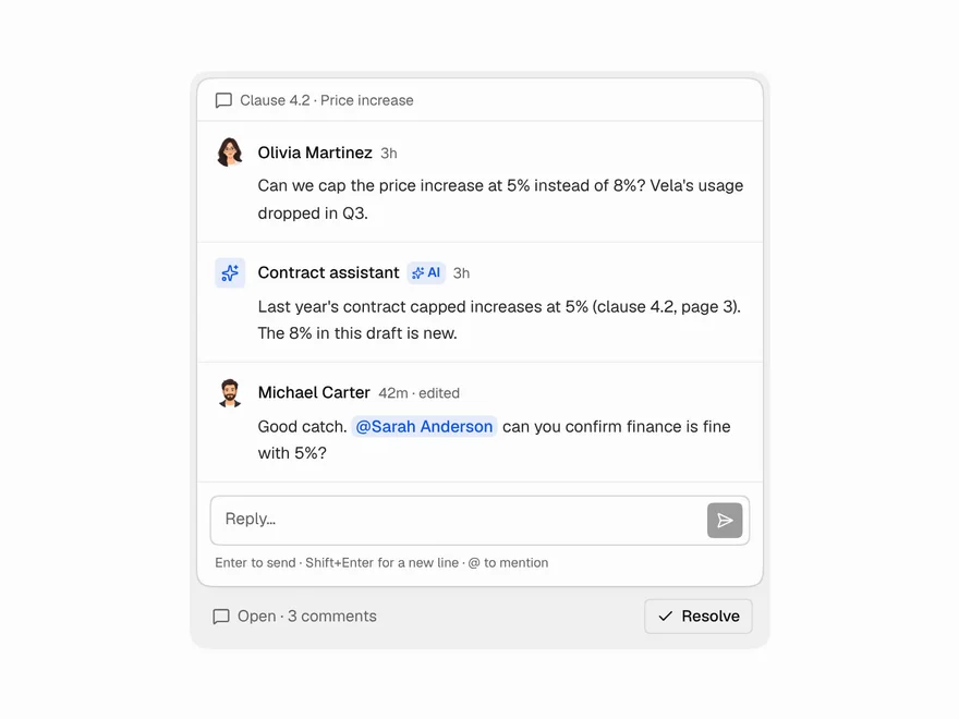 Pro
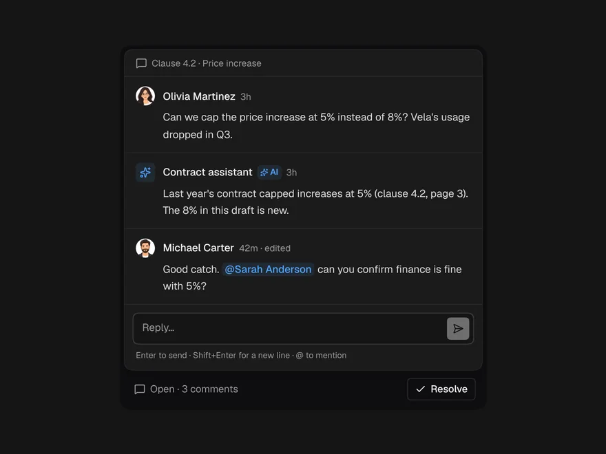
Comment Thread
Comment thread with replies, mentions and resolve.