Setup Guide
The onboarding checklist for a new account, ticked by your app, not by a checkbox.
PROGet Setup Guide and 168 other Pro components with pro lifetime — Get Pro
- Category
- Workspace
- Access
- ProPro · unlocked
- Source
- 645 lines · one file
- States
- 7 drawn
- Added
- 21 Oct 2026
The decision inside it
Done comes from your app
A checklist people can tick themselves fills up with things that never happened. Here a step is done when your props say so. The person can skip a step instead, and a skip counts toward finishing but is always drawn as skipped, never as done.
When to use it
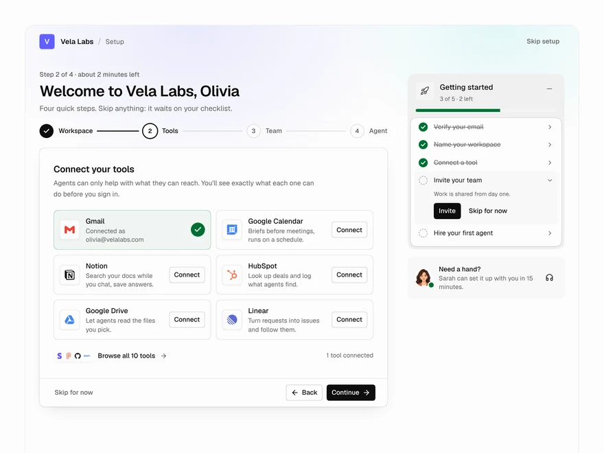
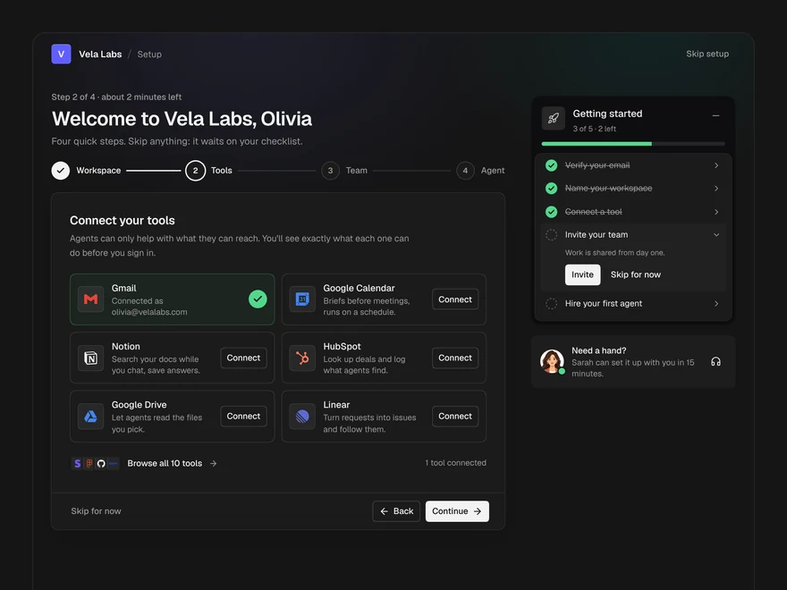
Use Setup Guide for a new account's onboarding checklist. Pass done from your own data, so a step is ticked only when the thing happened; people can Skip, which is shown as skipped. It can fold into a floating launcher.
Installation
How you get it
Paste this into Claude Code, Cursor, Codex or any coding agent. It installs the file and uses it as it is, instead of writing a new one.
Use Liro's Setup Guide for this.
Install it: npx shadcn@latest add @liro/setup-guide
(the @liro registry is set up in components.json, with LIRO_KEY in .env.local)
Import it from @/components/ui/setup-guide.
Do not rewrite or restyle it. Pass my data through its props
and keep its built-in states.
For the full brief with every prop and the mistakes assistants usually make, use Copy prompt above. Pro components install through the @liro registry with your CLI token: see the Namespaced tab.
Usage
import { SetupGuide, type SetupStep } from "@/components/ui/setup-guide";

export function OnboardingChecklist({ user, go }: {
  user: { emailVerified: boolean; hasSource: boolean; invited: boolean };
  go: (id: string) => void;
}) {
  const steps: SetupStep[] = [
    { id: "verify", group: "account", title: "Verify your email", why: "So invoices reach you.", actionLabel: "Resend link", done: user.emailVerified },
    { id: "source", group: "data", title: "Connect a source", why: "Your first sync starts here.", actionLabel: "Connect", done: user.hasSource },
    { id: "invite", group: "team", title: "Invite a teammate", actionLabel: "Invite", done: user.invited },
  ];
  return (
    <SetupGuide
      steps={steps}
      groups={[{ id: "account", title: "Account" }, { id: "data", title: "Data" }, { id: "team", title: "Team" }]}
      onAction={go}
    />
  );
}
API reference
“Copy prompt” above puts a full brief on your clipboard, install command, dependencies, props, and the mistakes an assistant usually makes with this component.
Props
Read from the component’s own TypeScript interface when the site is built, so this table cannot drift from the file you install.
| Type | Notes | ||
|---|---|---|---|
steps | SetupStep[] | Yes | – |
groups | SetupGroup[] | No | Order and titles of the groups. Steps without a group go in one list. |
title | React.ReactNode | No | The heading. Default "Set up your workspace". |
onAction | (id: string) => void | Promise<void> | No | May return a promise; the button shows it working and any error inline. |
skipped | string[] | No | Skipped step ids. Controlled when given. |
defaultSkipped | string[] | No | – |
onSkippedChange | (skipped: string[], changed: { id: string; skipped: boolean }) => void | Promise<void> | No | May return a promise; the list waits for it before it changes. |
docked | boolean | No | Folded into the launcher. Controlled when given. |
defaultDocked | boolean | No | – |
onDockedChange | (docked: boolean) => void | No | – |
onDismiss | () => void | No | Shown once everything is done or skipped. Leave out to hide Dismiss. |
floating | boolean | No | Fix the panel and the launcher to the bottom right of the screen. |
look | Look | No | Layered sets the steps on a card in a tray, the title and progress above. Flat is one card. |
Dependencies
npm packages
clsxframer-motionlucide-reacttailwind-mergeLiro foundations, installed alongside it
liro-themebuttonStates
All of them are drawn by the component. None is left for you to design.
- Fresh account
- Half done
- Skipped step
- Action running
- Action failed
- Docked
- All done
Accessibility
- Keyboard reachable throughout, in visual order
- Focus trapped in overlays, Escape closes them
- Focus returns to whatever opened it
- Live regions announce what changed, not that something did
- Honours prefers-reduced-motion
Responsive behavior
- Sizes to its container, not the viewport
- Usable from 320px up
- Pointer-based interaction, so trackpad and touch both work
- No hover-only affordances
Used in a screenAll screens
More like Setup Guide
All Workspace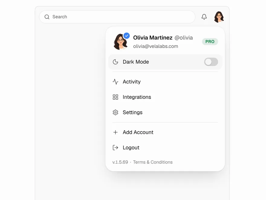 Pro
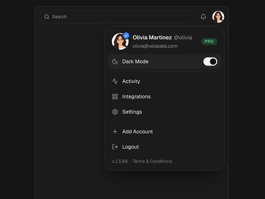
Profile Menu
Account menu behind the user avatar.
 Pro
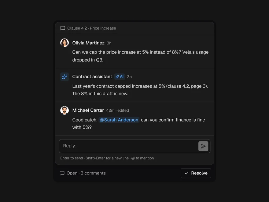
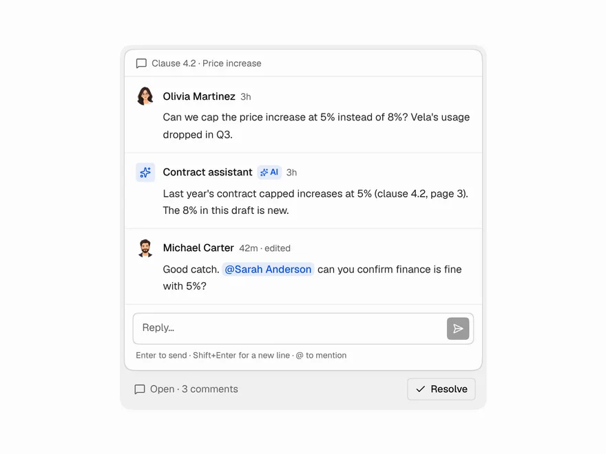
Comment Thread
Comment thread with replies, mentions and resolve.
 BlockPro
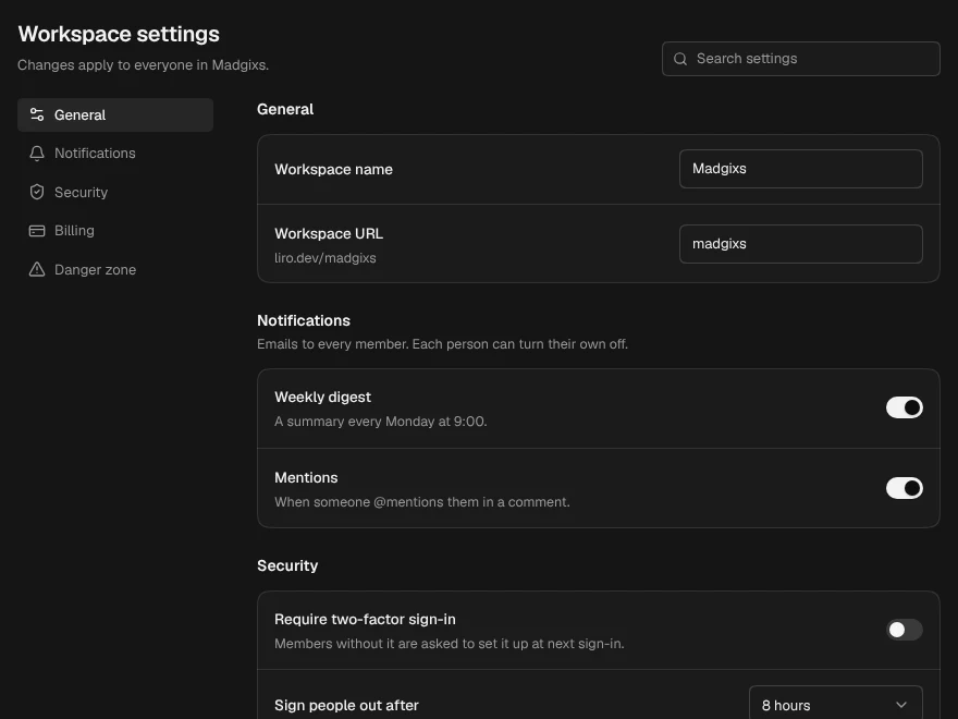
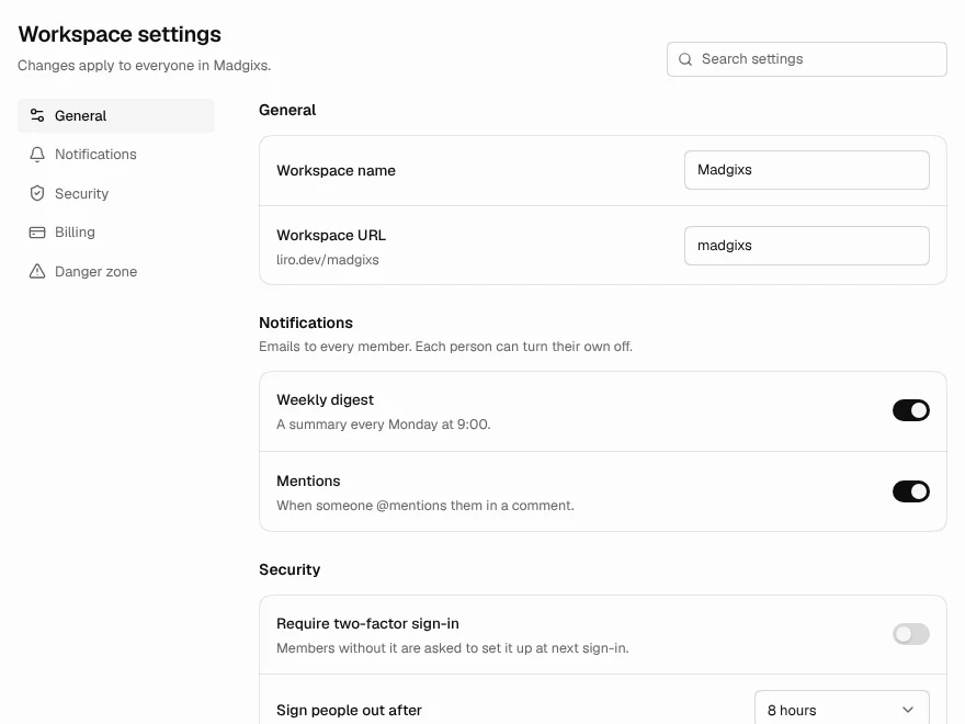
Settings Page
Settings page with sections, search and save bar.
 NewPro
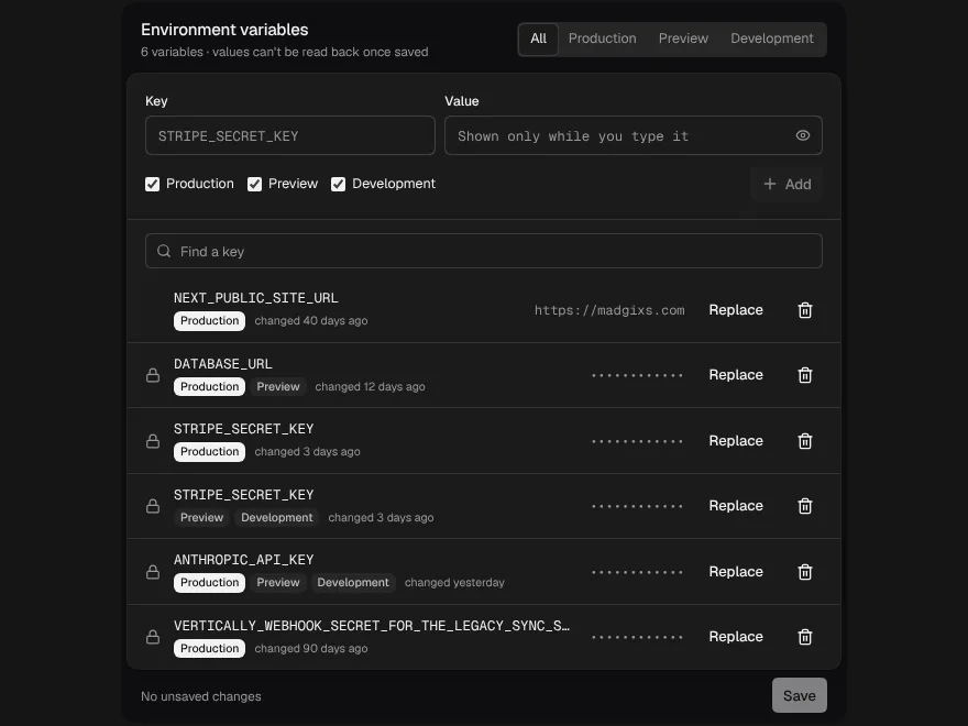
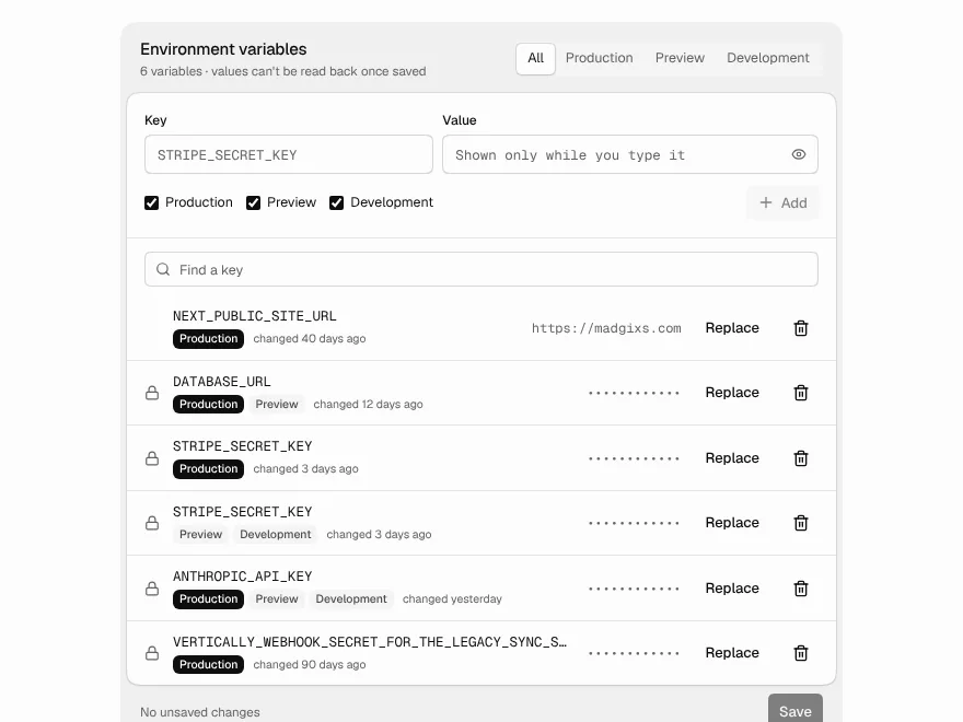
Env Variables
Environment variables per environment, write-only values, and a reminder to redeploy.
 NewPro
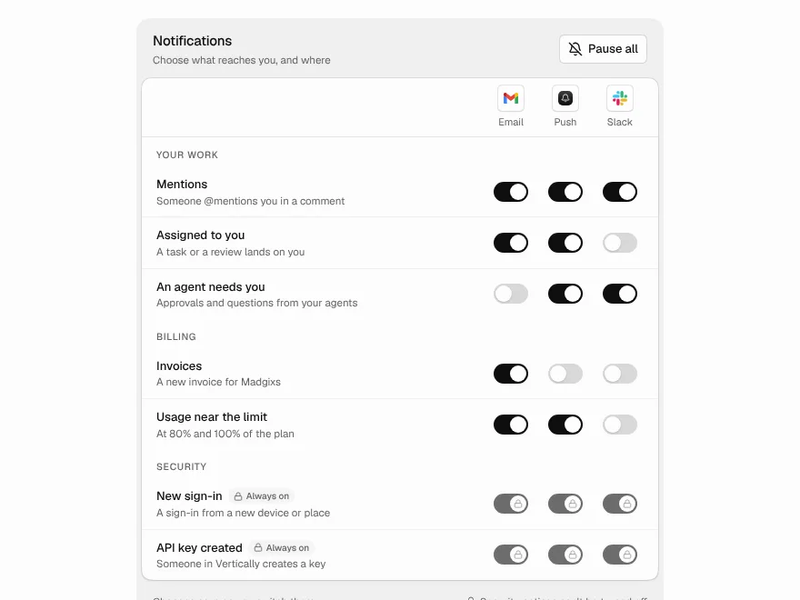
Notification Preferences
What reaches you and where: a switch per notice and channel, and a pause with an end.
 Free
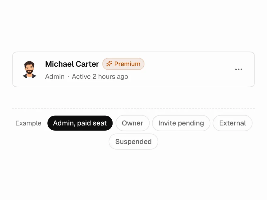
Member Card
Team member row with role and actions.