Filter Builder
Build table filters row by row and read them back as one plain sentence.
PROGet Filter Builder and 168 other Pro components with pro lifetime — Get Pro
- Category
- Data Tables
- Access
- ProPro · unlocked
- Source
- 714 lines · one file
- States
- 7 drawn
The decision inside it
An unfinished row is not an error
A new row has no value yet, and treating that as a failed condition would empty the table the moment someone clicks Add filter. So an unfinished row gets a dashed edge, stays out of the sentence and the count, and applyFilter ignores it. The table only changes when a condition means something.
When to use it
Use Filter Builder for "where" conditions on any list: sentence-like rows joined by And or Or, one nested group, the right value editor per field type and a live count. applyFilter filters your rows with the same rules on the client.
Installation
How you get it
Paste this into Claude Code, Cursor, Codex or any coding agent. It installs the file and uses it as it is, instead of writing a new one.
Use Liro's Filter Builder for this.
Install it: npx shadcn@latest add @liro/filter-builder
(the @liro registry is set up in components.json, with LIRO_KEY in .env.local)
Import it from @/components/ui/filter-builder.
Do not rewrite or restyle it. Pass my data through its props
and keep its built-in states.
For the full brief with every prop and the mistakes assistants usually make, use Copy prompt above. Pro components install through the @liro registry with your CLI token: see the Namespaced tab.
Usage
import * as React from "react";
import { FilterBuilder, applyFilter, type FilterField, type FilterGroup } from "@/components/ui/filter-builder";

type Deal = { name: string; amount: number; stage: string };

const fields: FilterField<Deal>[] = [
  { id: "name", label: "Name", type: "text" },
  { id: "amount", label: "Amount", type: "number", prefix: "$" },
  { id: "stage", label: "Stage", type: "select", options: [{ value: "won", label: "Won" }, { value: "open", label: "Open" }] },
];

export function DealFilters({ deals, onFiltered }: { deals: Deal[]; onFiltered: (rows: Deal[]) => void }) {
  const [filter, setFilter] = React.useState<FilterGroup>({ id: "root", conjunction: "and", items: [] });
  const matches = applyFilter(deals, filter, fields);
  React.useEffect(() => onFiltered(matches), [matches, onFiltered]);
  return <FilterBuilder fields={fields as FilterField<unknown>[]} value={filter} onChange={setFilter} resultCount={matches.length} noun="deal" />;
}
API reference
“Copy prompt” above puts a full brief on your clipboard, install command, dependencies, props, and the mistakes an assistant usually makes with this component.
Props
Read from the component’s own TypeScript interface when the site is built, so this table cannot drift from the file you install.
| Type | Notes | ||
|---|---|---|---|
fields | FilterField[] | Yes | What can be filtered, in the order it is offered. |
value | FilterGroup | No | The filter, when you hold it. |
defaultValue | FilterGroup | No | The filter to start with, when you do not. |
onChange | (filter: FilterGroup) => void | No | Called with the filter on every edit, or once per Apply when `onApply` is set. |
onApply | (filter: FilterGroup) => void | Promise<void> | No | Adds Apply and Cancel and keeps edits as a draft until Apply. Return a promise to show it working; reject to show the error. |
resultCount | React.ReactNode | ((filter: FilterGroup) => React.ReactNode) | No | What the filter leaves: "12 of 48 deals". A function is given the filter being edited, drafts included. Numbers in a string tick when they change. |
maxDepth | number | No | How deep groups may nest. 1 turns groups off. Default 2. |
noun | string | No | What is being filtered, in the plural, for the empty state: "deals". Default "rows". |
Dependencies
npm packages
clsxdate-fnsframer-motionlucide-reacttailwind-mergeLiro foundations, installed alongside it
liro-themebuttoncomboboxdate-pickerinputsegmented-controlselectstateStates
All of them are drawn by the component. None is left for you to design.
- With conditions
- Nested group
- Unfinished condition
- No matches
- Empty
- Draft with Apply
- Apply failed
Accessibility
- Keyboard reachable throughout, in visual order
- Focus trapped in overlays, Escape closes them
- Focus returns to whatever opened it
- Live regions announce what changed, not that something did
- Honours prefers-reduced-motion
Responsive behavior
- Sizes to its container, not the viewport
- Usable from 320px up
- Pointer-based interaction, so trackpad and touch both work
- No hover-only affordances
Used in a screenAll screens
More like Filter Builder
All Data Tables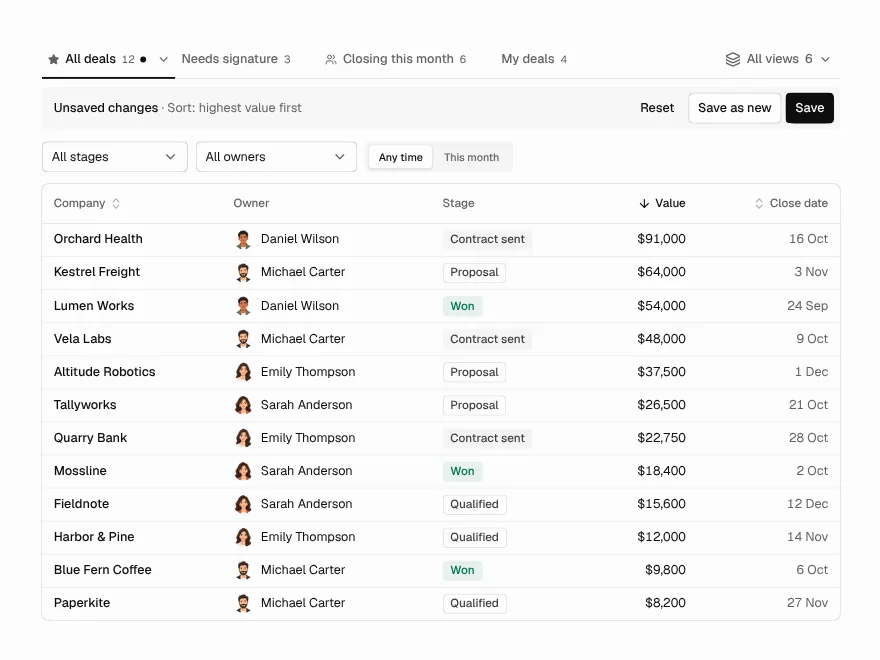 Pro
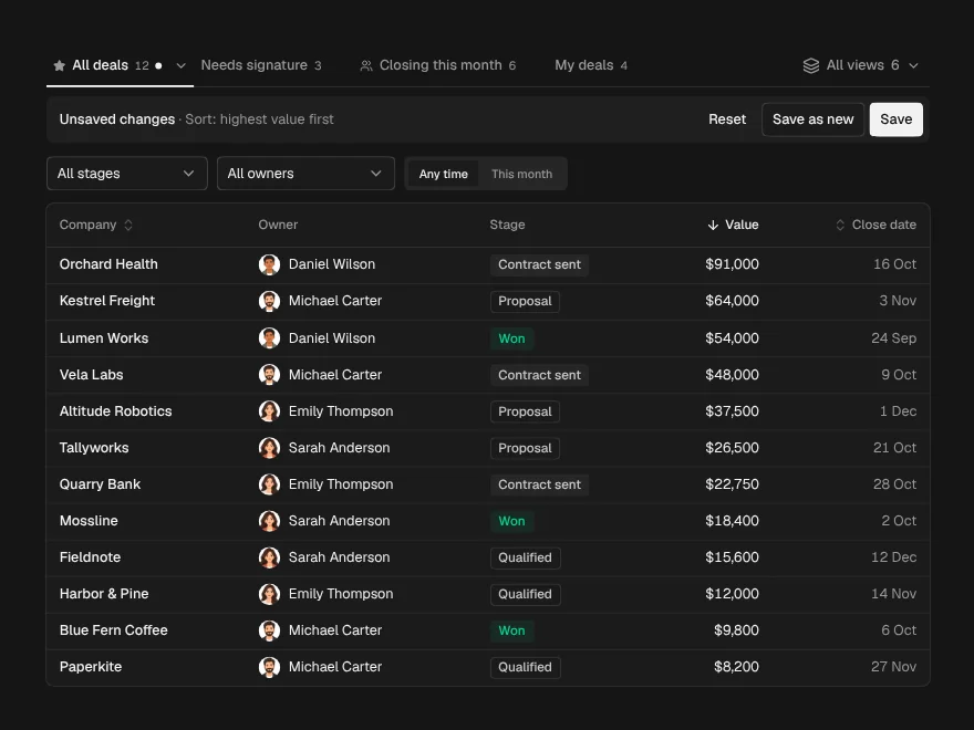
Saved Views
Saved, shareable views above a data table.
 Pro
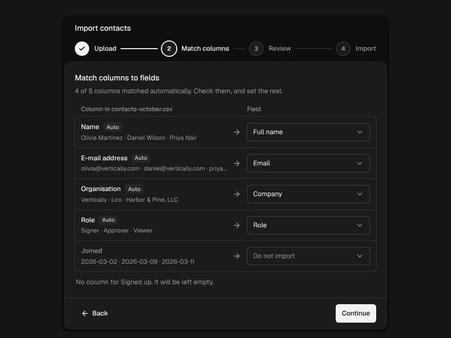
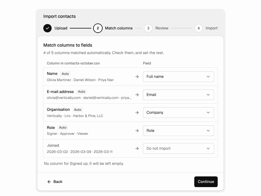
Data Import
CSV import with column mapping and fixes.
 BlockPro
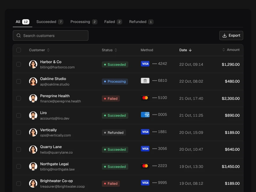
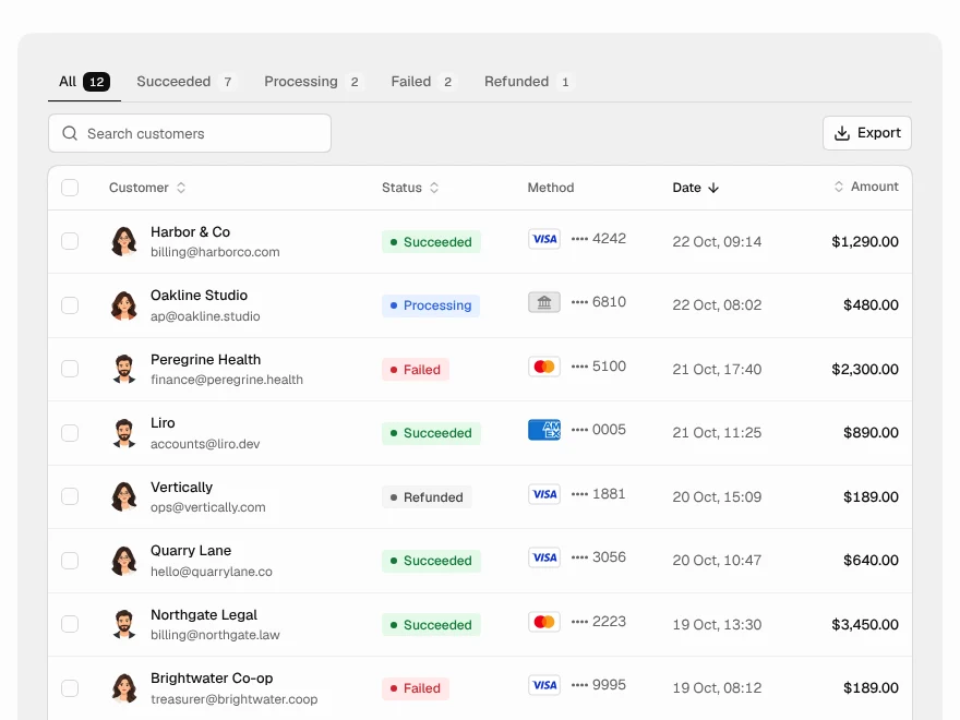
Payments Table
Payments table with status tabs and refunds.
 BlockPro
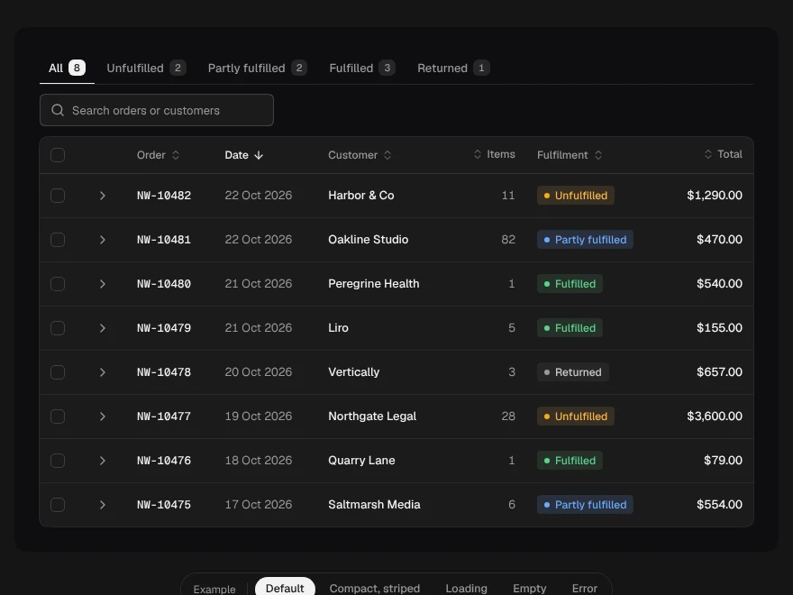
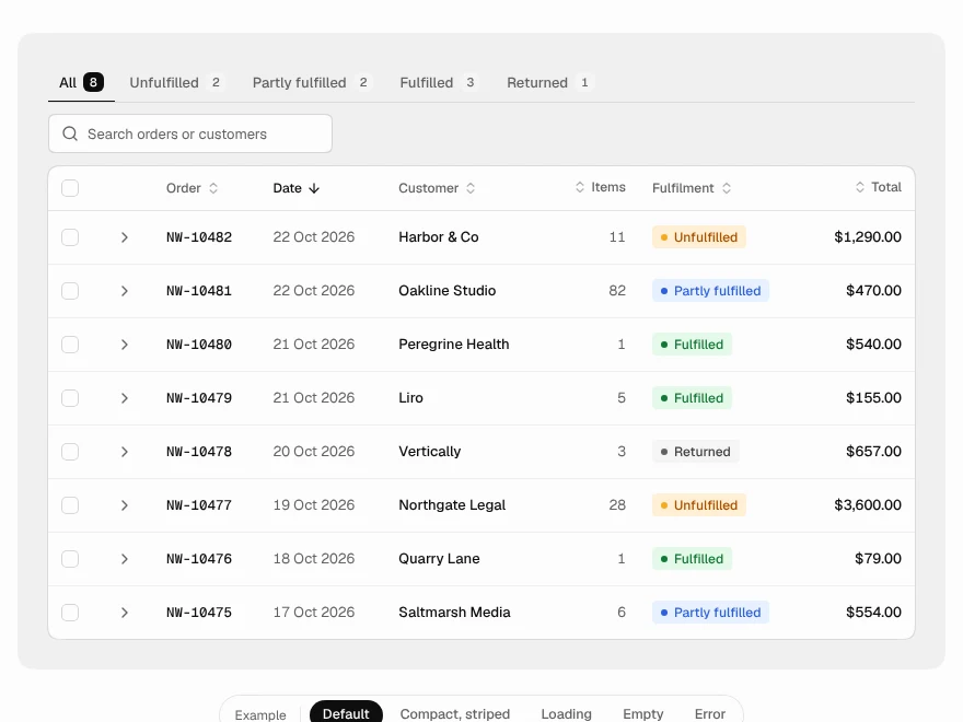
Orders Table
Orders table with status and expandable line items.
 BlockPro
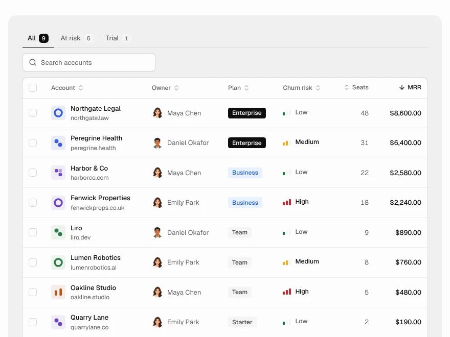
Customers Table
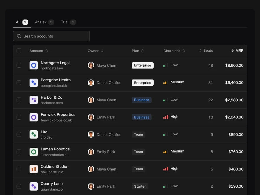
Customers table with MRR, plan and churn risk.
 BlockPro
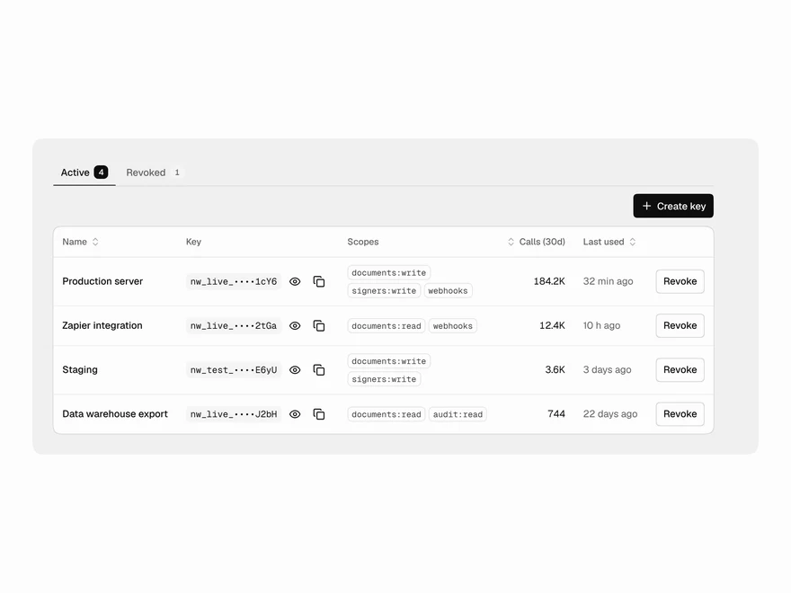
API Keys Table
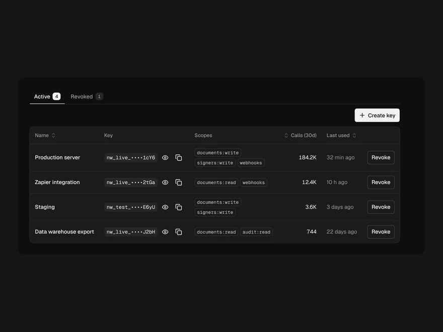
API keys table with scopes, usage and revoke.