Carousel
Slides you swipe, drag, click or arrow through, one or several at a time.
- Category
- Data & feedback
- Access
- Free with an account
- Source
- 299 lines · one file
- States
- 5 drawn
The decision inside it
Autoplay always stops
It pauses while the pointer is over it or focus is inside, never autoplays with reduced motion, and always has a pause button: movement people cannot stop fails WCAG.
When to use it
Use Carousel for a row of similar items people browse one or a few at a time: testimonials, screenshots, product cards. Pass the slides as children. For a full-screen photo view use Lightbox.
Installation
How you get it
Paste this into Claude Code, Cursor, Codex or any coding agent. It installs the file and uses it as it is, instead of writing a new one.
Use Liro's Carousel for this.
Install it: npx shadcn@latest add @liro/carousel
(the @liro registry is set up in components.json, with LIRO_KEY in .env.local)
Import it from @/components/ui/carousel.
Do not rewrite or restyle it. Pass my data through its props
and keep its built-in states.
For the full brief with every prop and the mistakes assistants usually make, use Copy prompt above. Free components install through the @liro registry with your CLI token: see the Namespaced tab.
Usage
import { Carousel } from "@/components/ui/carousel";

export function Testimonials({ quotes }: { quotes: { id: string; text: string; who: string }[] }) {
  return (
    <Carousel aria-label="Testimonials" slidesPerView={{ base: 1, md: 2 }} gap={16} loop>
      {quotes.map((q) => (
        <figure key={q.id} className="rounded-2xl border p-6">
          <blockquote>{q.text}</blockquote>
          <figcaption className="mt-3 text-sm text-muted-foreground">{q.who}</figcaption>
        </figure>
      ))}
    </Carousel>
  );
}
API reference
“Copy prompt” above puts a full brief on your clipboard, install command, dependencies, props, and the mistakes an assistant usually makes with this component.
Props
Read from the component’s own TypeScript interface when the site is built, so this table cannot drift from the file you install.
| Type | Notes | ||
|---|---|---|---|
children | React.ReactNode | Yes | The slides. Each child is one slide. |
index | number | No | The first visible slide. Controlled. |
defaultIndex | number | No | The starting slide when uncontrolled. Default 0. |
onIndexChange | (index: number) => void | No | Called with the new first visible slide. |
slidesPerView | number | { base: number; md?: number; lg?: number } | No | Slides visible at once, or by the carousel's width: base, md (560px+), lg (840px+). Default 1. |
gap | number | No | Space between slides in pixels. Default 16. |
loop | boolean | No | After the last slide, go back to the first. Default false. |
autoplay | number | false | No | Milliseconds between slides, or false. Default false. |
showArrows | boolean | No | Previous and next buttons. Default true. |
showDots | boolean | No | A dot per position. Default true. |
orientation | "horizontal" | "vertical" | No | Vertical needs a height on the carousel (className). Default horizontal. |
Dependencies
npm packages
clsxframer-motionlucide-reacttailwind-mergeLiro foundations, installed alongside it
liro-themeStates
All of them are drawn by the component. None is left for you to design.
- One at a time
- Several
- Dragging
- Autoplay
- Paused
Accessibility
- Keyboard reachable throughout, in visual order
- Focus trapped in overlays, Escape closes them
- Focus returns to whatever opened it
- Live regions announce what changed, not that something did
- Honours prefers-reduced-motion
Responsive behavior
- Sizes to its container, not the viewport
- Usable from 320px up
- Pointer-based interaction, so trackpad and touch both work
- No hover-only affordances
More like Carousel
All Data & feedback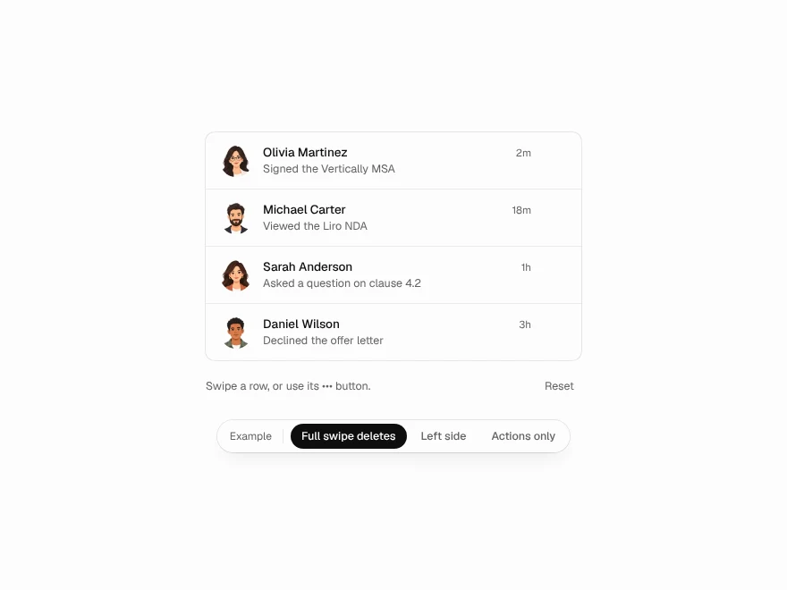 Pro
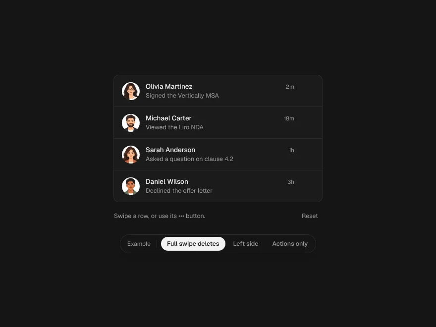
Swipe to Delete
Swipe-to-delete list row.
 Free
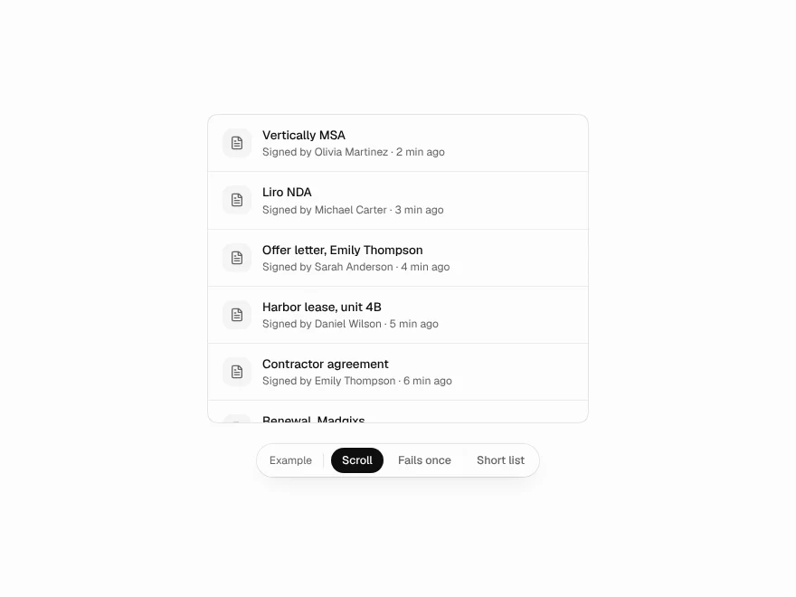
Infinite Scroll
Infinite scroll list with loading states.
 Pro
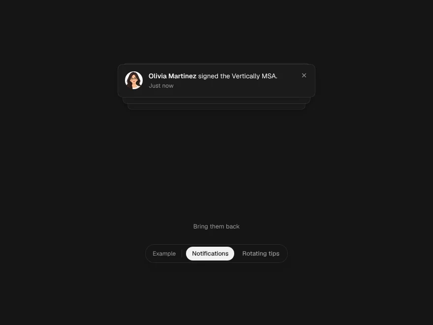
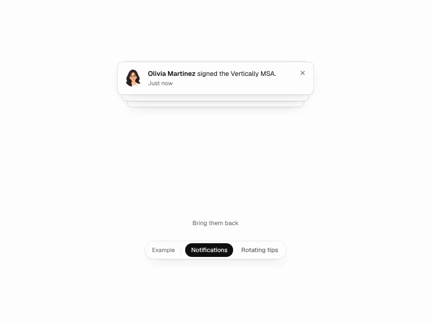
Stacked Cards
Stacked notification cards that fan out.
 Pro
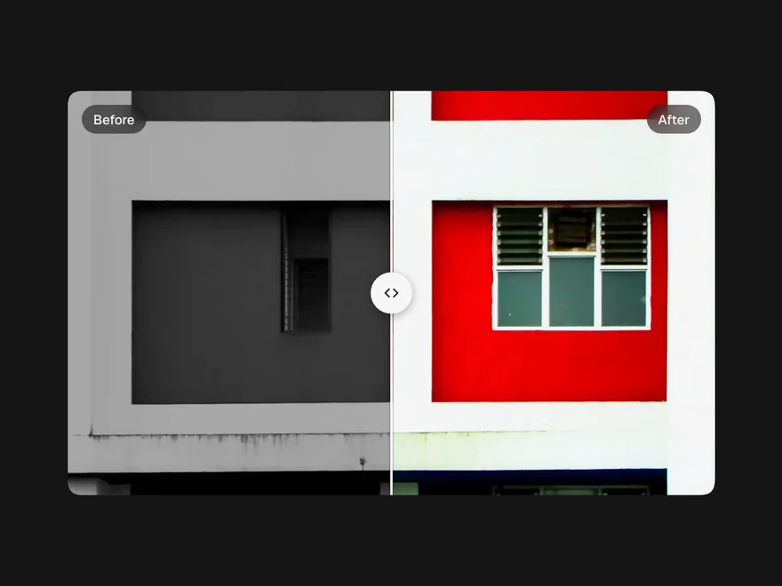
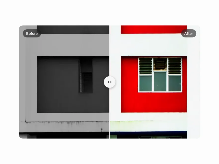
Image Compare
Before and after image comparison slider.
 NewFree
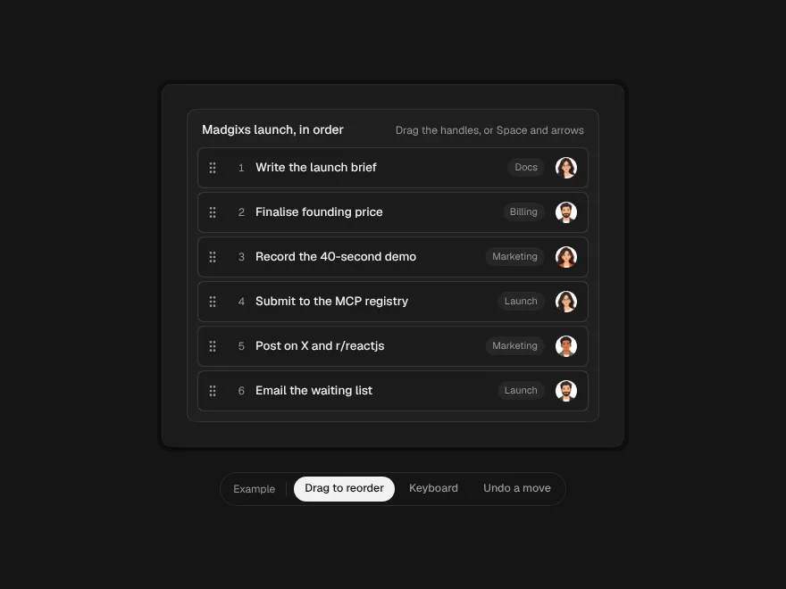
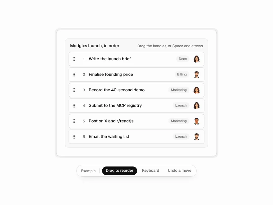
Sortable List
A list you reorder by dragging its handles or with the keyboard, with every move undoable.
 NewFree
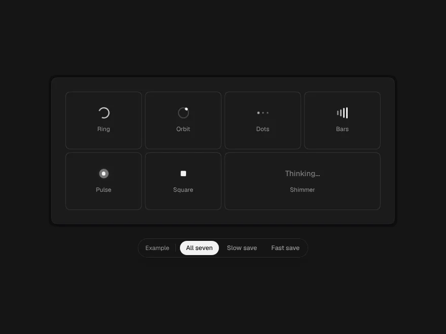
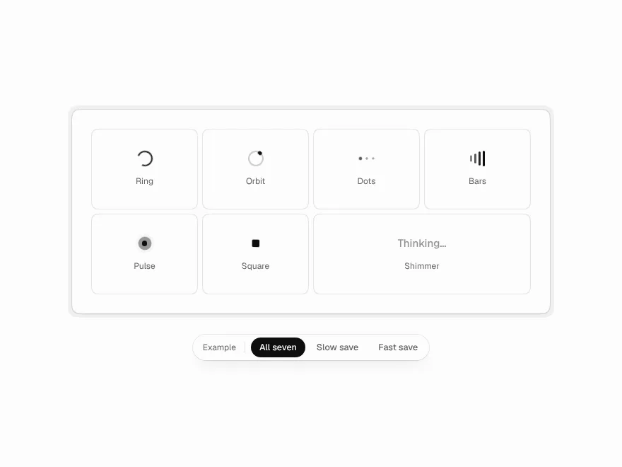
Loaders
Seven small loaders and a hook that stops quick replies from flashing a spinner.