Cancel & Downgrade
Dates first, the button in plain sight, and typing only for deleting now.
PROGet Cancel & Downgrade and 168 other Pro components with pro lifetime — Get Pro
- Category
- Billing
- Access
- ProPro · unlocked
- Source
- 423 lines · one file
The decision inside it
No maze, one hard confirmation
Cancel is a visible button, not a link hidden under three retention screens. The only thing that asks for the workspace name is deleting everything today, because that is the only part that cannot be undone.
When to use it
Use Cancel & Downgrade for the cancel flow: what happens and when (read-only from, deleted on), an optional pause instead, a reason, and keep or cancel. Export of data comes first when you pass onExport.
Installation
How you get it
Paste this into Claude Code, Cursor, Codex or any coding agent. It installs the file and uses it as it is, instead of writing a new one.
Use Liro's Cancel & Downgrade for this.
Install it: npx shadcn@latest add @liro/cancel-subscription
(the @liro registry is set up in components.json, with LIRO_KEY in .env.local)
Import it from @/components/ui/cancel-subscription.
Do not rewrite or restyle it. Pass my data through its props
and keep its built-in states.
For the full brief with every prop and the mistakes assistants usually make, use Copy prompt above. Pro components install through the @liro registry with your CLI token: see the Namespaced tab.
Usage
import { CancelSubscription } from "@/components/ui/cancel-subscription";

export function Cancel({ cancel, keep }: { cancel: () => Promise<void>; keep: () => void }) {
  return (
    <CancelSubscription
      planName="Team"
      endsOn="14 Nov"
      deletesOn="14 Dec"
      workspaceName="Madgixs"
      reasons={["Too expensive", "Missing a feature", "Switching tools"]}
      onCancel={cancel}
      onKeep={keep}
    />
  );
}
API reference
“Copy prompt” above puts a full brief on your clipboard, install command, dependencies, props, and the mistakes an assistant usually makes with this component.
Props
Read from the component’s own TypeScript interface when the site is built, so this table cannot drift from the file you install.
| Type | Notes | ||
|---|---|---|---|
planName | string | Yes | – |
endsOn | string | Yes | The last day of the paid period. Everything works until then. |
deletesOn | string | No | When the data is deleted after the period ends. Omit if it never is. |
readOnlyMeans | string | No | What read-only means for this product, in a sentence. |
workspaceName | string | No | Required to delete now: the name the customer types to confirm. |
pause | { label: string; detail: string; onPause: () => void } | No | Offer a pause. Omit on plans that cannot be paused. |
reasons | string[] | No | Reasons to offer. Optional for the customer, always. |
onCancel | (opts: { reason?: string; deleteNow: boolean }) => void | No | – |
onKeep | () => void | No | – |
onResume | () => void | No | – |
onExport | () => void | No | – |
look | Look | No | Layered sets the form on a card in a tray, the title above and the buttons in the strip below. Flat is one card. |
Dependencies
npm packages
clsxframer-motionlucide-reacttailwind-mergeLiro foundations, installed alongside it
liro-themeAccessibility
- Keyboard reachable throughout, in visual order
- Focus trapped in overlays, Escape closes them
- Focus returns to whatever opened it
- Live regions announce what changed, not that something did
- Honours prefers-reduced-motion
Responsive behavior
- Sizes to its container, not the viewport
- Usable from 320px up
- Pointer-based interaction, so trackpad and touch both work
- No hover-only affordances
More like Cancel & Downgrade
All Billing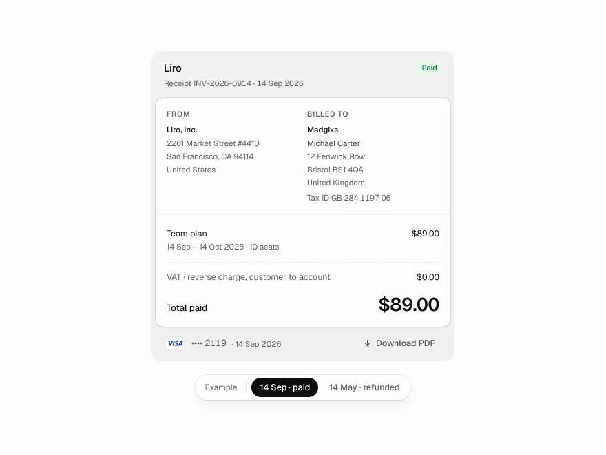 Pro
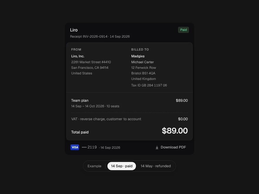
Receipt
Printable payment receipt with refunds.
 Pro
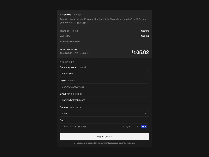
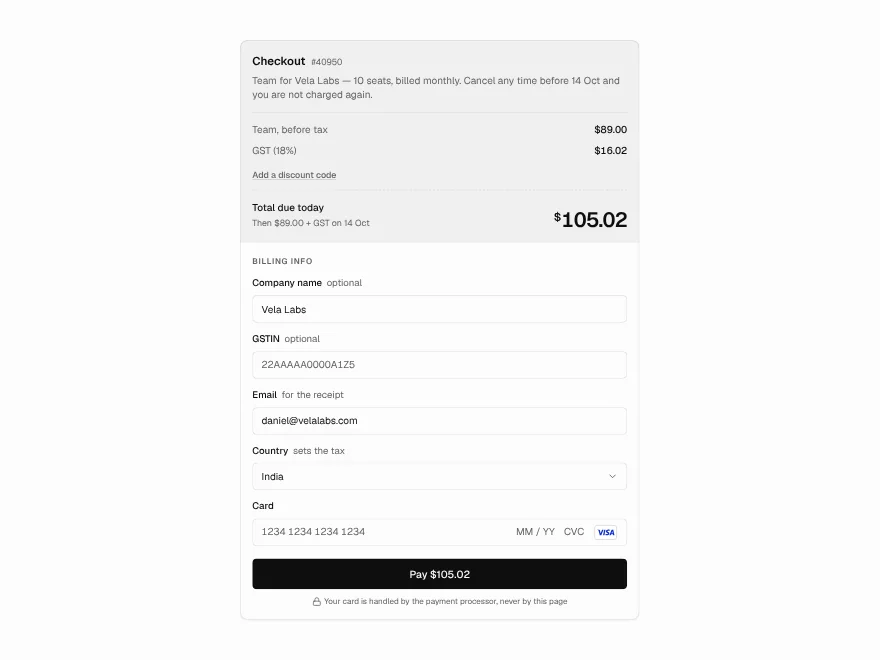
Checkout
Checkout form with tax and discount code.
 Pro
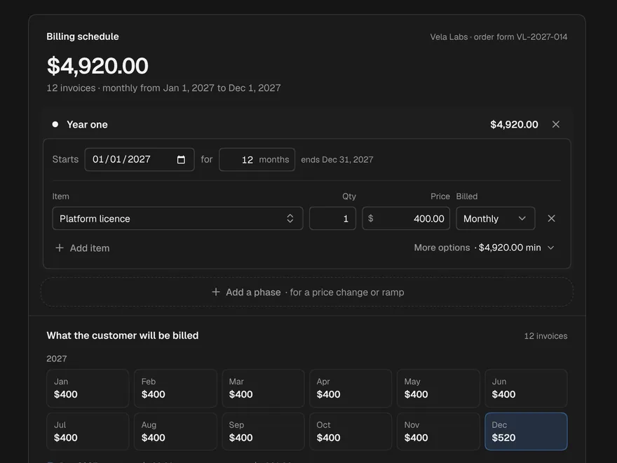
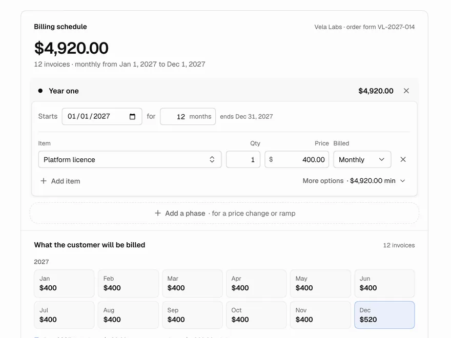
Billing Schedule
Build contract billing phases and invoices.
 Pro
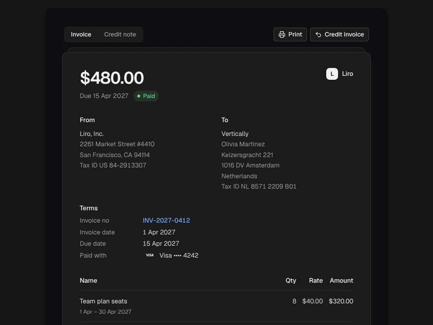
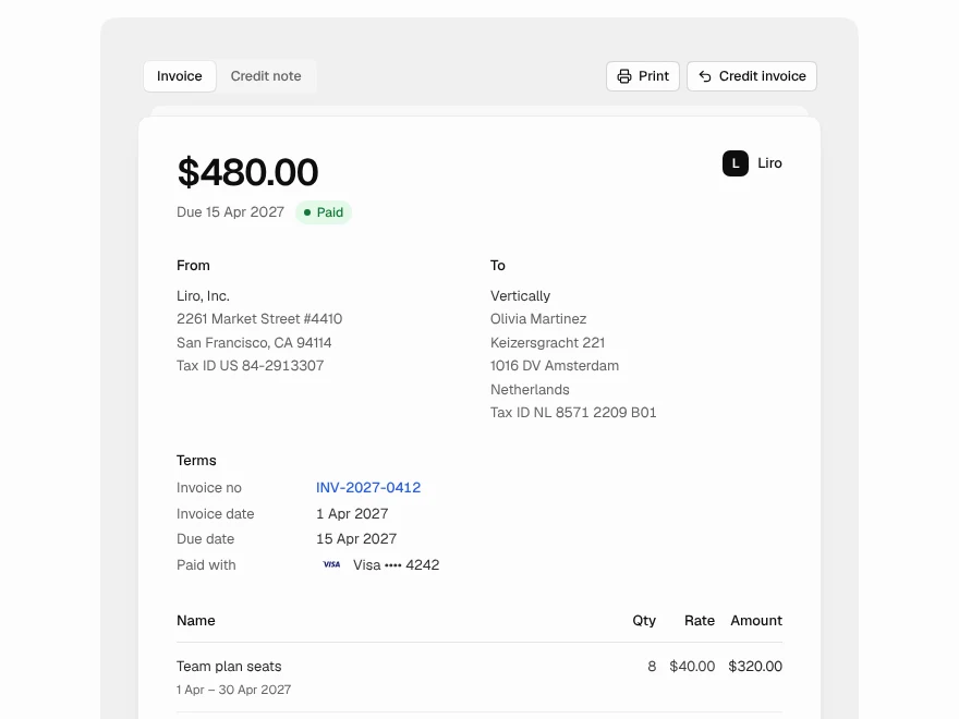
Invoice + Credit Note
Invoice with a credit note side by side.
 Pro
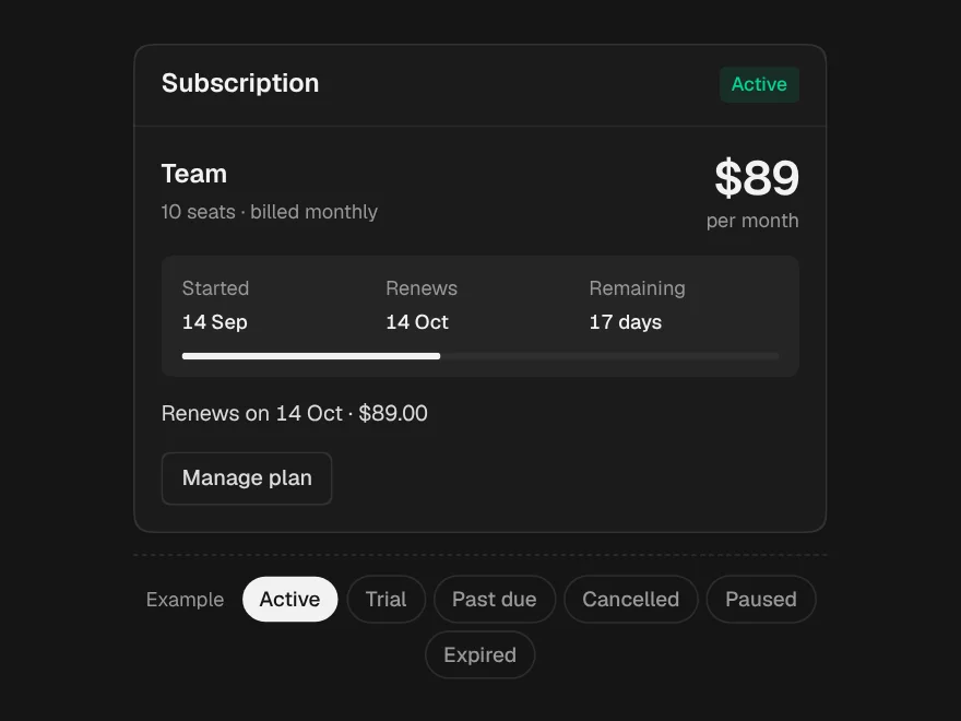
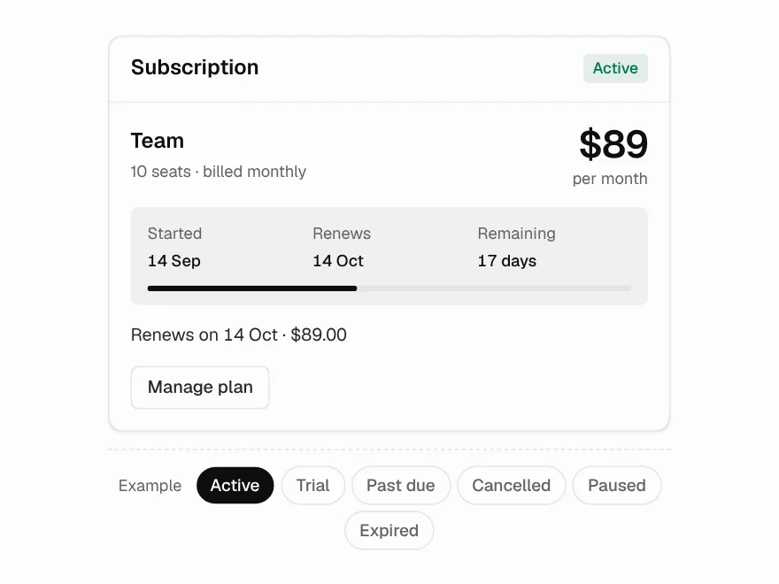
Subscription Status
Subscription status card for every plan state.
 Pro
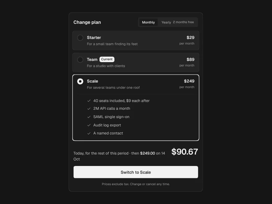
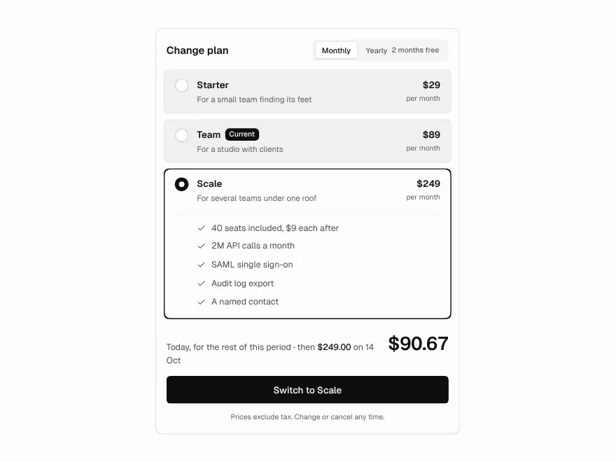
Plan Picker
Plan picker that shows the exact charge.