App Shell
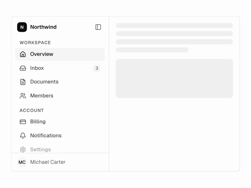
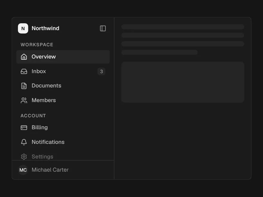
The frame every app screen sits in: sidebar, workspace switcher, nav, projects, top bar and ⌘K.
PROGet App Shell and 168 other Pro components with pro lifetime — Get Pro
- Category
- Navigation & layout
- Access
- ProPro · unlocked
- Source
- 580 lines · one file
- States
- 5 drawn
- Kind
- Block
The decision inside it
Every page, three ways in
The sidebar, the rail's tooltips and ⌘K all read the same nav and sections, so a page added once is findable everywhere. A parent opens itself when one of its children is the current page, so the active row is never hidden in a closed group.
When to use it
Use App Shell for the frame around every screen of an app: workspace switcher, nav with sub-pages, project lists, a top bar for the page's header and the account menu, ⌘K search and ⌘B collapse. Use Sidebar on its own when you already have a layout and only need the navigation.
Installation
How you get it
Paste this into Claude Code, Cursor, Codex or any coding agent. It installs the file and uses it as it is, instead of writing a new one.
Use Liro's App Shell for this.
Install it: npx shadcn@latest add @liro/app-shell
(the @liro registry is set up in components.json, with LIRO_KEY in .env.local)
Import it from @/components/ui/app-shell.
Do not rewrite or restyle it. Pass my data through its props
and keep its built-in states.
For the full brief with every prop and the mistakes assistants usually make, use Copy prompt above. Pro components install through the @liro registry with your CLI token: see the Namespaced tab.
Usage
"use client";

import { usePathname, useRouter } from "next/navigation";
import * as React from "react";
import { FileText, Home, Inbox, Users } from "lucide-react";
import { AppShell } from "@/components/ui/app-shell";

export default function AppLayout({ children }: { children: React.ReactNode }) {
  const router = useRouter();
  const pathname = usePathname();
  return (
    <div className="h-dvh">
      <AppShell
        workspace={{ name: "Madgixs", meta: "Team plan" }}
        nav={[
          { label: "Overview", href: "/", icon: <Home /> },
          { label: "Inbox", href: "/inbox", icon: <Inbox />, badge: 3 },
          {
            label: "Documents",
            icon: <FileText />,
            children: [
              { label: "All documents", href: "/documents" },
              { label: "Drafts", href: "/documents/drafts" },
            ],
          },
          { label: "Members", href: "/members", icon: <Users /> },
        ]}
        sections={[{ title: "Projects", items: [{ label: "Fenwick Row lease", href: "/projects/fenwick" }] }]}
        user={{ name: "Michael Carter", email: "michael@madgixs.com" }}
        header={<span className="text-[13.5px] font-medium">Madgixs</span>}
        activeHref={pathname}
        onNavigate={(href) => router.push(href)}
      >
        {children}
      </AppShell>
    </div>
  );
}
API reference
“Copy prompt” above puts a full brief on your clipboard, install command, dependencies, props, and the mistakes an assistant usually makes with this component.
Props
Read from the component’s own TypeScript interface when the site is built, so this table cannot drift from the file you install.
| Type | Notes | ||
|---|---|---|---|
variant | "inset" | "flat" | No | "inset" (default) floats the page as a card; "flat" runs it edge to edge. |
workspace | { name: string; logo?: string; icon?: React.ReactNode; meta?: string } | Yes | The workspace you are in. Shown in the header, and as its mark in the rail. |
workspaces | Workspace[] | No | Other workspaces: turns the header into a Team Switcher. |
workspaceId | string | No | Id of the workspace you are in, when `workspaces` is passed. |
onWorkspaceChange | (id: string, workspace: Workspace) => void | No | – |
nav | AppShellNavItem[] | Yes | The main nav, without a heading. |
sections | AppShellSection[] | No | Headed groups under the nav: Projects, Favourites. |
user | ProfileUser | Yes | The signed-in person, opened as a Profile Menu from the top bar. |
profile | Omit<ProfileMenuProps, "user" | "variant"> | No | Passed to the Profile Menu: plan, theme, sign out, accounts. |
header | React.ReactNode | No | The page's own header in the top bar: a breadcrumb, a title, actions. |
sidebarFooter | React.ReactNode | No | Pinned to the foot of the sidebar: usage, an upgrade card. Hidden in the rail. |
activeHref | string | No | The current page. Without it the shell tracks the last row chosen. |
onNavigate | (href: string) => void | No | Called instead of following the link, for client-side routing. |
commands | AppShellCommand[] | No | Extra rows for ⌘K, under "Actions". |
collapsed | boolean | No | Collapsed to the icon rail. Controlled. |
defaultCollapsed | boolean | No | Collapsed on first render. Default false. |
onCollapsedChange | (collapsed: boolean) => void | No | – |
shortcuts | boolean | No | Listen for ⌘K and ⌘B. Default true; turn off when two shells share a page. |
sidebarWidth | number | No | Sidebar width in px. Default 248. |
label | string | No | Accessible name for the nav. Default "Main". |
children | React.ReactNode | Yes | – |
Dependencies
npm packages
clsxframer-motionlucide-reacttailwind-mergeLiro foundations, installed alongside it
liro-themecommandprofile-menusidebarteam-switchertooltipworkspace-markStates
All of them are drawn by the component. None is left for you to design.
- Inset
- Flat
- Collapsed to rail
- Phone drawer
- Command menu
Accessibility
- Keyboard reachable throughout, in visual order
- Focus trapped in overlays, Escape closes them
- Focus returns to whatever opened it
- Live regions announce what changed, not that something did
- Honours prefers-reduced-motion
Responsive behavior
- Sizes to its container, not the viewport
- Usable from 320px up
- Pointer-based interaction, so trackpad and touch both work
- No hover-only affordances
Used in screensAll screens
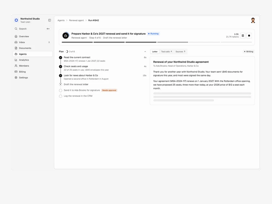
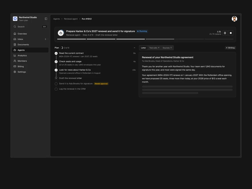
Agent Run
One agent run, live: its plan, every tool call, a pause for approval and the finished output.
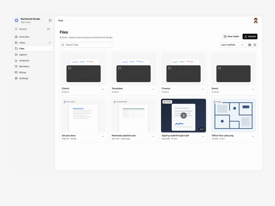
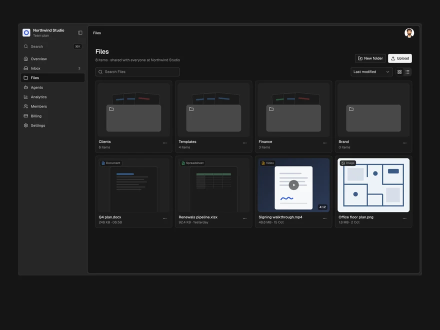
Files
A shared drive: folders and files in a grid or a list, drag to upload, rename, move and delete.
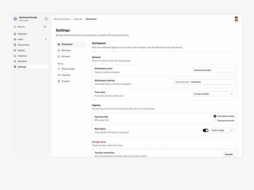
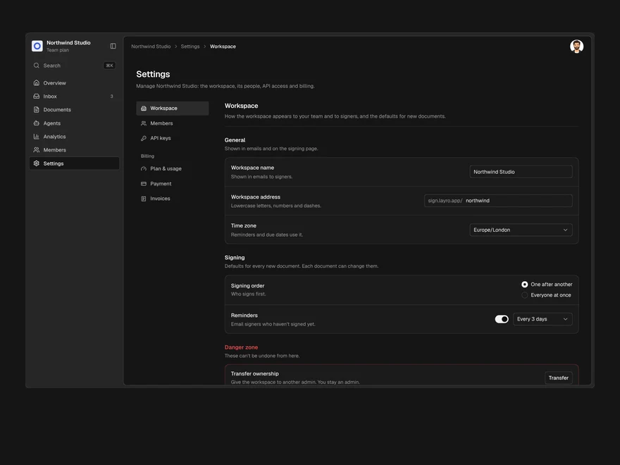
Settings & Billing
Workspace settings, members, API keys and billing in one page, with one save bar for every change.