Tag Input
Several values in one field as chips; a paste never loses one.
Type and press Enter or a comma, or paste a whole list. Each value becomes a chip, checked as it lands. Backspace and the arrow keys move through the chips, Enter edits one, and suggestions complete what you type.
- Category
- Forms
- Access
- Free with an account
- Source
- 450 lines · one file
- States
- 6 drawn
- Added
- 13 Nov 2026
The decision inside it
A paste never loses data
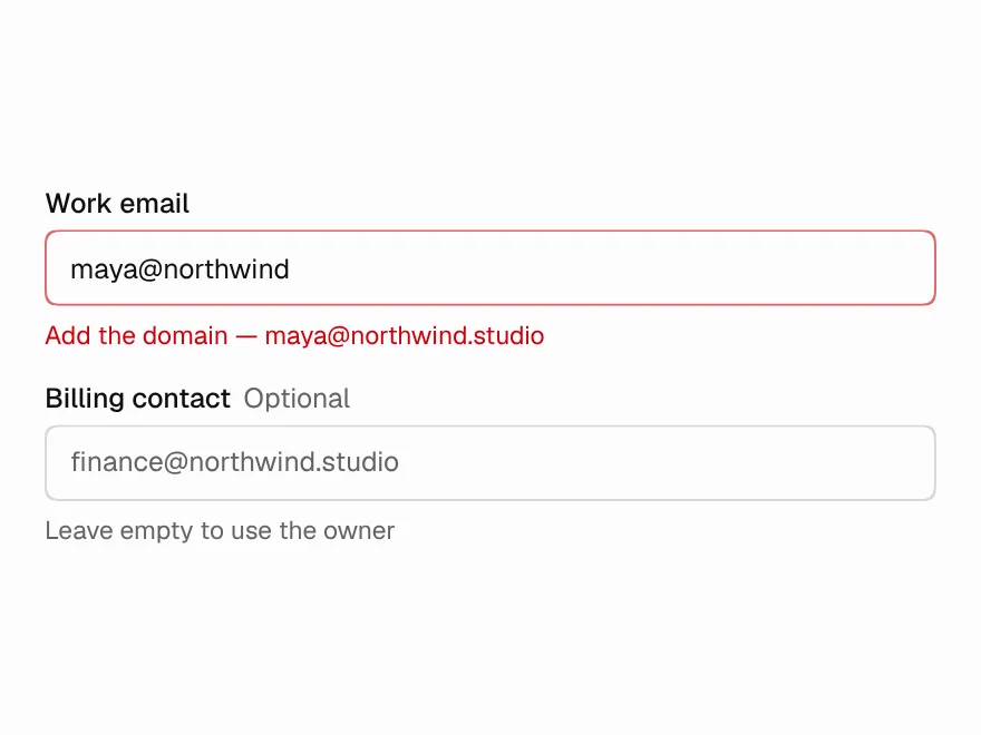
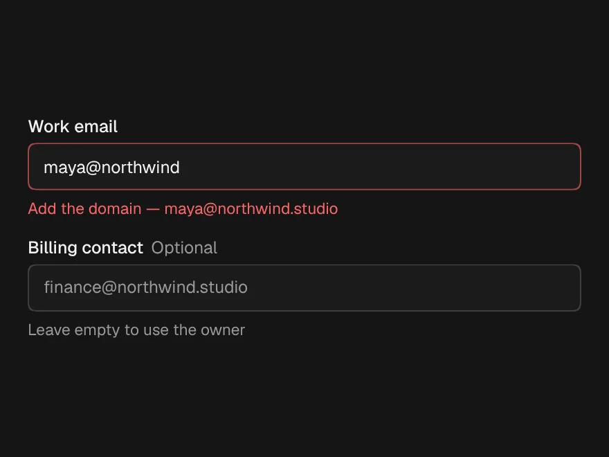
A pasted list splits on commas, new lines and tabs, duplicates are caught regardless of case and flash the chip that already has them, and values that fail the check stay in the field as red chips you can edit, with the reason. Over the limit, the values that didn't fit are listed, not silently cut.
When to use it
Use Tag Input for several values in one field (emails, labels, domains) where people paste lists. For picking from a fixed list use Combobox; for one value use Input.
Installation
How you get it
Paste this into Claude Code, Cursor, Codex or any coding agent. It installs the file and uses it as it is, instead of writing a new one.
Use Liro's Tag Input for this.
Install it: npx shadcn@latest add @liro/tag-input
(the @liro registry is set up in components.json, with LIRO_KEY in .env.local)
Import it from @/components/ui/tag-input.
Do not rewrite or restyle it. Pass my data through its props
and keep its built-in states.
For the full brief with every prop and the mistakes assistants usually make, use Copy prompt above. Free components install through the @liro registry with your CLI token: see the Namespaced tab.
Usage
import * as React from "react";
import { TagInput } from "@/components/ui/tag-input";

const isEmail = (v: string) => (/^[^\s@]+@[^\s@]+\.[a-z]{2,}$/i.test(v) ? undefined : "not an email address");

export function InviteField() {
  const [emails, setEmails] = React.useState<string[]>([]);
  return <TagInput label="Invite" value={emails} onChange={setEmails} validate={isEmail} normalize={(v) => v.trim().toLowerCase()} max={20} />;
}
API reference
“Copy prompt” above puts a full brief on your clipboard, install command, dependencies, props, and the mistakes an assistant usually makes with this component.
Props
Read from the component’s own TypeScript interface when the site is built, so this table cannot drift from the file you install.
| Type | Notes | ||
|---|---|---|---|
value | string[] | No | The valid values, controlled. |
defaultValue | string[] | No | The valid values to start with, uncontrolled. |
onChange | (values: string[]) => void | No | Called with the valid values whenever they change. |
validate | (value: string) => string | undefined | null | false | No | Returns why a value is wrong, or nothing when it is fine. |
max | number | No | The most values allowed. |
label | string | Yes | The field's label. Required: a chip field without one reads as nothing to a screen reader. |
hint | string | No | A short line under the field. |
placeholder | string | No | – |
suggestions | string[] | No | Completions shown while typing. |
caseSensitive | boolean | No | Treat "Ana" and "ana" as different values. Default false. |
disabled | boolean | No | – |
normalize | (value: string) => string | No | Rewrites a value before it is checked: trim and lower-case emails, say. Default: trim. |
Dependencies
npm packages
clsxframer-motionlucide-reacttailwind-mergeLiro foundations, installed alongside it
liro-themeStates
All of them are drawn by the component. None is left for you to design.
- Emails
- Pasted list
- Invalid values
- Over the limit
- Suggestions
- Disabled
Accessibility
- Keyboard reachable throughout, in visual order
- Focus trapped in overlays, Escape closes them
- Focus returns to whatever opened it
- Live regions announce what changed, not that something did
- Honours prefers-reduced-motion
Responsive behavior
- Sizes to its container, not the viewport
- Usable from 320px up
- Pointer-based interaction, so trackpad and touch both work
- No hover-only affordances