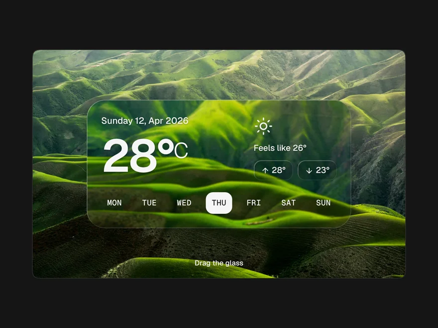
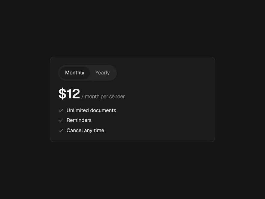
Spotlight Card
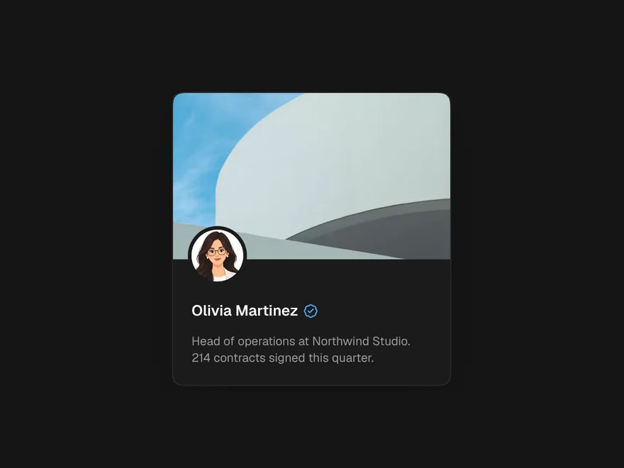
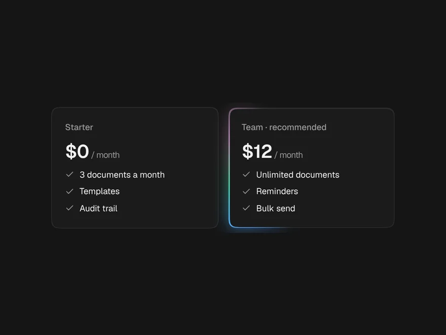
A card with a soft light that follows the pointer and lights the nearest edge.
PROGet Spotlight Card and 168 other Pro components with pro lifetime — Get Pro
- Category
- Creative
- Access
- ProPro · unlocked
- Source
- 135 lines · one file
- States
- 5 drawn
The decision inside it
No effect on touch
A finger has no hover, so on touch the card stays plain instead of flashing a light where it was tapped.
When to use it
Use Spotlight Card for feature or pricing cards that should respond to the pointer with a soft light and a lit edge. Render it as a link with as="a" when the whole card goes somewhere. For a card that tilts, use 3D Tilt Card.
Installation
How you get it
Paste this into Claude Code, Cursor, Codex or any coding agent. It installs the file and uses it as it is, instead of writing a new one.
Use Liro's Spotlight Card for this.
Install it: npx shadcn@latest add @liro/spotlight-card
(the @liro registry is set up in components.json, with LIRO_KEY in .env.local)
Import it from @/components/ui/spotlight-card.
Do not rewrite or restyle it. Pass my data through its props
and keep its built-in states.
For the full brief with every prop and the mistakes assistants usually make, use Copy prompt above. Pro components install through the @liro registry with your CLI token: see the Namespaced tab.
Usage
import { SpotlightCard } from "@/components/ui/spotlight-card";

export function FeatureCard() {
  return (
    <SpotlightCard as="a" href="/audit-trail" className="p-6">
      <h3 className="font-semibold">Audit trail</h3>
      <p className="text-sm text-muted-foreground">Every view, signature and download, stamped.</p>
    </SpotlightCard>
  );
}
API reference
“Copy prompt” above puts a full brief on your clipboard, install command, dependencies, props, and the mistakes an assistant usually makes with this component.
Props
Read from the component’s own TypeScript interface when the site is built, so this table cannot drift from the file you install.
| Type | Notes | ||
|---|---|---|---|
spotlightColor | string | No | The light's colour. Default the theme's foreground at low strength. |
radius | number | No | Radius of the light, in pixels. Default 320. |
borderGlow | boolean | No | Light the border near the pointer too. Default true. |
reveal | React.ReactNode | No | Decoration seen only inside the light, e.g. a pattern or an illustration. Hidden from screen readers. |
as | React.ElementType | No | The element to render, e.g. "a" or "article". Default "div". |
href | string | No | For `as="a"`. |
children | React.ReactNode | No | – |
Dependencies
npm packages
clsxtailwind-mergeLiro foundations, installed alongside it
liro-themeStates
All of them are drawn by the component. None is left for you to design.
- Rest
- Lit
- Edge glow
- Focused
- Touch
Accessibility
- Keyboard reachable throughout, in visual order
- Focus trapped in overlays, Escape closes them
- Focus returns to whatever opened it
- Live regions announce what changed, not that something did
- Honours prefers-reduced-motion
Responsive behavior
- Sizes to its container, not the viewport
- Usable from 320px up
- Pointer-based interaction, so trackpad and touch both work
- No hover-only affordances
More like Spotlight Card
All Creative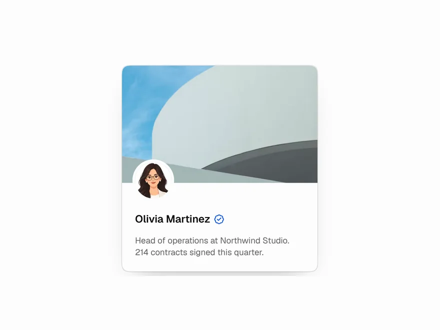 Pro
3D Tilt Card
3D tilt card with layered depth.
 Pro
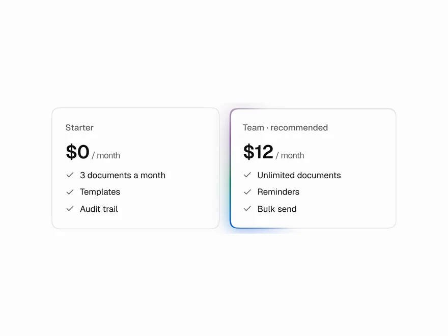
Moving / Glowing Border
Animated glowing border for cards.
 Free
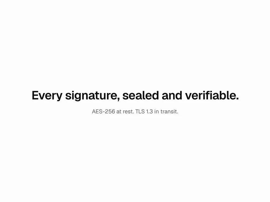
Scramble Text
Text that unscrambles into words.
 Free
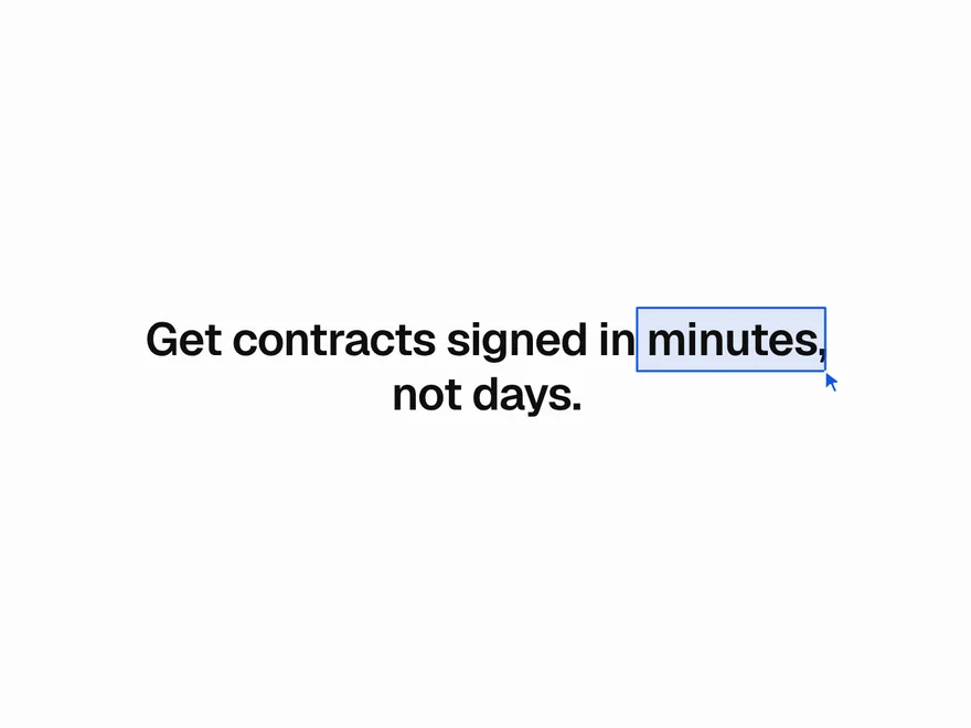
Pointer Highlight
Hand-drawn highlight around words.
 Pro
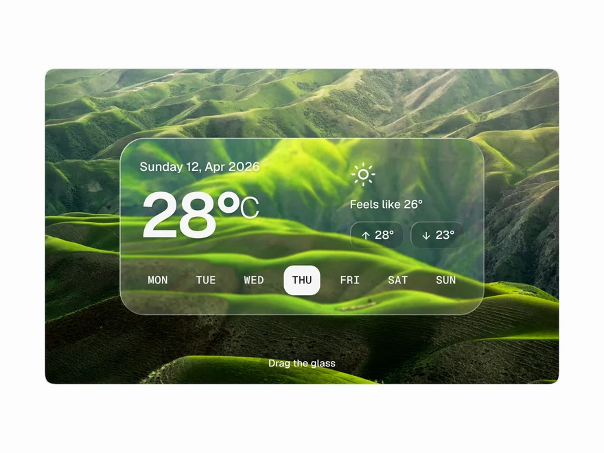
Liquid Glass
Liquid glass panel with lens blur.
 Free
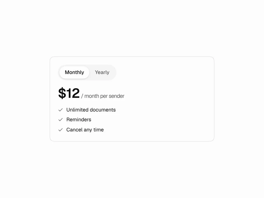
Blur Crossfade
Smooth blur transition between content.