Slice Reveal Title
A title cut in line by line, like the opening of a film.
PROGet Slice Reveal Title and 168 other Pro components with pro lifetime — Get Pro
- Category
- Creative
- Access
- ProPro · unlocked
- Source
- 98 lines · one file
- States
- 4 drawn
The decision inside it
The words appear in the bar's wake
Each word is uncovered exactly as the bar's trailing edge passes, never faded in underneath or flashed before it, so it reads as one clean cut. The whole title is a single heading to a screen reader. Reduced motion shows it whole.
When to use it
Use Slice Reveal Title for a short, bold statement cut in line by line, like a film title. You choose the line breaks; mark a line as accent to set it apart.
Installation
How you get it
Paste this into Claude Code, Cursor, Codex or any coding agent. It installs the file and uses it as it is, instead of writing a new one.
Use Liro's Slice Reveal Title for this.
Install it: npx shadcn@latest add @liro/slice-reveal-title
(the @liro registry is set up in components.json, with LIRO_KEY in .env.local)
Import it from @/components/ui/slice-reveal-title.
Do not rewrite or restyle it. Pass my data through its props
and keep its built-in states.
For the full brief with every prop and the mistakes assistants usually make, use Copy prompt above. Pro components install through the @liro registry with your CLI token: see the Namespaced tab.
Usage
import { SliceRevealTitle } from "@/components/ui/slice-reveal-title";

export function Statement() {
  return (
    <SliceRevealTitle
      lines={["Small team.", "Big releases.", "Every Friday."]}
      accent={[1]}
      className="text-7xl font-bold tracking-tight"
    />
  );
}
API reference
“Copy prompt” above puts a full brief on your clipboard, install command, dependencies, props, and the mistakes an assistant usually makes with this component.
Props
Read from the component’s own TypeScript interface when the site is built, so this table cannot drift from the file you install.
| Type | Notes | ||
|---|---|---|---|
lines | string[] | Yes | The title, one string per line. |
as | Tag | No | The element to render. Default `h2`. |
barClassName | string | No | Colour class for the bar, read as `bg-*`. Default the text colour. |
stagger | number | No | Seconds between lines. Default 0.14. |
trigger | "view" | "mount" | No | Start when it scrolls into view, or on mount. Default `view`. |
accent | number[] | No | Lines to mark in the accent colour, by index. |
accentClassName | string | No | Classes for an accent line's text. Default blue. |
accentBarClassName | string | No | Classes for an accent line's bar. Default blue. |
Dependencies
npm packages
clsxframer-motiontailwind-mergeLiro foundations, installed alongside it
liro-themeStates
All of them are drawn by the component. None is left for you to design.
- Slicing
- Revealed
- Accent line
- Reduced motion
Accessibility
- Keyboard reachable throughout, in visual order
- Focus trapped in overlays, Escape closes them
- Focus returns to whatever opened it
- Live regions announce what changed, not that something did
- Honours prefers-reduced-motion
Responsive behavior
- Sizes to its container, not the viewport
- Usable from 320px up
- Pointer-based interaction, so trackpad and touch both work
- No hover-only affordances
More like Slice Reveal Title
All Creative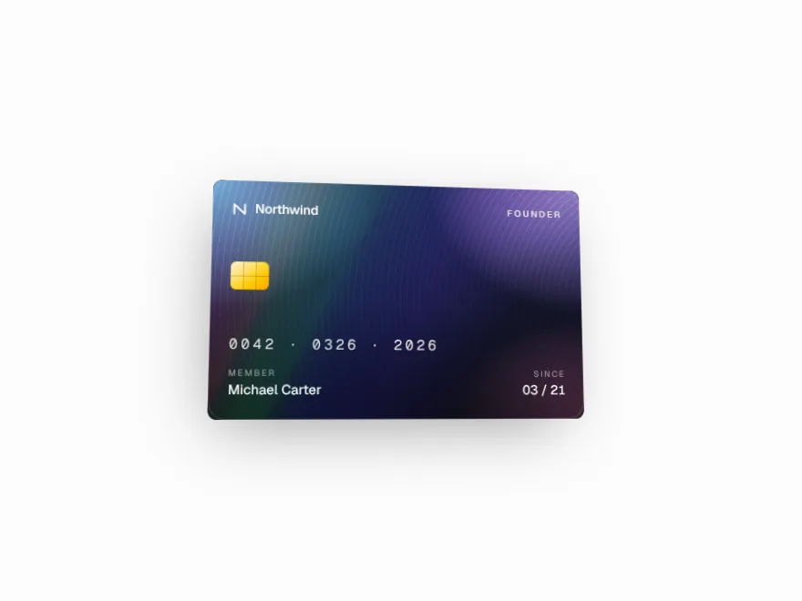 Pro
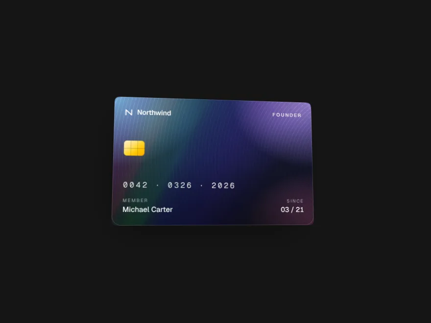
Prism Card
Card that tilts with a spectrum sheen.
 Pro
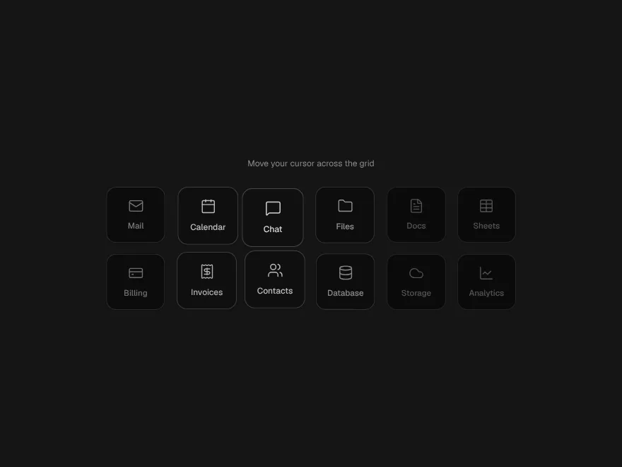
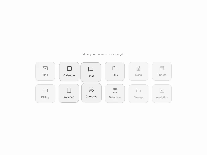
Magnet Cluster
Tiles that lean toward the pointer.
 Free
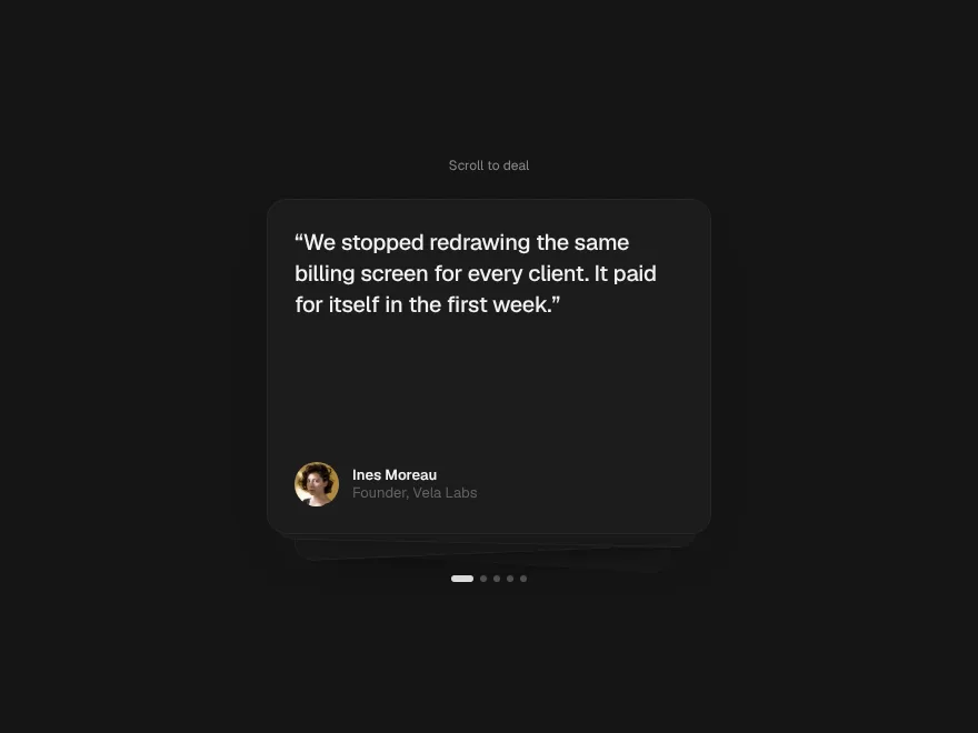
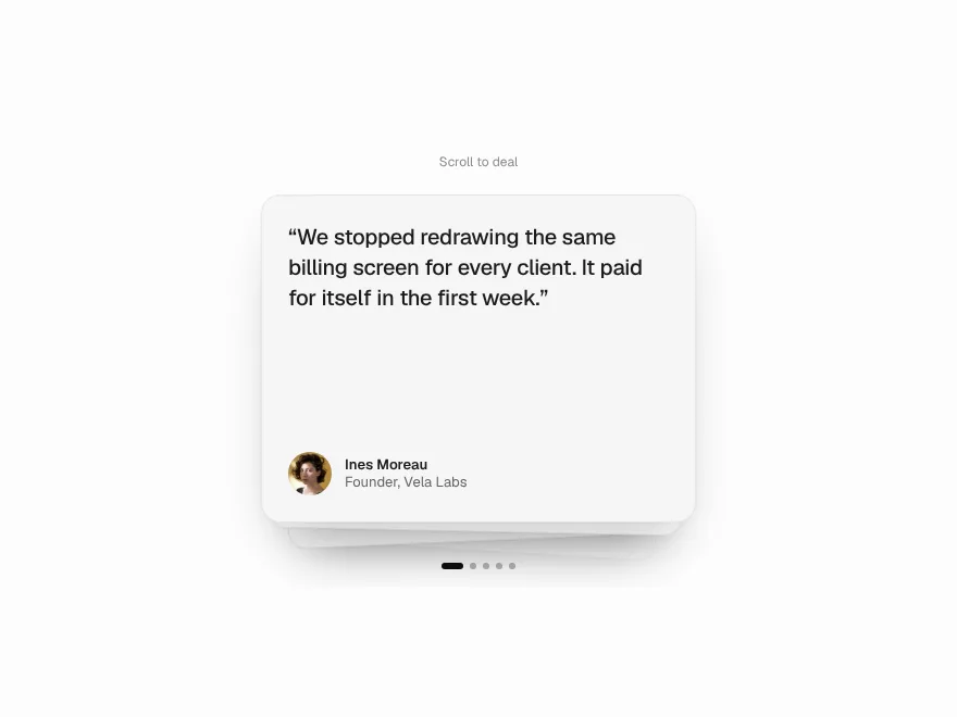
Stack Shuffle
Card deck that deals itself on scroll.
 Pro
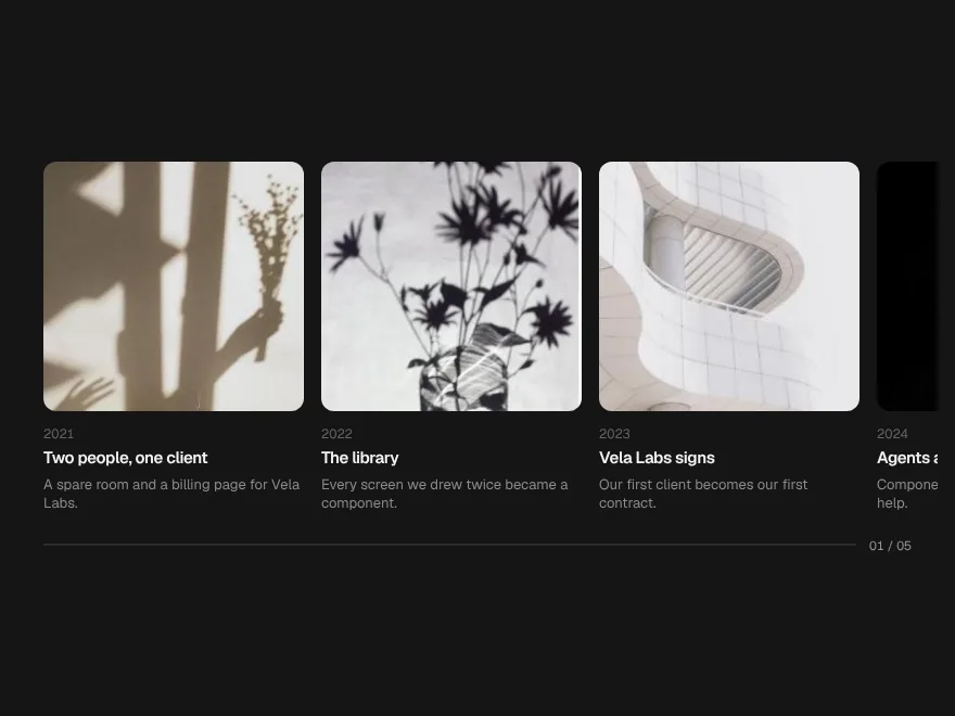
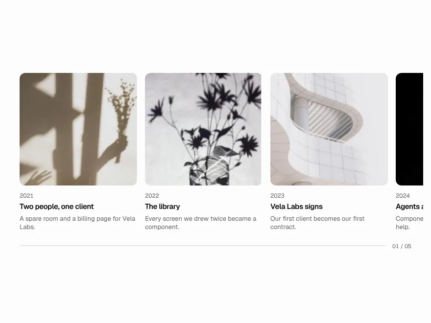
Horizon Pin
Pinned section that scrolls sideways.
 Free
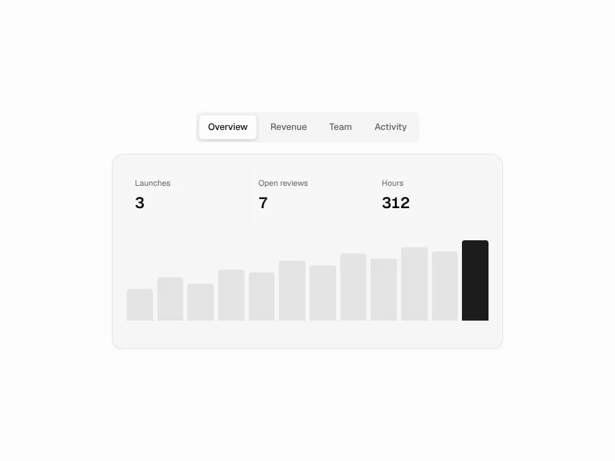
Morph Tabs
Tabs with a liquid sliding indicator.
 Pro
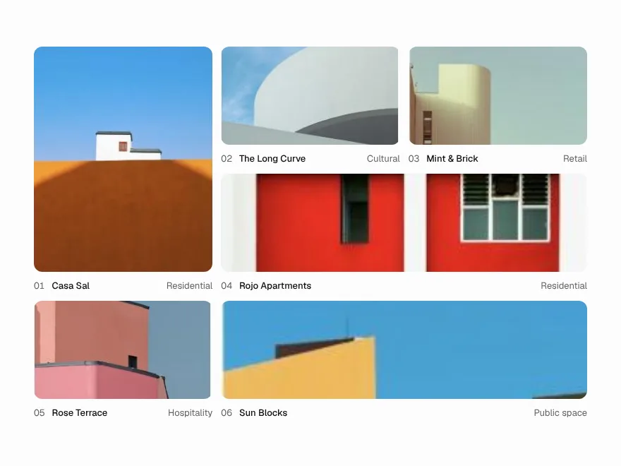
Expand Gallery
Image gallery that expands in place.