Scroll Fill Text
A line that fills in as it is read, character by character.
PROGet Scroll Fill Text and 168 other Pro components with pro lifetime — Get Pro
- Category
- Marketing
- Access
- ProPro · unlocked
- Source
- 295 lines · one file
- Added
- 23 Sept 2026
The decision inside it
Reduced motion fills it and stops
Tying colour to scroll position is motion whether or not anything moves on its own. When the system asks for less of it, the text renders filled and the listener is never attached.
When to use it
Use Scroll Fill Text for a statement that fills in word by word as the reader scrolls, with chosen words highlighted. It is a scroll effect, so it needs room to scroll past.
Installation
How you get it
Paste this into Claude Code, Cursor, Codex or any coding agent. It installs the file and uses it as it is, instead of writing a new one.
Use Liro's Scroll Fill Text for this.
Install it: npx shadcn@latest add @liro/scroll-fill-text
(the @liro registry is set up in components.json, with LIRO_KEY in .env.local)
Import it from @/components/ui/scroll-fill-text.
Do not rewrite or restyle it. Pass my data through its props
and keep its built-in states.
For the full brief with every prop and the mistakes assistants usually make, use Copy prompt above. Pro components install through the @liro registry with your CLI token: see the Namespaced tab.
Usage
import { ScrollFillText } from "@/components/ui/scroll-fill-text";

export function Manifesto() {
  return (
    <ScrollFillText as="p" highlight={["finished", "accessible"]} className="text-3xl">
      Every screen your product needs, finished and accessible, ready to install.
    </ScrollFillText>
  );
}
API reference
“Copy prompt” above puts a full brief on your clipboard, install command, dependencies, props, and the mistakes an assistant usually makes with this component.
Dependencies
npm packages
clsxtailwind-mergeLiro foundations, installed alongside it
liro-themeAccessibility
- Keyboard reachable throughout, in visual order
- Focus trapped in overlays, Escape closes them
- Focus returns to whatever opened it
- Live regions announce what changed, not that something did
- Honours prefers-reduced-motion
Responsive behavior
- Sizes to its container, not the viewport
- Usable from 320px up
- Pointer-based interaction, so trackpad and touch both work
- No hover-only affordances
More like Scroll Fill Text
All Marketing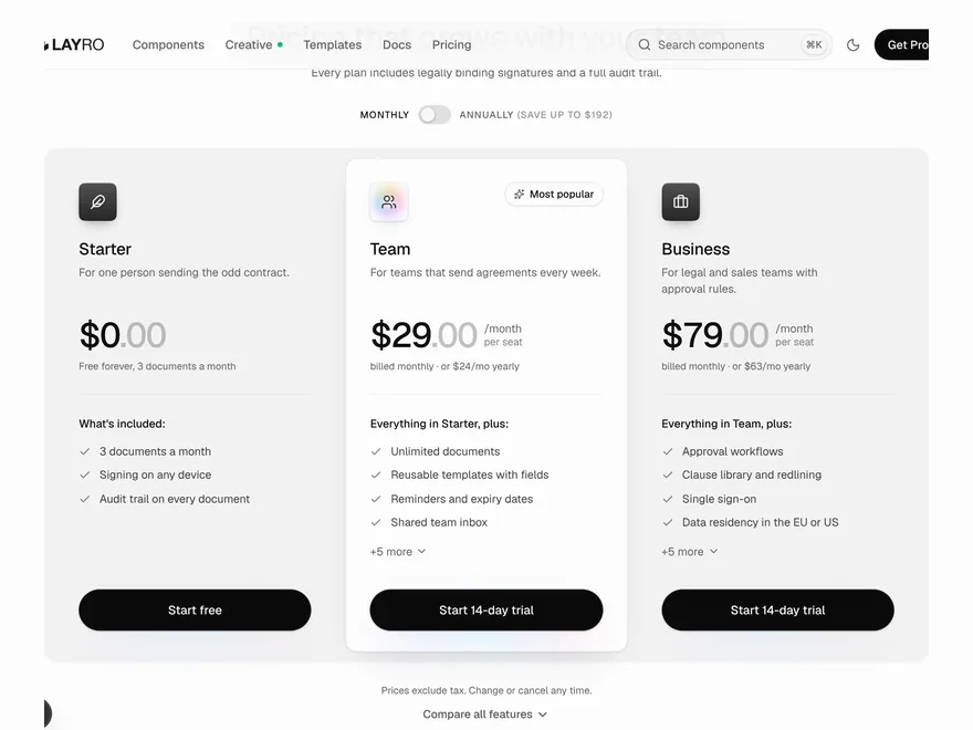 Pro
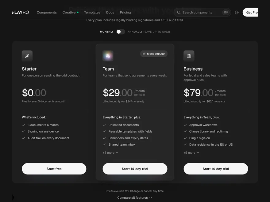
Pricing Plans
Pricing section with monthly and yearly plans.
 Pro
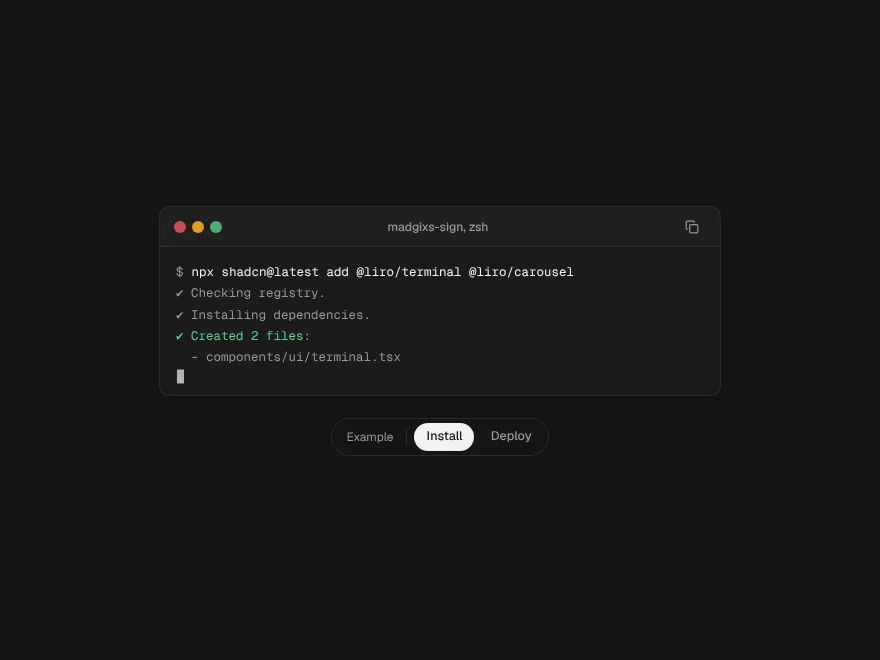
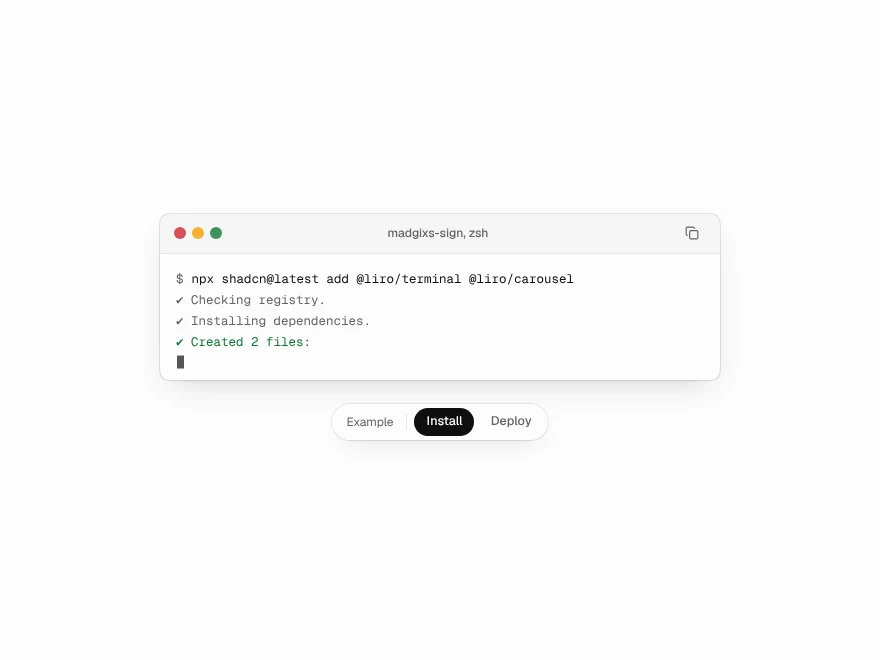
Terminal
Animated terminal that types commands.
 Free
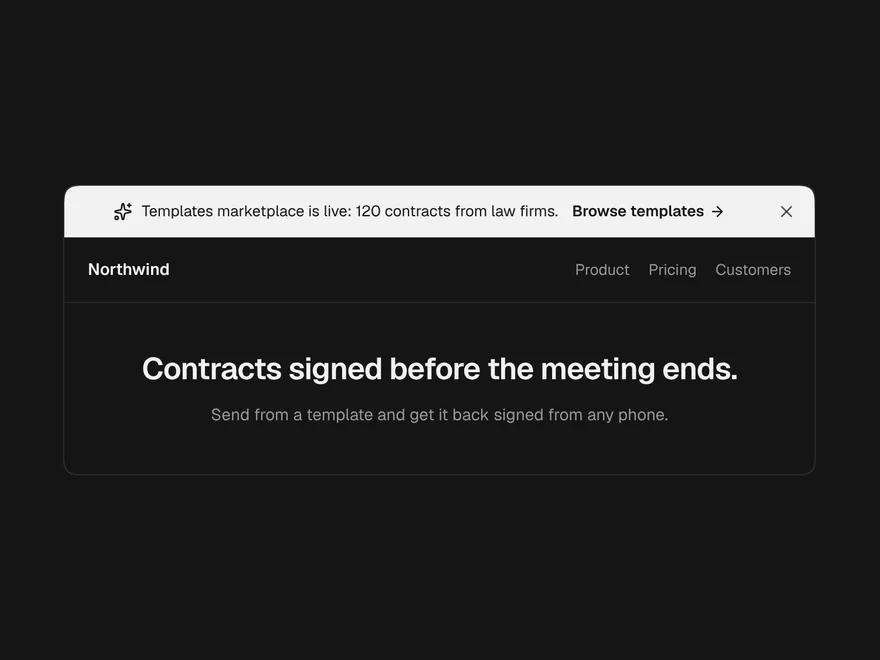
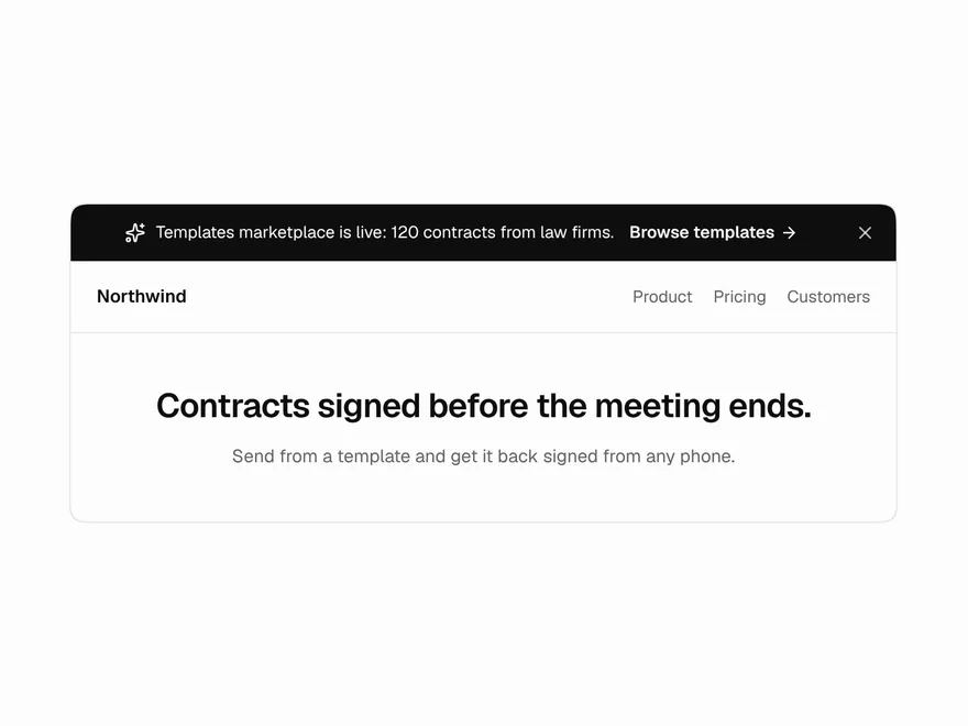
Announcement Banner
Announcement bar for launches and notices.
 Pro
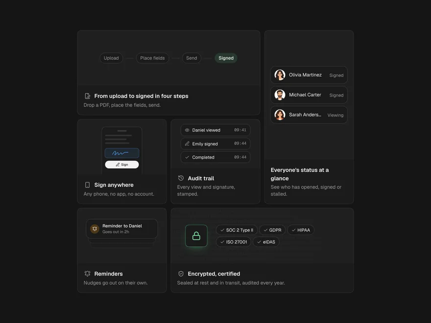
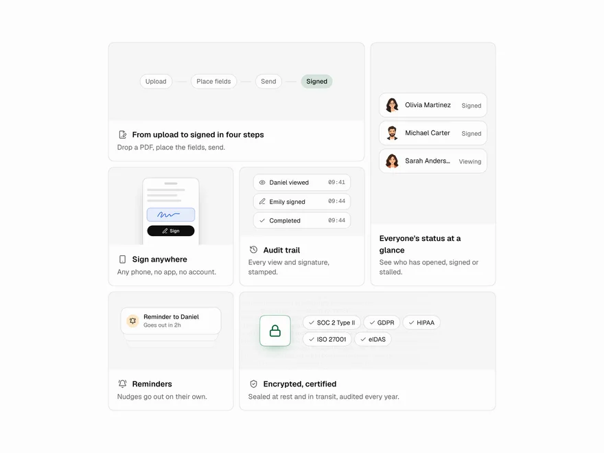
Bento Grid
Bento grid feature section.
 Pro
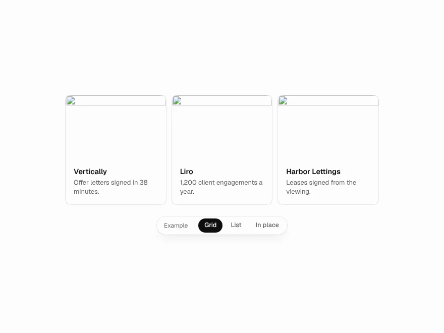
Expandable Card
Cards that expand into full detail.
 Pro
Globe / World Map
Interactive dotted globe and world map.