Hover Card
A profile or link preview that opens on hover and on keyboard focus.
- Category
- Overlays
- Access
- Free with an account
- Source
- 179 lines · one file
- States
- 4 drawn
The decision inside it
Extra, never the only way
It does not open on touch, where there is no hover, and focus stays on the trigger. Anything essential belongs on the page; the card is a preview.
When to use it
Use Hover Card to preview what a link or name leads to without leaving the page: a profile, a document, a URL. It opens on hover or focus, never on touch. For an action menu use Popover or Dropdown Menu.
Installation
How you get it
Paste this into Claude Code, Cursor, Codex or any coding agent. It installs the file and uses it as it is, instead of writing a new one.
Use Liro's Hover Card for this.
Install it: npx shadcn@latest add @liro/hover-card
(the @liro registry is set up in components.json, with LIRO_KEY in .env.local)
Import it from @/components/ui/hover-card.
Do not rewrite or restyle it. Pass my data through its props
and keep its built-in states.
For the full brief with every prop and the mistakes assistants usually make, use Copy prompt above. Free components install through the @liro registry with your CLI token: see the Namespaced tab.
Usage
import { HoverCard } from "@/components/ui/hover-card";

export function DocsLink() {
  return (
    <HoverCard
      trigger={<a href="https://madgixs.com/docs">our docs</a>}
      url="https://madgixs.com/docs"
      preview={{ title: "Madgixs docs", description: "Send, sign and store contracts.", domain: "madgixs.com" }}
    />
  );
}
API reference
“Copy prompt” above puts a full brief on your clipboard, install command, dependencies, props, and the mistakes an assistant usually makes with this component.
Props
Read from the component’s own TypeScript interface when the site is built, so this table cannot drift from the file you install.
| Type | Notes | ||
|---|---|---|---|
trigger | React.ReactElement | Yes | The element that opens it: a link, a name, a button. Must be focusable. |
content | React.ReactNode | No | Your own card. Wins over `preview`. |
url | string | No | The link being previewed. |
preview | LinkPreviewData | No | The page's title, description and image, fetched on your server. |
openDelay | number | No | Milliseconds before it opens. Default 500. |
closeDelay | number | No | Milliseconds before it closes once the pointer leaves. Default 200. |
side | "top" | "bottom" | "left" | "right" | No | Which side of the trigger. Default bottom. |
width | number | No | Card width in pixels. Default 320. |
open | boolean | No | Controlled open state. |
onOpenChange | (open: boolean) => void | No | – |
className | string | No | – |
Dependencies
npm packages
@radix-ui/react-popoverclsxlucide-reacttailwind-mergeLiro foundations, installed alongside it
liro-themeStates
All of them are drawn by the component. None is left for you to design.
- Closed
- Link preview
- Profile card
- Focus opened
Accessibility
- Keyboard reachable throughout, in visual order
- Focus trapped in overlays, Escape closes them
- Focus returns to whatever opened it
- Live regions announce what changed, not that something did
- Honours prefers-reduced-motion
Responsive behavior
- Sizes to its container, not the viewport
- Usable from 320px up
- Pointer-based interaction, so trackpad and touch both work
- No hover-only affordances
More like Hover Card
All Overlays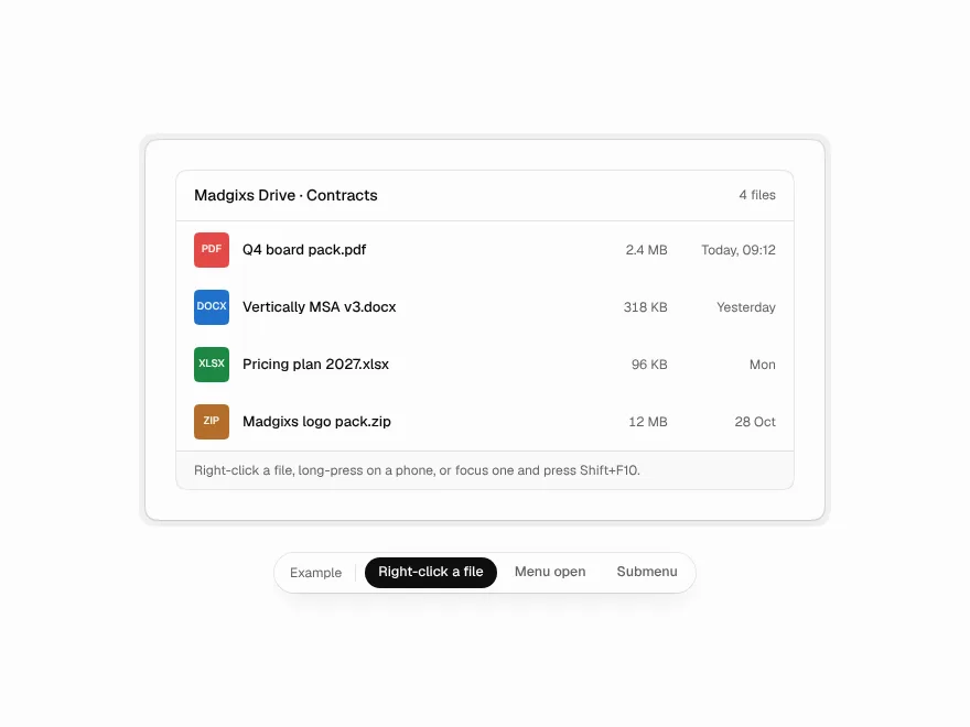 NewFree
Context Menu
The menu behind a right-click, a long press or Shift+F10, with submenus that don't snap shut.
 Free
Dialog
Modal dialog and confirm dialog.
 Free
Drawer
Slide-out drawer panel.
 Free
Popover
Popover panel for filters and forms.
 Free
Tooltip
Tooltip with keyboard shortcut.
 Free
Dropdown Menu
Dropdown menu with keyboard support.