Away Summary
What happened while you were away, from the last message you actually saw.
The card at the top of a thread when you come back: how long you were gone, a strip with a mark per event, then what needs you, what failed and what got done, with one action per row. Got it folds it into a one-line divider.
PROGet Away Summary and 176 other Pro components with pro lifetime — Get Pro
- Category
- AI Agent
- Access
- ProPro · unlocked
- Source
- 303 lines · one file
- States
- 5 drawn
- Added
- 13 Nov 2026
The decision inside it
Counts from what you saw, not when you visited
"Away" starts at the last message you saw in this thread, not your last visit to the app. Things that needed you but sorted themselves out show as resolved, never as alerts, so the card only asks for what is still open.
When to use it
Use Away Summary at the top of a chat or agent thread when someone comes back, to show what happened since the last message they saw. For a live feed use Activity Feed; for one run's outcome use Run Summary.
Installation
How you get it
Paste this into Claude Code, Cursor, Codex or any coding agent. It installs the file and uses it as it is, instead of writing a new one.
Use Liro's Away Summary for this.
Install it: npx shadcn@latest add @liro/away-summary
(the @liro registry is set up in components.json, with LIRO_KEY in .env.local)
Import it from @/components/ui/away-summary.
Do not rewrite or restyle it. Pass my data through its props
and keep its built-in states.
For the full brief with every prop and the mistakes assistants usually make, use Copy prompt above. Pro components install through the @liro registry with your CLI token: see the Namespaced tab.
Usage
import { AwaySummary, type AwayEvent } from "@/components/ui/away-summary";

export function ThreadRecap({ lastSeenAt, events, markSeen }: { lastSeenAt: number; events: AwayEvent[]; markSeen: () => void }) {
  return <AwaySummary lastSeenAt={lastSeenAt} events={events} onDismiss={markSeen} />;
}
API reference
“Copy prompt” above puts a full brief on your clipboard, install command, dependencies, props, and the mistakes an assistant usually makes with this component.
Props
Read from the component’s own TypeScript interface when the site is built, so this table cannot drift from the file you install.
| Type | Notes | ||
|---|---|---|---|
lastSeenAt | Date | number | Yes | The last message the person saw in this thread. Events before it are not news. |
events | AwayEvent[] | Yes | – |
onDismiss | () => void | No | Marks it all as seen. The card folds into a divider. |
defaultFolded | boolean | No | Start folded. |
defaultShowDone | boolean | No | Start with the done and resolved list open. |
now | Date | number | No | – |
Dependencies
npm packages
clsxframer-motionlucide-reacttailwind-mergeLiro foundations, installed alongside it
liro-themebuttonStates
All of them are drawn by the component. None is left for you to design.
- Back after a night
- Needs you
- Sorted itself out
- Folded
- Action fails
Accessibility
- Keyboard reachable throughout, in visual order
- Focus trapped in overlays, Escape closes them
- Focus returns to whatever opened it
- Live regions announce what changed, not that something did
- Honours prefers-reduced-motion
Responsive behavior
- Sizes to its container, not the viewport
- Usable from 320px up
- Pointer-based interaction, so trackpad and touch both work
- No hover-only affordances
More like Away Summary
All AI Agent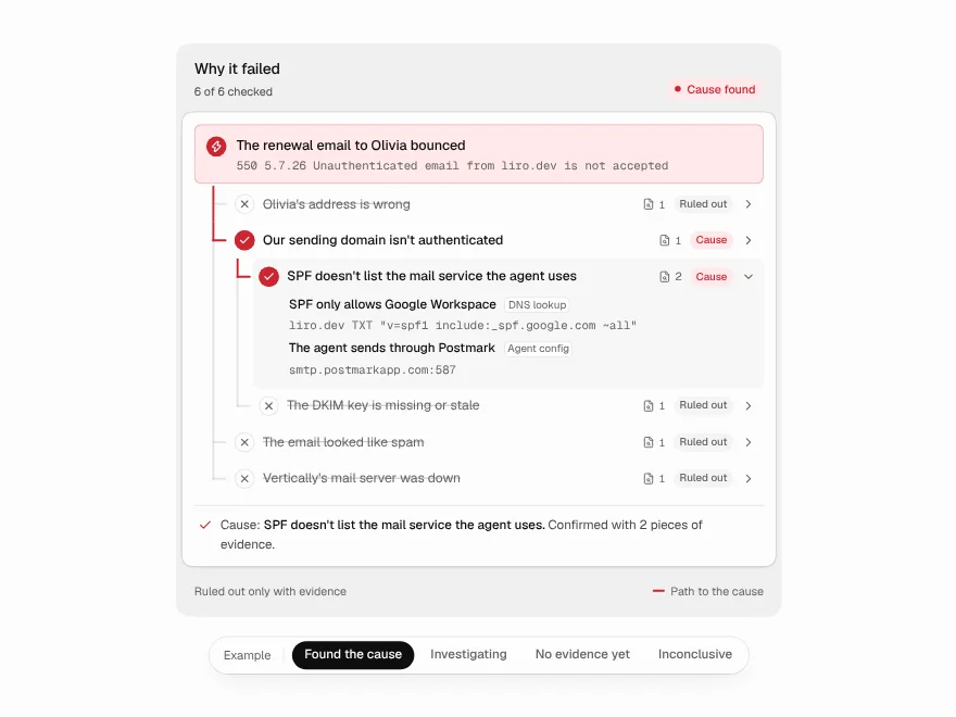 NewPro
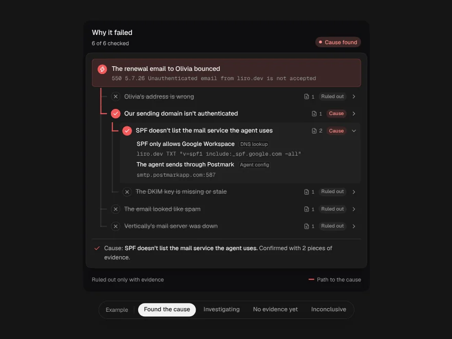
Root Cause Tree
How an agent finds why a run failed, as a tree of checked guesses.
 NewFree
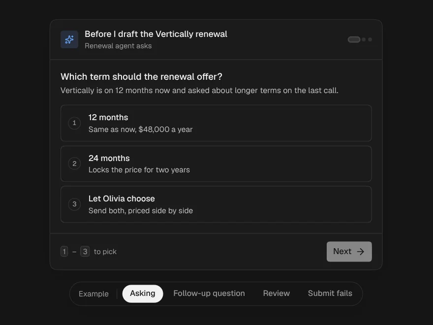
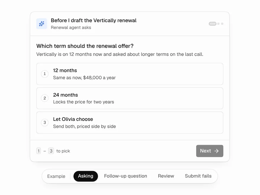
Questionnaire
Questions an agent asks mid-run, one at a time, with answers that stay consistent.
 NewPro
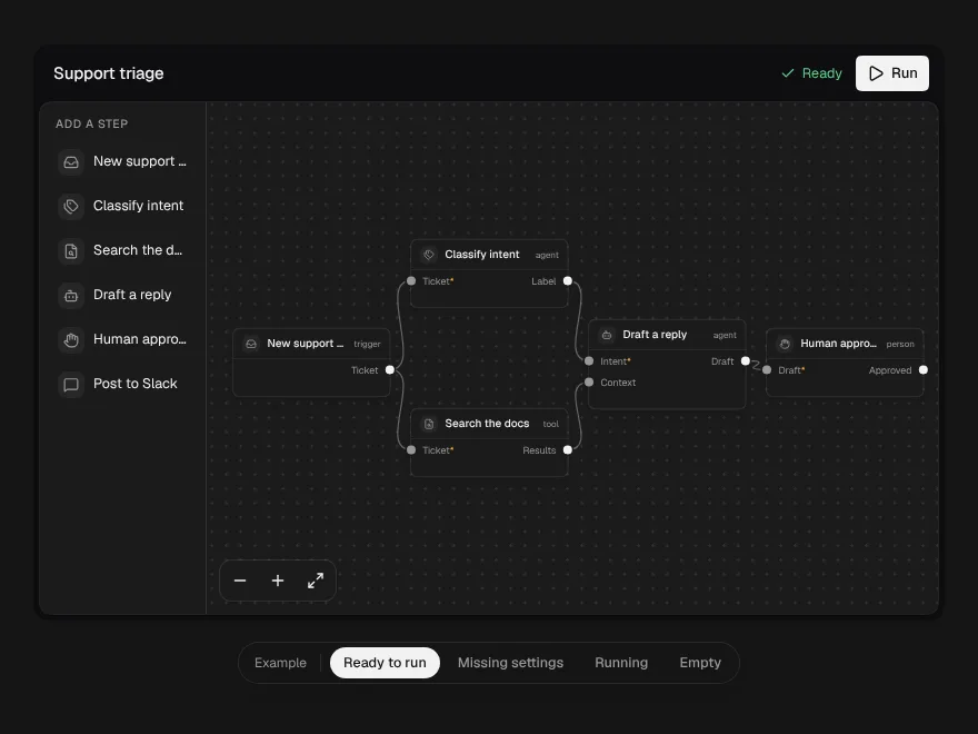
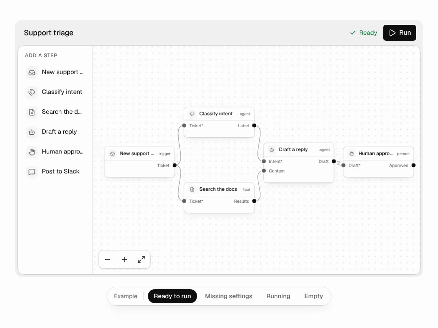
Workflow Builder
A node canvas for agent workflows that refuses broken wiring as you draw it.
 NewPro
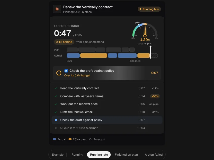
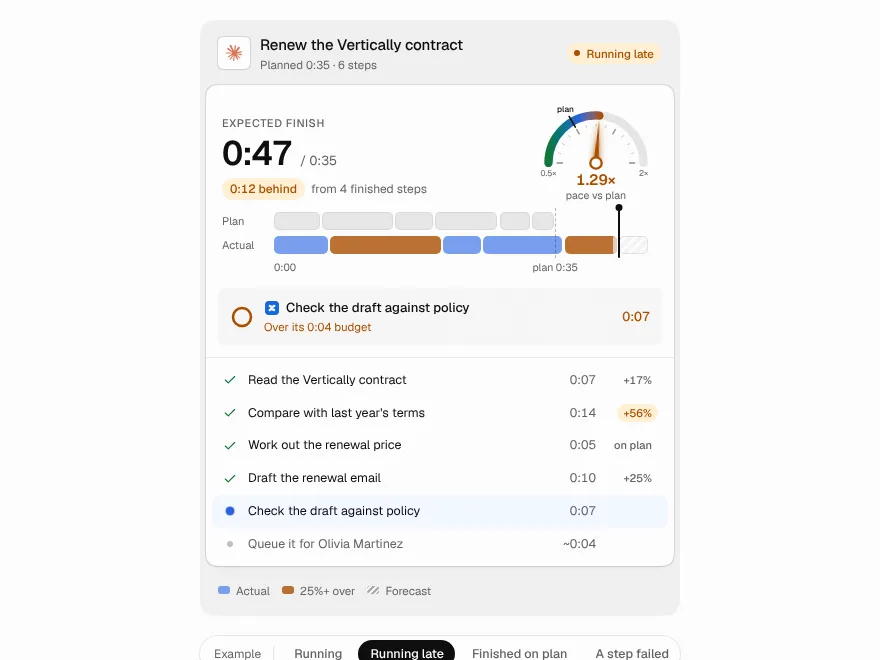
Plan vs Actual
An agent's plan and its real run as two lanes on one clock, with a pace dial and a finish time that rolls over.
 NewPro
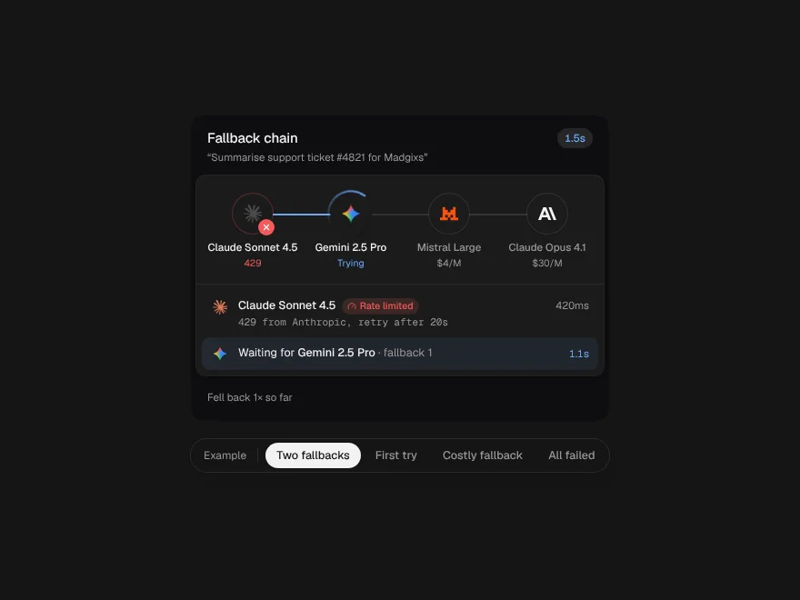
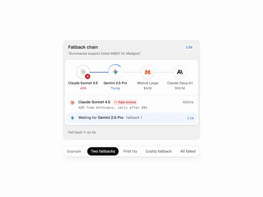
Fallback Chain
A request passed from model to model like a relay, with why each one failed and a receipt for the detour.
 NewPro
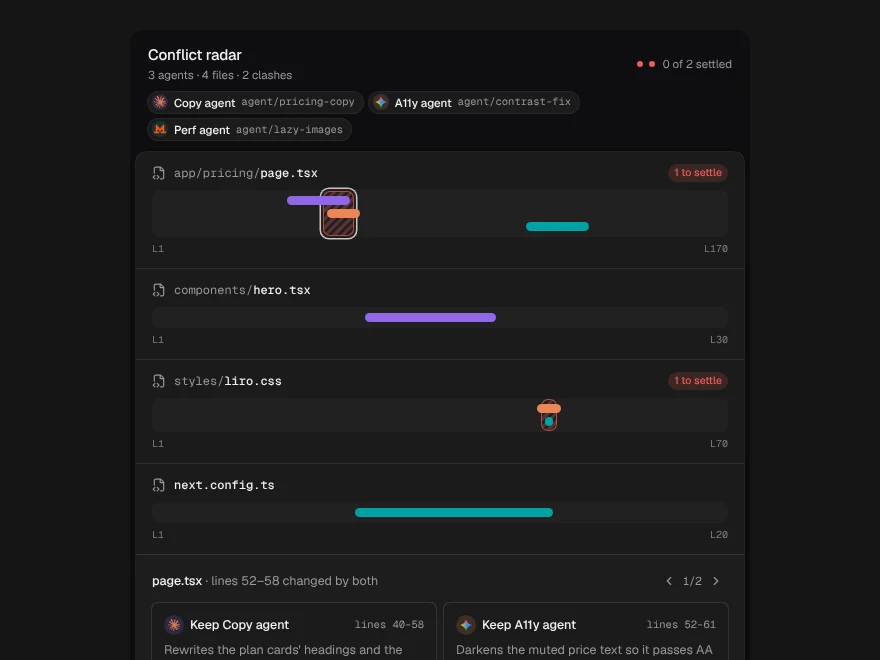
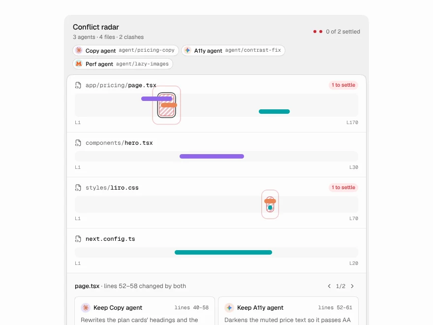
Conflict Radar
Parallel agents drawn as a minimap of each file, with the lines where their changes collide marked before merge.